i just use a continuous line then go from there. i guess you have to have a feel to the graffiti your doing, i been doing letters for about 6 years. and im still learning how to create a good alphabet!
It seems to me that graffiti is very similar to asian calligraphy, both of which I have dabbled in... the main difference being that a can of spray paint is obviously not a brush. The similarity is creating art from the form of strokes of a word or in case of an English letter. I would like to suggest not using the continuous line entirely because it can limit your style sometimes, and the masters know when and where to stop spraying, much like calligraphy. Obviously though that's just whatever style you may have.
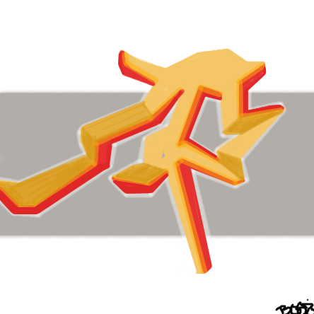
About this particular piece I think the background needs something badly... a grey stripe imo doesn't suit it at all. The shape itself is interesting, it reminded me of an 'm' at first. One of the greatest things about graffiti is that it can disguise it's message and force people to find whatever the message is while looking all over the piece.
drawn in 45 min
I really like those ridges aswell.
What do you start out with? A simple sketch?
About this particular piece I think the background needs something badly... a grey stripe imo doesn't suit it at all. The shape itself is interesting, it reminded me of an 'm' at first. One of the greatest things about graffiti is that it can disguise it's message and force people to find whatever the message is while looking all over the piece.