| |||||||||
| Public Boards/Intermediate | |||||||||
|
thinbear
(Nov 23, 2013)
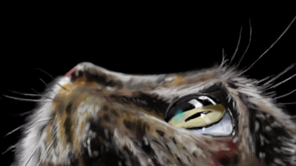
ref used: http://1.bp.blogspot.com/-TjlUbs2yALg/UQWah1sg6eI/AAAAAAAAADU/jtABF5-_Q4E/s1600/animals-pictures-cat-eyes-macro-photography+%282%29.jpgmay "debug" tomorrow |
| ||||||||
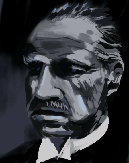
|
thinbear
(Nov 18, 2013)
davincipoppalag (Nov 18, 2013)
this one is better! makeemanoffertheycantrefuse
thinbear (Nov 18, 2013)
lol is that you irl?
davincipoppalag (Nov 19, 2013)
lol sort of often ends up drawing too much details, and ctrl-z all the way back;
I'd like to try the "unfinished stroke" feeling |
| ||||||||
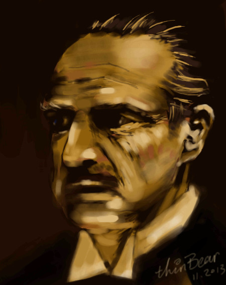
|
thinbear
(Nov 16, 2013)
http://en.wikipedia.org/wiki/File:Godfather15_flip.jpg
davincipoppalag (Nov 17, 2013)
recognizeable..
thinbear (Nov 17, 2013)
hope the next try will be better |
| ||||||||
| Specialty Boards/Elite Bastards | |||||||||
|
Axil62
(Oct 2, 2013)
DeadlyBlondeArcher (Dec 10, 2013)
I see the portion of the lightbulb that screws into the socket....the lightbulb that fell and broke while on an LSD trip....that's what this is...it's TRIPPY. I looooove it.l
davincipoppalag (Mar 30, 2019)
so does this
yellow.nutella (Oct 1, 2022)
Was this from imagination or with references? Regardless it has such an aesthetic feel to it.
elly (Nov 23, 2023)
A light bulb full of paint and dropped...VERY cool, VERY well done! |

| ||||||||
| Public Boards/Advanced | |||||||||
|
Roytje
(May 8, 2013)
Suntan (May 13, 2013)
beautiful :)
Pantera (May 14, 2013)
Well done:)
Miss_DJ (May 14, 2013)
Wonderful...again and again...and always.
thinbear (May 15, 2013)
is that impressionism painting? I envy your way to express it as well as the speed. Thanks for drawing it with [animation] enable so hopefully I may learn a thing or two. |

| ||||||||
|
thinbear
(Apr 28, 2013)
http://customize.org/wallpapers/59611
Wraith (Apr 28, 2013)
Nice bird! I can almost see it looking around.
Pantera (Apr 29, 2013)
oooo one of my favorites here, I love bw drawings of birds did a few myself, but yours looks awesome :)
thinbear (Apr 29, 2013)
Thank you all :D
firecracker (Apr 29, 2013)
Very very nice.....:) |

| ||||||||
| Public Boards/Intermediate | |||||||||
|
pawillie
(May 7, 2012)
|

| ||||||||
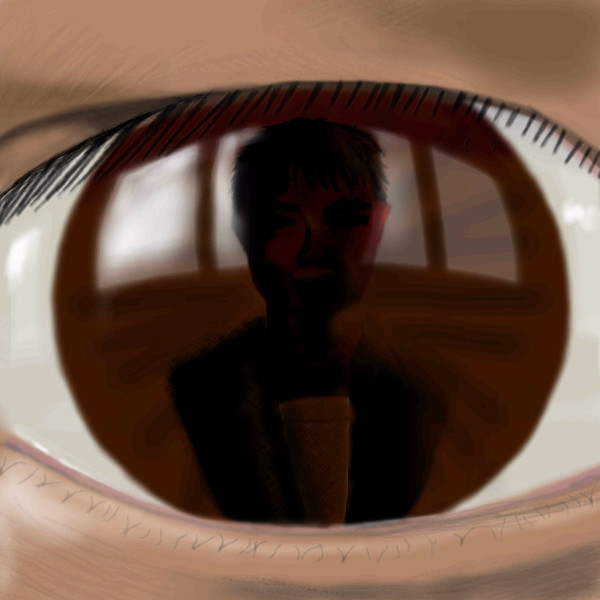
|
thinbear
(May 6, 2012)
reference: myself, mirror stagehow come the compression messed up?
Very not what I expecting. Well, at least I tried...
lori (May 8, 2012)
the thumb is pretty cool.. this would be good if it was smaller I think... I like the reflections off to the sides of the person
thinbear (May 8, 2012)
thanks~It would be better if I got a better reference, staring at a dental mirror is not fun at all |
| ||||||||
| Public Boards/Beginner | |||||||||
|
Pantera
(Apr 10, 2009)
firecracker (Apr 10, 2009)
Yeah.....I can see a palm tree in there.....very nice draw!! :)
C_bikini_N (Apr 19, 2009)
It is interesting here pantera. I can see no progression in your work whatsoever and I have been watching.
Wraith (Dec 16, 2013)
Whatever it is, it looks amazing!
thinbear (Dec 16, 2013)
feeling of Bushido themed expression |

| ||||||||
| |||||||||
| 2draw.net © 2002-2024 2draw.net team/Cellosoft - copyright details - 0.18sec (sql: 39q/0.07sec) |
drawn in 32 min
http://www.ratemydrawings.com/drawings/photorealism/415490.html
Here's what I think: (could be wrong as most of my experience/tutorial are from internet)
I used to paint animal by drawing their fur, one by one, slow yet I thought it was "accurate".
Later I figured out using photo as reference is better than real object as the focal point is fixed. The unfocused area should be blurred or using a softer brush. (In a real object painting, your eyes auto focus wherever your stare at, I made this mistake for a long time)
Later when I see Roytjes' amazing art on 2draw, I learn that using "rough" "in-completed" brush stroke to represent the non-focused area/unimportant part (instead of blurring it), elevate the feeling of the whole picture to another level. It is very different from the realism painting I have been practicing.
It is hard for me to jump to his style, could be I am missing some basic lessons and lack of sufficient practice. (I tried several before and they turns out giving a very sloppy with weird color tones >_<) I think I can somewhat manipulate in "pixel level" well, but not "brush stroke" level yet.
In this drawing I intend not to "jump too far", experiencing somewhere between his style and realism where I am more comforted with.
About the color, someone taught me I can break down the color for lighten and shaded part; taken a green leave as example, the sun lit area can be colored with lime yellow or even yellow on the edge; the shaded part can be darken with blue or black. I sometimes even shift the color tone for fun, but not always success.
It is hard to express abstract things in second language, hope you understand. :)