| |||||||||||||||||||||||
| Public Boards/Beginner | |||||||||||||||||||||||
|
solve
(Dec 14, 2005)
im done for a while. |

| ||||||||||||||||||||||
| Public Boards/Intermediate | |||||||||||||||||||||||
|
solve
(Nov 30, 2005)
da.
woah_pockster (Dec 1, 2005)
rofl seems like it!this is coool solvee the old man's face is just fading awayy <3
nekodesu (Dec 1, 2005)
I love the different shades of blue in this :D
LisaAnne (Dec 1, 2005)
Hey Marcus from the streets...Did you know this was blue?...Just checking. No in all seriousness, the eye lid and position is very pretty.
TaCO (Dec 1, 2005)
All the shades of blue you used look great togeather, but the White areas could use some atmosphere coming out of It to bring the whole pic togeather. |

| ||||||||||||||||||||||
|
solve
(Nov 26, 2005)
i hope this turns out as i seen it.
HunterKiller_ (Nov 27, 2005)
Mmm... taco... I would really like to see the signature drip going on in this one.tired of this in my studio.
woah_pockster (Nov 30, 2005)
look neattt, if the lines were made with the pen, I think it'd look cooler :P <33 I LOVE THIS <3
Mafuyu (Nov 30, 2005)
Them's some smoooooth lines. I like this, a lot. Very pleasing to the eye. =3 |

| ||||||||||||||||||||||
|
solve
(Nov 18, 2005)
smay recolor from scratch.
LisaAnne (edited Nov 20, 2005)
Wow...very new. The nose is much more soft...for me much more the way I'd think of an elderly person. Beautiful, and taken for granted. The change in head position and overall expression has me so curious to what your and "their" thought process now is...what are the fears marcus?I'm also glad to see your cookie cook icon. Oh yeah, why blue?
davincipoppalag (Nov 20, 2005)
This looks better now marcus..it does look like a more tired, older face .
Gigge (Nov 26, 2005)
I love the shine you put on. The tautness of the skin over the cheeks, chin, nose and lips is a great contrast to the wrinkled, dry look of the rest of the skin. It emphasizes the sagginess elsewhere. |

| ||||||||||||||||||||||
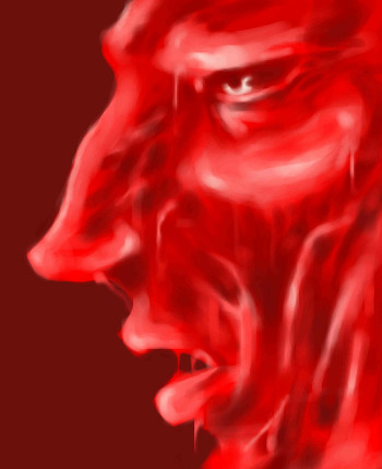
|
solve
(Nov 21, 2005)
there are parts of this i love and hate.
Priszcilla (Nov 21, 2005)
I know he's supposed to be all nasty, but I dunno...I feel like licking him.
davincipoppalag (Nov 21, 2005)
Great job on this one marcus. I like the change from version 1
evelina (edited Nov 22, 2005)
Heeey~ another fantastic pic by my idol #01!I really love this... his lips and nose are just amazing to look at and the liquidness makes me feel all happy xD! Lavaness!
Gigge (Nov 26, 2005)
The drippiness is splendid. |
| ||||||||||||||||||||||
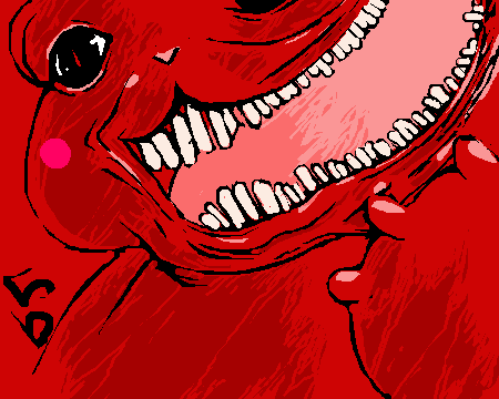
|
solve
(Nov 25, 2005)
from: Ichi The Killer.ive had the movie for quite some time, and its about damn time i did the anime/manga version of this sadomasochist. the sick fucker.
JK-Arts (Nov 25, 2005)
You did a few pictures in red tones and they all look awsome.
TaCO (Nov 25, 2005)
O.O Wicked!!!!!
woah_pockster (Nov 25, 2005)
oh man that movie was fucking greatttttt "i lve sweet things, so I will give you the tip of my tongue" or something *chops the tip of my tongue off and gives it to boss guy* *incoherent mumblung and shreiking in bg* good jobbb solve <3
HunterKiller_ (Nov 25, 2005)
Great close up. Very comic-ish. |

| ||||||||||||||||||||||
|
solve
(Nov 21, 2005)
much cleaning to do.tired of this trash.
hideyourface (Nov 21, 2005)
I think it's look better without the light red outline and a background. Really love those brush strokes though.
LisaAnne (edited Nov 22, 2005)
Fuck...marcus this is one of my favorites. Its very out of your normal box, which I like. Plus it has a primary color basis, yet not the normal stuff you use. The bird also has alot of different things it can be associated with. I would in some ways like to say leave it be. In other ways I'd like to see it get really abstract...and very sharp. Also one of the more accurate pictures as far as anatomy I'd say.We'll just have to see what mr. awesomesauce does with it.... |

| ||||||||||||||||||||||
| Specialty Boards/Collaborations | |||||||||||||||||||||||
|
solve
(Aug 12, 2005)
mercy and severity. renaur and solve.
LisaAnne (Nov 13, 2005)
This has lots of potential, but honestly I'd have to say the red tone is a little too strong. The eyes and shadows of the nails though are extremely effective.
hideyourface (Nov 13, 2005)
I dont mind the red at all. I really like everything about this picture.
Punky (Nov 14, 2005)
I like this alot. :) I think the red and black make a nice contrast.
kitty25 (Nov 21, 2005)
this is very good ,this looks like pinehead from the movie pinehead! |

| ||||||||||||||||||||||
| Public Boards/Intermediate | |||||||||||||||||||||||
|
solve
(Nov 16, 2005)
oh yeah!
HunterKiller_ (Nov 16, 2005)
Your sure like Akuma, huh. I liked your coloured version much better.
Maiko (Nov 16, 2005)
haha, I was just reading D.Gray-man, and there are Akuma in there, and then I refreshed 2drawand I was like "OMG COiNCIDENCE???"
meobi (Nov 17, 2005)
I prefer it before, without the colours cos i think it looks too thick now and the black&white with a bit of red gives a good colour balance |

| ||||||||||||||||||||||
|
solve
(Nov 14, 2005)
havent drawn him in a while.
Creature201 (Nov 15, 2005)
Thank you, I will now have nightmares for weeks.
TOL-CREW (Nov 15, 2005)
wow man thats all i got to say is WOW
woah_pockster (Nov 15, 2005)
eet meeeee <3 I love you. marry me!
Ty854 (Nov 18, 2005)
hahah this thing is awesome! I loooove the teeth. |
| ||||||||||||||||||||||
| |||||||||||||||||||||||
| 2draw.net © 2002-2024 2draw.net team/Cellosoft - copyright details - 0.96sec (sql: 31q/0.57sec) |
Its awesome :D I like the bold colours.