| |||||||||||||||||||||||
| Public Boards/Advanced | |||||||||||||||||||||||
|
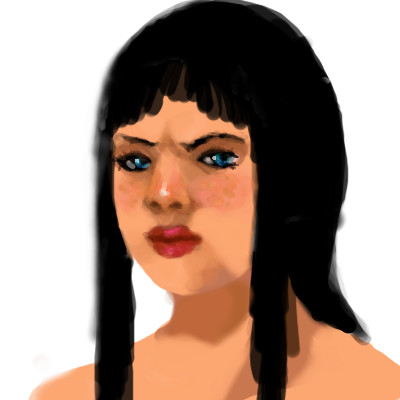
Oud
Roytje
(Jul 1, 2009)
I really want to make good art here again, where I spend more then 2 houres on.
Teapot (Mar 29, 2010)
The way you have depicted age with the sunken mouth, the collapsed brow and drooping eyelids, the wrinkled and thin translucent skin...and even the little hint of chin bristles...and yet her beauty and strong character shine through. What a portrait!
Roytje (Mar 29, 2010)
Thank you. I dont like to speak about my art, but this is one of favorites. :)
lynnandcharlie (Mar 29, 2010)
this is beautiful, I bet she is able to speak up for herself according to her facial expression
shell (Apr 2, 2010)
so talented |

| ||||||||||||||||||||||
| Public Boards/Intermediate | |||||||||||||||||||||||
|
Black_Bird
(Jul 3, 2009)
QTgillie (Jul 7, 2009)
I especially like the composition here, created by the very closeup view you have chosen.
Black_Bird (Jul 8, 2009)
Thank you very much for the nice comments everyone, it is appreciated.
catfish (Jul 8, 2009)
cool
shell (Apr 3, 2010)
looks good |

| ||||||||||||||||||||||
|
Moosh
(Jun 29, 2009)
Axil62 (Aug 24, 2009)
I think her bobbies need a nice light spank with a crop or ruler or something..
Flubbles (Aug 24, 2009)
I must admit this makes me slightly aroused..which is worrying because the proportion of her head to her body suggests she's a dwarf.
Axil62 (Aug 24, 2009)
Yeah, dwarf sex is hot as long as it's between two consenting adult dwarfs.... or ever one consenting adult dwarf and a big fat Sharpie marker.
shell (Apr 3, 2010)
huh I guess that's her design. so nevermind proportions, nice work |

| ||||||||||||||||||||||
|
wolfchr1
(Jun 19, 2009)
bette_davis_eyes (Jun 20, 2009)
very nice work so far wolfchr!
Anxa (Jun 21, 2009)
Looks good so far. My only real suggestion is that if she's leaning against the wall(which it looks like she is) that her butt be squished a little to indicate that. :)i blended the butt so that it looked like it was pressed up against the wall and did some other touch ups. hope yall enjoy
shults (Jun 29, 2009)
But.. the color you used to blend is lighter than her butt and the wall. |
This is hidden because it is rated 18+. Edit your privacy settings to make it visible.
| ||||||||||||||||||||||
| Public Boards/Beginner | |||||||||||||||||||||||
|
OST
(Jun 29, 2009)
More practice after not being here again. :/
shults (Jun 29, 2009)
cute frown.
firecracker (Jun 29, 2009)
I like her hair cut.....kinda shaggy looking....cute draw!! :) |
| ||||||||||||||||||||||
| Public Boards/Intermediate | |||||||||||||||||||||||
|
shults
(May 27, 2009)
Talkin about too much.
firecracker (Jun 29, 2009)
This kinda looks like a chibi doodle,,,,,,but it's really a lascaux doodle...."LOL"!! It's really cool though.....I like the green colors. :D
Bubblicious (Jun 29, 2009)
Nice :)
lori (Jun 29, 2009)
mmm greens.. and always have to love anything that takes on the form of a bird.... well doneunfinished again?
|

| ||||||||||||||||||||||
|
PS
(Jun 28, 2009)
Across the tapioca sea.
Miss_DJ (Jul 13, 2009)
this is terrific
Blackmoon (Jul 13, 2009)
love the colors
Luvvy (Jul 14, 2009)
The effects went really well.It looks like it really raining and people mocing around. Well done
beefcake619 (Oct 2, 2012)
very well done , rain, rain, go away--come back another day? |

| ||||||||||||||||||||||
|
lori
(Jun 28, 2009)
"...used to feel your fire but now it's cold inside..." woke with those lyrics in my head
lori (Jun 28, 2009)
thanks shults :)
davincipoppalag (Jun 28, 2009)
intense indeed
firecracker (Jun 28, 2009)
Very nice.....I like the bright colors. :)
lori (Jun 29, 2009)
ty |
| ||||||||||||||||||||||
|
HiroDaZero
(Jun 24, 2009)
meh
vlad.the.hamster (Jun 24, 2009)
Feels so whimsical. Whee!
HiroDaZero (Jun 24, 2009)
lol Thanks guys :)
shults (Jun 24, 2009)
You're awesome Hiro.
firecracker (Jun 24, 2009)
Very cool "pic"....I likey!!! :) |

| ||||||||||||||||||||||
|
Roytje
(Apr 17, 2009)
:)
shults (edited Jun 23, 2009)
Hi :)I can see an old man looking down too! wait.. did you draw him on purpose, like he really is in heaven?! You have great color combination here roy, as always. :) But-I find the lines on the right disturbing, They kind of take me out of the story I could have built around this piece. maybe it was intended, don't know.. but I liked the piece better without them, like in the previous version. edit- Im with that lady, even if it took him 40 years, it would be much better at 40 years and an hour!
gerbear (Jun 24, 2009)
In my opinion, compositionally, this piece is brilliant. You have two completely different pictures here, the left side all simple and monochromatic with just warm colors and large simple shapes and the right side is full of action, warm and cool colors, blurred and sharp lines, smaller shapes, etc etc. The two meet in the middle at the center of the volcano and my gaze is caught there, just as it should be. The part i like best are the vertical lines on the left, without them the left side would not be strong enough to balance the seething wildness on the right. They also keep the birds from becoming too much of a distraction. Simply wonderful. I have been a fan of your work for quite a few yrs even tho I do not comment.
Roytje (edited Jul 7, 2009)
That's a great comment to read. Thanks alot, gerbear and shults.
Alter.Native (Jul 23, 2009)
Beautiful colors, cool composition! |

| ||||||||||||||||||||||
| |||||||||||||||||||||||
| 2draw.net © 2002-2026 2draw.net team/Cellosoft - copyright details - 0.90sec (sql: 39q/0.59sec) |