| |||||||||||||
| Public Boards/Advanced | |||||||||||||
|
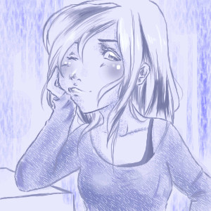
Sugar
Anna
(Aug 14, 2006)
Uh none.oh and sorry... posting here cuz of space. dont know how much i'll need and dont wanna bother lello with my petty requests. haha <3
Gigge (Sep 27, 2006)
*sugar rush*
ilikechocolatemilk (Jul 22, 2007)
wow! this is awsome and it looks very tasty!
Alyssa11895 (Jun 1, 2008)
*rams iinto screen* I CAN SMELLL IT!!!!!
staci (Jun 23, 2012)
dang. its really awesome that the highlight is pink. miss you. |

| ||||||||||||
| Public Boards/Beginner | |||||||||||||
|
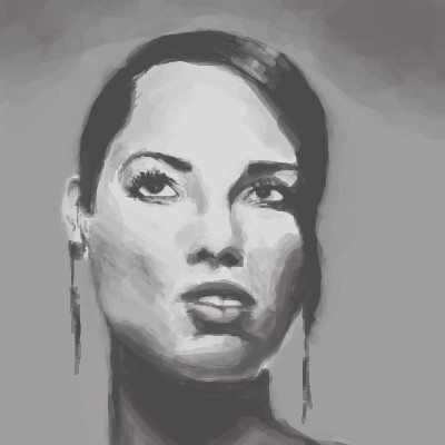
DoOp
(May 8, 2007)
D:~
senshi (May 8, 2007)
Nicely done.I don't really like blue, but I like this.
resident-bishounen (May 9, 2007)
Nice job with the hair and the face.
LadyBlader (May 9, 2007)
Her expression is great! I love your colouring technique!
ichigokurosaki (Aug 12, 2008)
i love it!!!!! |
| ||||||||||||
| Main Forums/2draw.net | |||||||||||||
 |
Zack (edited Jul 12, 2006)
Exciting news for you Lascaux fans! A group of my classmates and I are going to work on improving Marcello's Lascaux applet for our Software Engineering class. That's right, some of the features you've dreamed of for Lascaux may actually happen! Right now we're still in a research phase for the project, so here's your chance to make your voices heard. We will not be able to make all (or even most) of the changes that could be made to improve the applet, so we want to know what features you...
30 comments
|
||||||||||||
| Public Boards/Beginner | |||||||||||||
|
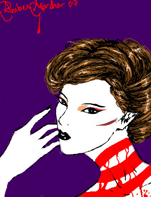
Pakka
(Mar 24, 2007)
Looks weird still...first pic here. Ref used.
resident-bishounen (Mar 24, 2007)
Looks good to me. Welcome to 2draw!
davincipoppalag (Mar 24, 2007)
It's good work..I think what looks odd is the mouth is off line for the position.. if you cover the lower half of the face.. the top looks fine.. if you cover the top half, the bottom looks fine...its just outta line somehow.
fleeting_memory (Mar 24, 2007)
welcome-good start. |
| ||||||||||||
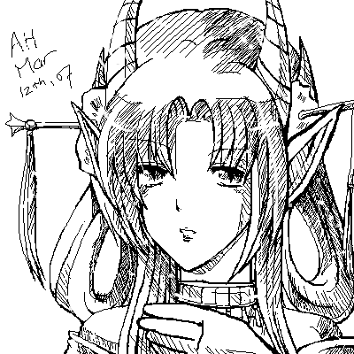
|
PockyGod
(Mar 16, 2007)
Eh, just a doodle. Turned out somewhat Geisha-esque...er, I think D:I really like the face so far, I can't decide if I should color this or leave it greyscale. I remember now why I hate drawing hands :O
whitefox0 (Mar 16, 2007)
its good I really ;ole it and you did good on the hands....I like the hair and face xD the rest....eh >_>;
resident-bishounen (Mar 16, 2007)
I agree I like the hair. And the lips.
whitefox0 (Mar 17, 2007)
wow that's awesome i love the eyes and everything looks good grate job keep up the good work! |
| ||||||||||||
|
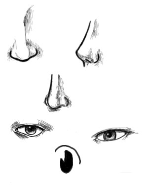
resident-bishounen
(Mar 16, 2007)
A bit of nose and eye practice.Ignore about half that time, due to chatting, TV watching, and otherwise being generally distracted.
Mocha_Bean (Mar 16, 2007)
Very nice!!
HunterKiller_ (Mar 16, 2007)
Well, ya know there's still plenty more space on that canvas.The top two noses are nice. The eyes could do some more work. =)
resident-bishounen (Mar 17, 2007)
Yeah, there's plenty of space, but I ran out of time, so maybe I'll add to this later. |
| ||||||||||||
|
arilishia
(Mar 12, 2007)
A commission from a avatar forum i'm on.. I think i went overboard with the lines... @@;
resident-bishounen (Mar 12, 2007)
No way, this isn't overboard at all. The crosshatched shading looks great!
Maiko (Mar 12, 2007)
Hmmm is this someone on Gaia's OC?I remember drawing this person too |D verynice. <3
arilishia (Mar 14, 2007)
^^ thanks all <3usually closes the applet before saving Dx;; -dies- so bleh.. -ninjas- oh ya, gaia's oc xD;;; |
| ||||||||||||
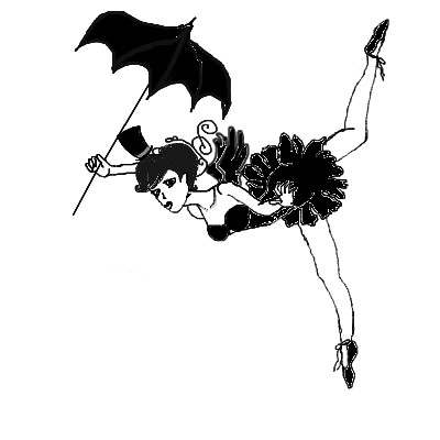
|
xCheex
(Mar 12, 2007)
a balancing ballerina plz comment on so i can improve thank u! :)<<< comment!
resident-bishounen (Mar 12, 2007)
Not bad. I like the pose, and the design of the costume. The white lines around the lineart is pixellated and distracting. I would recommend smoothing them out, or eliminating them entirely. Great idea, I like the pose!
LadyBlader (Mar 12, 2007)
Ohh, black and white--Impossible for me to do. I think the pose is nifty, and her costume is * C U T E * Her hand is half-holding a stick, though.... maybe close her fingers a little tighter, there? Unless, of course, that was intentional... There are no right answers in art, just opinions. (Can't remember where I got that from, but it's a real butt-saver when offering criticism!) All in all, a nice picture, reminds me of those tight-rope walkers in travelling cirques. ^_^
fleeting_memory (Mar 12, 2007)
I highly highly recommend you stay away from the fill button unless absolutely necessary because it will cause those little rough white lines and makes it look grainy. If you want lines to stand out against black you can try doing them in a dark grey then use the layers to color underneath! This is a very cute piece-keep it up!
xCheex (edited Mar 12, 2007)
thank u for the nice commets and thnx 4 the critism i will take it into account thank u agen! xxx |
| ||||||||||||
|
Lalai
(Dec 30, 2006)
To be finished later on a different computer.
Hyde676 (Mar 7, 2007)
*waves* XDDD <3Trying to get back in the habit.
resident-bishounen (Mar 12, 2007)
Looks good. I like the shading on the shirt. |

| ||||||||||||
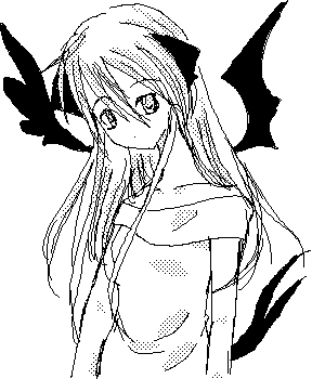
|
CLIC
(Feb 24, 2007)
I was bored, and I haven't been on this site for awhile so I decided to draw something. It's a pic of my OC.
resident-bishounen (Feb 24, 2007)
I like her design, especially the hair, shirt, and wings. Good tone work, but her neck seems a bit long.
kissimmeegurl (Feb 24, 2007)
I dont really like the wings, but the hair and shirt are good!! <3 |
| ||||||||||||
| |||||||||||||
| 2draw.net © 2002-2026 2draw.net team/Cellosoft - copyright details - 1.18sec (sql: 37q/0.33sec) |