| |||||
| Public Boards/Beginner | |||||
|
nozomii
(May 5, 2006)
right now all i have to say is "##$"!"@"#@" >.< |
| ||||
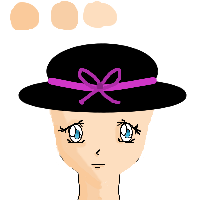
|
nozomii
(Jun 22, 2005)
d'oh!Something i started quite sometime ago. All i did now was color and the bg, but i'm hoping to add something else to it lter, looks really unfished lol. And yes, i do know the lineart sucks, i might try to make it better later. :)
xiang (edited Apr 5, 2006)
Homer! :D 'tis nifty, but I think the forehead looks a bit too big
pulmonq2 (edited May 17, 2006)
nozomii (edited May 29, 2006)
... |

| ||||
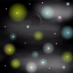
|
nozomii
(May 2, 2005)
Just having fun.
Knockoff (May 2, 2005)
Please first spend more time and add detail thnx. :|
Xodiak (May 2, 2005)
Xod likes, it is like an interstellar trip. <:)|XOD|
nozomii (edited May 19, 2005)
KO: if you don't like it you don't have to look. Like i said, i was just having fun.
pulmonq2 (edited Oct 27, 2005)
I like you Xod :P (not in THAT way) |
| ||||
|
nozomii
(Feb 5, 2005)
Just a sketch. I was watching Peanuts yesterday and i felt like trying. Far from finished.Reference used. |

| ||||
| Public Boards/Intermediate | |||||
|
nozomii
(Jan 24, 2005)
A Celestial Fairy by Vera and Paul
davincipoppalag (Feb 4, 2005)
This finished up great!
nozomii (Feb 5, 2005)
I dunno. I don't really like the dress. Didn't come out as i wanted. Does'nt really have that sence of volume... I hate shading. >:
davincipoppalag (Feb 5, 2005)
I think it has a nice satin look..
nozomii (Feb 5, 2005)
Well thank you, lol. I'm not really happy with it, but acompliment is always nice to hear. :) |

| ||||
| Public Boards/Beginner | |||||
|
nozomii
(Jan 10, 2005)
My try to sketch. I guess its not that bad. Still needs alot of work though.Edit: The only reason i uploaded this draw, its because you asked me to, Paul. Cause for my own will i wouldn't have done it. And i anxiously wait for your version, cause it looks amazing so far. I'll post the link here as soon as you upload it. Edit 2: Ha, i had too erase the reference picture, this makes it no justice. But if you want to see one that absolutely does, here where you should go : http://www.cellosoft.com/2draw/view/37557/
pulmonq2 (Jan 12, 2005)
something colorful and blurred.hehe funky bg. Doesn't really match him, but i kinda like it. :P
Cordelia_Pink (Jan 14, 2005)
this looks pretty good. I don't know who it is but he looks pretty good drawn that way. background is nice too. it's a little weird lol but good thing he's wearing white and not colorful so that he would stand out from the background. Make the lines a bit thinner though. =) Use the pen tool rather than the pencil although the pencil just makes it bolder and darker. But good job anyway!
nozomii (Jan 14, 2005)
lol i dont know who it is either. Paul gave me this pic so i couls try to sketch it. I know it doesnt looka nything with the refeence, but hey. My first try. And ty for advice. |

| ||||
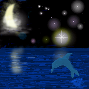
|
nozomii
(Dec 26, 2004)
I like te stars. Got a little help from my bf. The rest... I tried. That's all i can say.
pulmonq2 (Dec 27, 2004)
getting lots of helpful comments here I see! Oh honey, your moon is fantastic. I really love it. And I was like :O A dolphin! Nice honey! And yea, get some more space and keep making it better, cause this is looking good! =D *squeezes her*
nozomii (Dec 29, 2004)
I did want to make it better.. but i cant. no more space for it. *sniffs*
davincipoppalag (Dec 29, 2004)
Send a memo to one of the mods and paste the url for this into the memo, and ask for a little more space to finish it. I am sure they will give it to you, it's a nice picture with a lot of effort.(they will take some points though, it just happens)
nozomii (Dec 29, 2004)
Yea, i did that. The problem is it was the second time i did it for this pic, and i've been told it cant be granted. =/ |
| ||||
|
nozomii
(Dec 13, 2004)
GrRRrRRRr i can't do hair!!! Aaaahhhhhh! *dies*
Xodiak (Dec 15, 2004)
Xod likes, she is a nice anime girl. Both sweetie and Paul did a good job. Bravo. >:)|XOD| tiny details, Eyes and mouth. I'm happy. =D
Cordelia_Pink (Dec 18, 2004)
This is pretty good, Vera! I like the purple aura around her.
StrawberryYamichan (Dec 18, 2004)
this is really pretty ^_^! everything about it looks great to me =) |

| ||||
|
nozomii
(Nov 19, 2004)
My heart beats for you, and the stars shining make me feel closer. Cause we under the same sky.I know it's not really good, but i did it with all my love. To you. Love you alot, Paul.
spiritdweller (Nov 21, 2004)
that's very sweet.... I think love sucks.
pulmonq2 (Nov 21, 2004)
lol spirit. It is a little rough sweetie, but it's not bad for a beginner. My favorite part is the big star on the right. It really shines. Like I say, Vera, I think you have a pretty good grasp of color, if you could just get bold and not worry so much about the outcome, I think you could make some nice colorist works. Try being more impressionistic if you want: worry less about exact and perfect forms and just make gestures with color. Also, try working less with the pattern tools.
Cordelia_Pink (Nov 22, 2004)
Oh I think it looks fine. Although maybe you should add a bit of shine on the heart but other than that it looks pretty good. And I'm not saying that to be polite or anything but it does look illustrative. lol The stars are really nice, they're shining, (especially the one on the right) and you did really make some nice light and dark areas. I like the texture too. But keep up the good work. Just put more emphasis on the heart since that's what's more focussed. |

| ||||
| 2draw.net © 2002-2025 2draw.net team/Cellosoft - copyright details - 0.29sec (sql: 30q/0.11sec) |
I will Excel, ty. I was only playing with the coloring of the eyes, and i didn't even fisnish that lol. but i will get to it!
drawn in 31 min
And yea, version 3 was my best one. I'm such a great artist.