| |||||||||||||||||||||||
| Public Boards/Beginner | |||||||||||||||||||||||
|
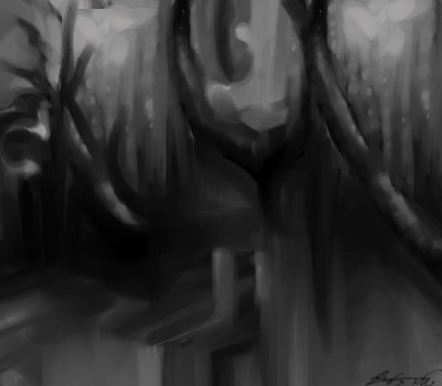
?!
shults
(Jan 29, 2012)
Mmph...
shults (Feb 9, 2012)
maybe for the colors..
lori (Feb 9, 2012)
what a hideous drawing I just did... wow, just sayin
shults (Feb 9, 2012)
where?
lori (Feb 10, 2012)
Oh.. I deleted it. lol |
| ||||||||||||||||||||||
|
Wraith
(Feb 8, 2012)
Started listening to some stuff called Dubstep. Thought the name Skrillex was cool.
lori (Feb 8, 2012)
looks good Wraith, love the scritchy scratchy over it
Wraith (Feb 8, 2012)
Thanks :)
davincipoppalag (Feb 8, 2012)
New SKRILLEX...Skrills any surface,, even under water!.. This amazing product can be yours for only $19.99 (plus S&H),, but you must act NOW.. AND..if you call within the next twenty minutes..(because we can't do this all day!)..we will DOUBLE your order..THAT"S RIGHT.. you'll receive TWO of the AMAZING NEW SKRILLEX units ! (Just pay separate S & H for each).. so Pick up the phone NOW.. Our operators are standing by... |

| ||||||||||||||||||||||
| Public Boards/Intermediate | |||||||||||||||||||||||
|
Roytje
(Feb 5, 2012)
dorothyblueeyes (Feb 6, 2012)
Roytje is at it again! Wow!:) it's paint, wet, not electricity, pixels, and software! YUM! go, go, go, more! Lovely!
Suntan (Feb 7, 2012)
:)
abaete (Feb 7, 2012)
nice :)
staci (Jun 23, 2012)
texture. dang. |

| ||||||||||||||||||||||
|
elmenora
(Feb 4, 2012)
davincipoppalag (Feb 6, 2012)
really good work
dorothyblueeyes (Feb 6, 2012)
yes, you have a A great feeling. real touch for fine art!
Suntan (Feb 7, 2012)
like it :)
Teapot (Feb 8, 2012)
I like! |
| ||||||||||||||||||||||
| Public Boards/Beginner | |||||||||||||||||||||||
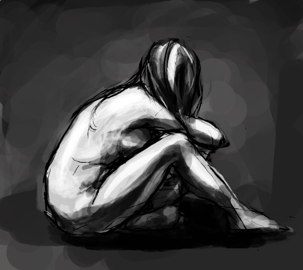
|
rogerroger
(Feb 4, 2012)
lori (Feb 4, 2012)
I like this. It looks like it belongs in claymation.
davincipoppalag (Feb 4, 2012)
he's creepy.. I like him |
| ||||||||||||||||||||||
| Public Boards/Intermediate | |||||||||||||||||||||||
|
elmenora
(Feb 2, 2012)
Flubbles (Feb 4, 2012)
Or that could be the stand for the globe infront of the globe.
elmenora (Feb 4, 2012)
Sorry to disappoint... it's not anything. Just some practice for lighting using some abstract shapes :)
underwater (Feb 4, 2012)
... So it's whatever we want it to be? :)
beefcake619 (May 23, 2012)
wow youve got skills!! |

| ||||||||||||||||||||||
|
Axil62
(Jan 31, 2012)
Riot on an empty street
lori (Feb 2, 2012)
really good
Wraith (Feb 3, 2012)
Thought it was old and torn paper. Pretty good stuff here.
lori (edited Feb 3, 2012)
I like the white outline of the words that makes it stand out.. very nice. Curious if that's a song or what. And why those words in particular? |

| ||||||||||||||||||||||
| Public Boards/Beginner | |||||||||||||||||||||||
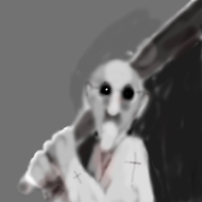
|
penpen
(Feb 2, 2012)
oh baby!
davincipoppalag (Feb 3, 2012)
Heheh.. now y'all go shave ya chin and git me 'notha beer
lori (Feb 3, 2012)
oo thank you for drawing me!
firecracker (Feb 3, 2012)
She must be a redneck woman....lol! |

| ||||||||||||||||||||||
| Public Boards/Intermediate | |||||||||||||||||||||||
|
elmenora
(Feb 1, 2012)
Axil62 (Feb 1, 2012)
Nice. I like it.
davincipoppalag (Feb 2, 2012)
well done
lori (Feb 2, 2012)
looks good
firecracker (Feb 3, 2012)
This reminds me of the kind of balls that you use to play the game of croquet.....very nice draw. :) |

| ||||||||||||||||||||||
| Public Boards/Beginner | |||||||||||||||||||||||
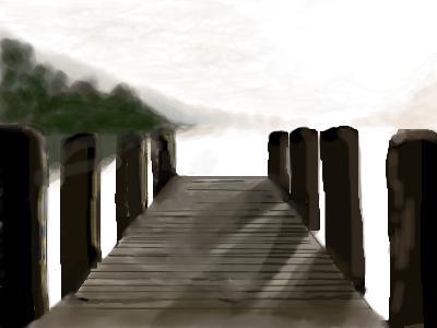
|
tehbecki
(Feb 1, 2012)
Ok.. so this is my second posting, I can't make my mind up on this if its extremely messy or I did the soft hazy effect better than I thought I could.. Feedback please. and should I still post in beginner or sneakily slip my way into a a grade higher?
tehbecki (Feb 2, 2012)
Thanks Lori. :)
davincipoppalag (Feb 3, 2012)
I like the shadows too.. does'nt matter what board a drawing is on, If it's good, its just as good on beginner as it would be on advanced.
lori (edited Feb 3, 2012)
I think the sky and water and horizon could be more defined, and that tree line.. maybe some lighter and darker green dabs in it would make it pop more... other than that, I think you can get away with intermediate
tehbecki (Feb 6, 2012)
I did his on my alienware laptop, now im on a toshiba, it loos really different, maybe the contrast was darker, I see this completely different than how it was suppose to be, like the lines through the left posts, and the tree's were darker without fades in the middle.. ugh. It looks awful! Lol |
| ||||||||||||||||||||||
| |||||||||||||||||||||||
| 2draw.net © 2002-2026 2draw.net team/Cellosoft - copyright details - 3.01sec (sql: 41q/2.46sec) |