| |||||||||||||||||||||||
| Public Boards/Beginner | |||||||||||||||||||||||
|
Space
SaheraNights
(Feb 24, 2004)
Uhm....cool?^.^
lilypad (Feb 24, 2004)
maybe some shading would be nice...it's cool...i guess. il really like the hair, tho. u should try not to blur it as much and make the bg black to make it more like space. or white. so far, so good! ^^
dixielandcutie (Feb 24, 2004)
very nice detail...transition b/w bg and face could be smoother...and a lil less blur. but nice work! |
| ||||||||||||||||||||||
|
lilypad
(Feb 24, 2004)
13+ for language...
lilypad (Feb 24, 2004)
acctuly, that's my mum for you. die, rikku! DIE!!!
Knockoff (Feb 24, 2004)
lol "mice" job lillypad.I like this one, ITs funny. The mouses tail looks like a work. o_O :)
Deformed (Feb 24, 2004)
Ahhhh!! *falls down in puddle of own blood*
lilypad (Feb 25, 2004)
YES! *she manage to kill her friend* oh, wait...SHIT! |

| ||||||||||||||||||||||
|
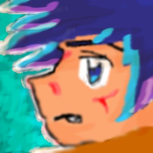
SaheraNights
(Feb 24, 2004)
This is the brother of one of my chars for digimon. He was supposed to be dead but she found out he wasnt, he was stuck in the digital world!
Enishi (Feb 24, 2004)
This isn't really intermediate quality, try beginners ^^
dixielandcutie (Feb 24, 2004)
nice start. maybe sharpen it up a bit, and spend some more time adding detail...
lilypad (Feb 24, 2004)
dixel's right. spend more time on ur pics and they will turn out nicer. also add more detail if ur going to have the amount that there is right now. enishi, this IS on beginner.
Northern_shadow (Feb 24, 2004)
Good start indeed and ns eye :D |

| ||||||||||||||||||||||
|
lilypad
(Feb 24, 2004)
to submit or not to submit... oh, to hell with it, i'll submit it! i messed up the boobs, though...
Deformed (Feb 24, 2004)
Why won't you're mom care?
lilypad (Feb 24, 2004)
she doesn't care what i draw...
marcello (Feb 24, 2004)
um, you guys aren't even allowed on this site, so shut up. go read the child protection act thingy about requiring 13+
lilypad (Feb 25, 2004)
wah. ur kicking us off? *cries* |
This is hidden because it is rated 18+. Edit your privacy settings to make it visible.
| ||||||||||||||||||||||
|
7 comments
– latest 4: making bloob
Northern_shadow (Feb 24, 2004)
Hehe, funneh ^^. hmmh, why blood? neato pic :D
Deformed (Feb 25, 2004)
I don't know why lil put blood either.
lilypad (Feb 25, 2004)
Hey! he's got stabbed and dissed because he got bitten by a horse with magical powers and...um.. he turns into a horsebefore he dies? ^^' *suddenly realizes shes an idot* |

| ||||||||||||||||||||||
|
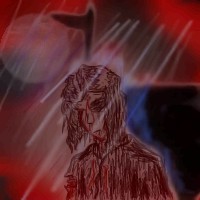
Northern_shadow
(Feb 24, 2004)
I need new ideas for bg`s, black/maroon is starting to be boring... (those blue lines should try to be rain drops)
Northern_shadow (Feb 24, 2004)
thx. yea, that could be an good idea
dixielandcutie (Feb 24, 2004)
hehe, no problem. just fiddle around and be creative! its fun : )
lilypad (Feb 24, 2004)
for the landscape, u could do a mountain or a cave. ust a thought. really like the person although u should get the blue darker because it isn't that visible against the maroon. or maybe i'm just colour blind. ^^Ookey, this is sumthing different. But atleast its an bg (kinda). He`s now next to an box and on the bg is an polelamp or somthing. rain sux...
|
| ||||||||||||||||||||||
|
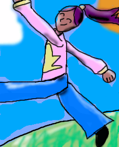
foxman8245
(Feb 24, 2004)
Poloroid picture of a rainbow :)
sal (Feb 24, 2004)
nice pic.... cool idea...
dixielandcutie (Feb 24, 2004)
haha, shaake it like a polo...yea. ;pcute idea, and nicely rendered : )
lilypad (Feb 24, 2004)
nice! the picture in the pic looks awsome. it's a great landscape. really like the rainbow and the grass...^^
PinkuEspeon (Feb 25, 2004)
^_^!! AIEE!!! That's so cute! Shake it, sh-sh-shake it, shake it, shake it like a poloroid pickta! |

| ||||||||||||||||||||||
| Public Boards/Intermediate | |||||||||||||||||||||||
|
LovelyLori
(Feb 24, 2004)
revised for the black box commentators
Deformed (Mar 2, 2004)
This should be deleted. Did ya' hear that Mods?!
lilypad (Mar 2, 2004)
i agree that it should be deleted. it was fine before. now it's just a black box. stupid free will...there... it's not a black square anymore.... yarn?
lilypad (Mar 3, 2004)
meh. it's better. i guess. well, i mean, it's good. i guess i think the colours clash. but it's better now. it's not a black box and that's good. ^^ |

| ||||||||||||||||||||||
| Public Boards/Beginner | |||||||||||||||||||||||
|
lilypad
(Feb 18, 2004)
finish colouring later..
Deformed (Feb 23, 2004)
It looks good but just try not to overlap your backround into her face.
dixielandcutie (Feb 23, 2004)
yea that transition could be smoother...but cute
foxman8245 (Feb 24, 2004)
lu lu, skip to my lu..... happy little pic here... makes me wanna get up and skip about the house!! heh-hehnice, simple pic!!
friendly_lies (Dec 20, 2004)
Then she skipes off a cliff with the same happy face. (kidding) |
| ||||||||||||||||||||||
|
lilypad
(Feb 23, 2004)
my imagination...
Deformed (Feb 24, 2004)
It kinda looks like somthin i would draw dosnt it?? I like it though!!
lilypad (Feb 24, 2004)
no. it looks like me at night. lol. you draw people WHEN thy're bloody, not when they've just sucked someone's blood. oh, doesn't it look like me?
Deformed (Feb 24, 2004)
...... Just add geeky glasses! LOL!! Oh shit I've done it this time!! Nice knowing all of you 2 draw users!! I hope you will come to my funeral! *starts running*
lilypad (Feb 24, 2004)
*rums even faster* FOR UR INFORMATION, THEY ARE NOT GEEKY! THEY JUST MAKE ME LOOK SMART! I WILL KILL YOU! *tries to axe off rikku's head* *misses* |

| ||||||||||||||||||||||
| |||||||||||||||||||||||
| 2draw.net © 2002-2026 2draw.net team/Cellosoft - copyright details - 1.58sec (sql: 33q/0.64sec) |