| |||||||||||||||||||||||
| Public Boards/Intermediate | |||||||||||||||||||||||
|
Jervy
(Feb 1, 2006)
Another development of coloring following the previous. Focusing on facial hair.I may have gone overboard with the lines rather than using color. Negative space is a little less dramatic than before, but I hope I'm using it effectively. Crits and Comments welcome as always. ref |

| ||||||||||||||||||||||
| Public Boards/Beginner | |||||||||||||||||||||||
|
WhiteSpark
(Jan 7, 2006)
Ren from dears.
hideyourface (Feb 3, 2006)
IT IS SO PRETTY KAREN
blahaha (Feb 3, 2006)
The hair is pretty...bonus points for the "whoosh" factor. <---*hair fetish* |
| ||||||||||||||||||||||
| Public Boards/Intermediate | |||||||||||||||||||||||
|
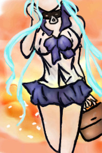
Orkdoop
(Sep 25, 2005)
uumm, I had a really bad headache tonight. so I drew this. and Im going to make the drawing more headache-ey lookin'alright its done took like a month...for me to get around to it. uhh decided to do the backround now....
thesolarwinds (Jan 29, 2006)
I like this.. the dress is very pretty.awesome.
hideyourface (Jan 29, 2006)
she got giants hands. Neatt hair.
TaCO (Feb 3, 2006)
O.o Very Cool!!!!!!well worth the wait. |

| ||||||||||||||||||||||
| Specialty Boards/Collaborations | |||||||||||||||||||||||
|
PLEASE DO NOT DELETE!!!
10 comments
– latest 4:hide your face is gonna join and my odd will look good!
marini135 (Dec 9, 2005)
ok
hideyourface (Dec 9, 2005)
omg who drew this, it's sooo beginner.
whitebunny1063 (Jan 11, 2006)
You're a mean boy,Mr Conor!:(
vertex (Feb 3, 2006)
:) |

| ||||||||||||||||||||||
| Public Boards/Intermediate | |||||||||||||||||||||||
|
mx
(Feb 1, 2006)
i must be going mad
hideyourface (Feb 2, 2006)
INTERESTING
thitheth (Feb 3, 2006)
you missed the A...updated and changed
|
| ||||||||||||||||||||||
|
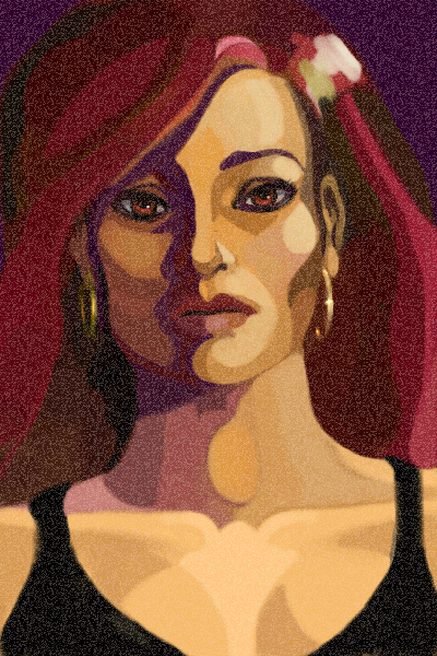
terracotta
(Jan 26, 2006)
Filter Follies.
Sweetcell (Jan 27, 2006)
Fiesta, love it too.
LisaAnne (Jan 28, 2006)
Rich.
Opium (edited Feb 3, 2006)
hmm...I can't tell if I prefer the lines or the snowy look it has now. I like this style!and what a transformation she underwent to get to what she is now! (I watched the animation) hehe
terracotta (edited Feb 16, 2006)
. |
| ||||||||||||||||||||||
|
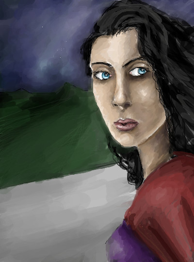
patienceisoverrated
(Jan 30, 2006)
Yup. She had a rough day, she did. I don't know how much mascara you'd have be wearing to get it to run like that.
shining_star_sam (Jan 31, 2006)
Crikey... I've felt like that a few times... brilliant draw
hideyourface (edited Feb 1, 2006)
the bridge of the nose looks a bit too squareish and the eyes are a little too far apart, but other that that, I really like this.
patienceisoverrated (Feb 1, 2006)
Thanks, everybody. I think everyone feels like this sometimes XPYeah, hideyourface, I noticed about the eyes when I was nearly done, and tried to shift them over, but the select tool in lascaux gives me hives, so eventually I just left it alone.
hideyourface (Feb 2, 2006)
YEAH I KNOW. The select in lascaux is a bitch. |

| ||||||||||||||||||||||
|
thesolarwinds
(Feb 1, 2006)
wheee... it sucks...wheeee.... tried throwing some purple in there...
terracotta (Feb 2, 2006)
Do you like it better? I do. Got more depth, I think.
hideyourface (Feb 2, 2006)
well the whole face is a bit too long. The side of the face could have a little more shape too.
thesolarwinds (Feb 2, 2006)
I know.... but overall its okay. still room for improvement. and yes, I liked the purple. It did get more depth, more, pulse in a sense. |
| ||||||||||||||||||||||
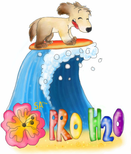
|
Becksie
(Feb 1, 2006)
Its a logo for my graphocs project me and my friends are doing (me katie and steph) and in the lesson we have to create kool names for these hotels that we are designing (omg its so fun!) and I thought that we should call it Pro H20 because ours is a water sports on so it works pretty good :B and then we kept on brainstorming more ideas so then I got bored and started making aloud of rhymes up with the word sensations... illuminations.. sdfdshfskations... accomodations. Perfect.. Sentsations Accomodations xDD So that name is now the chain that Pro H20 belongs too. Were just awesome :D then we started to create logos.. and my idea won again.. hehe so now Im drawing it like this so we can get extra marks. I dont have to make the anatomy brill for this project.. cause Im only 14 and at our age our work doesnt have to be perfect so you can laze off abit :D We have a Cafe where you can by some Kay-Tea Yum (hense Katie my friends name) Omg we had such a laaaugh in Graphics today.. we have never laughed so much in that lesson! :3 |
| ||||||||||||||||||||||
|
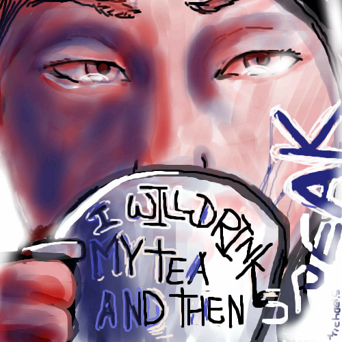
hideyourface
(Feb 1, 2006)
C'est moi
staci (Feb 1, 2006)
this is pretty cool. the definition and shape are great for the seemingly few strokes you used. it should have more comments.
TaCO (edited Feb 1, 2006)
I love the strength of his expression.Very cool pic!!!!! I'm Glad to see you drawing again.
hideyourface (Feb 1, 2006)
thanks for the comments.
terracotta (Feb 2, 2006)
It's a very expressive self portrait. |

| ||||||||||||||||||||||
| |||||||||||||||||||||||
| 2draw.net © 2002-2025 2draw.net team/Cellosoft - copyright details - 1.46sec (sql: 45q/0.90sec) |
drawn in 1 hour 18 min
drawn in 2 hours 14 min