| ||||||||||||||
| Public Boards/Intermediate | ||||||||||||||
|
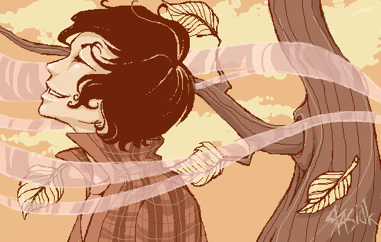
cianteed2
(Sep 16, 2007)
My favourite season. |
| |||||||||||||
| Public Boards/Beginner | ||||||||||||||
|
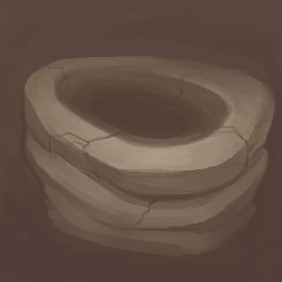
Kloxboy
(Sep 10, 2007)
Things get damagedThings get broken I thought we'd manage But words left unspoken Left us so brittle There was so little left to give
davincipoppalag (Sep 10, 2007)
Still looks like a solid structure even with a few cracks.
gizemko3 (Sep 10, 2007)
can't remember the song's title. i thought it's a ring when i saw it. i agree with davincipoppalaq, it looks pretty solid. like many things that has gone through hardships that leave scars
Kloxboy (Sep 10, 2007)
gizemko3: The song title is Precious. ;) Thanks.
DeadlyBlondeArcher (Sep 10, 2007)
Precious.... little. Sometimes that's enough. |
| |||||||||||||
|
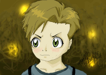
choc_gum_dropz
(Aug 8, 2007)
BLAH!! I'm trying to get use to my new tablet... first time using it...it was really weird..
gizemko3 (Aug 9, 2007)
aww, he's blushing. both Ed and Al have glden eyes though. i think his hair should be more blond (or does it seem so because of the light?)
xiau (Aug 9, 2007)
Ah, gizemko, you're probably comparing it to Al in the manga. Al in the anime had darker eyes and hair.This is cute :D I really like the eyes.
Sweetcell (Aug 9, 2007)
It's hard at first but after a while it'll be like "I can't go back to my mouse now."His lower jaw looks truncated but those eyes and hair make this. |
| |||||||||||||
| Public Boards/Advanced | ||||||||||||||
|
Sweetcell
(Aug 7, 2007)
Scows doing that buggy thing where no matter what I use no brush strokes show. grrrrrrrrrrrrrrrrrrrrrrrrrrrrrr...............
amagic2u (Aug 15, 2007)
This one is a blast sweetcell. clouds are great
JillJJ (Aug 17, 2007)
There are so many wonderful details in this pic. The water at the bottom is a great touch, adding to the reality and energy. Excellent work! Jillj
DeadlyBlondeArcher (Sep 24, 2007)
Came around to check your gallery since I've missed so much lately, and this one in particular caught my eye. I have often thought of doing one of some photos from NASA in Houston, since I'm from the area, been visiting recently, and really familiar with it, but haven't had time.This one turned out great. My favorite thing is the area to the right. This is a good piece of art.
shell (Apr 2, 2010)
cool |

| |||||||||||||
| Public Boards/Intermediate | ||||||||||||||
|
lori
(Jul 18, 2007)
it didn't come out as pretty as I wanted it to :(
marcello (Jul 18, 2007)
try adding more contrast. you could do this by making a new layer with burn and filling it with various colors until you find something you like (or try other layer blending modes).
lori (edited Jul 19, 2007)
thanks peoples - Cello, I did try to mess with contrast using a different program, but it still looked like shit. The problem with this was that at some point I had switched from airbrush to paintbrush, and didn't realize for a while that I never switched back to airbrush, so it doesn't look as good as intended. But yes, contrast would help too, but I'm done with this sucker.
gizemko3 (Jul 19, 2007)
it's still beautiful. i just love clouds...
Sweetcell (Jul 19, 2007)
I don't know, I like it. It's like looking at the corner of a large canvas in detail.Purple, blue and yellow, all good. |

| |||||||||||||
|
Roytje
(Jul 15, 2007)
I like you just the way you are..
PS (Jul 16, 2007)
This is so good, a really nice piece of art.
Sweetcell (Jul 16, 2007)
Lori's right, looks like crystals. But I also see a face in the blue above it. There's an eye of a rather reptilian face. It feels like something I can't place my finger on. Man I love your work. If you ever do anything on canvas I hope you post it.
Roytje (edited Jul 17, 2007)
Actually I'm busy with oil paintings lately. I try to paint this one right now: http://fc02.deviantart.com/fs18/f/2007/166/3/c/Hoofd_by_Roytje.png It's the first time ever with oil, but I like it. I'll draw this one: http://fc01.deviantart.com/fs16/f/2007/155/2/1/Holding_old_pictures_by_Roytje.jpg , if I finished the first one :)
gizemko3 (Jul 18, 2007)
only one face Sweetcel? i can see about 6... absolutely beautiful, love the colours |
| |||||||||||||
|
Sweetcell
(Jul 15, 2007)
Icon, of course.
Sweetcell (Jul 16, 2007)
Why thank you DK, frankly his face is a little off (his nose was driving me bonkers) but I didn't want to spend an uber amount of time on it. He's mah boy, yes. And man does he eat it. A gastrinomical feast of sugery goodness. :D Tankie my friends.
clover_pocky (Jul 16, 2007)
ZOMG.I love Gir. He's so sweet. You've really captured the style of Johnen very nicely. <3
gizemko3 (Jul 17, 2007)
cuute. i wanna a cookie too...
Lore_V_of_BlackHat (Jul 18, 2007)
Yes more Gir icons.......:DWhen ever I see Gir it always reminds me of you my friend......>:D Nice to see Gir once again from you......XD .............Logging of Lore.V........... |

| |||||||||||||
|
Axil62
(Jun 3, 2004)
Nnn so...like, this one time I was on acid nnn...yeah...nnn then we played Led Zepplin backwards on 78 speed man....and I saw God man....
assha-rei (Sep 12, 2009)
i'm not exactly sure why it works, i think it was something like, your mind works like a camera, so when you look at it and your eye shifts its vision to (or just focuses on) another portion of the image, your mind tries to smoothly transition from the image of 'your first glance' and the image of 'your second glance'. thus, the image moves to the side, but the circular arrangement of the dots makes them appear to rotate, rather than merely shift.but, like i said, i'm not really sure :l
Roytje (edited Sep 13, 2009)
Not cool for my eyes.
Flubbles (Sep 13, 2009)
http://loscuatroojos.com/wp-content/uploads/2008/08/scary_optical_illusion_count_faces.jpg
shell (Mar 1, 2011)
And everyone did acid but me. But thanks to this I'm not missing out this time. |

| |||||||||||||
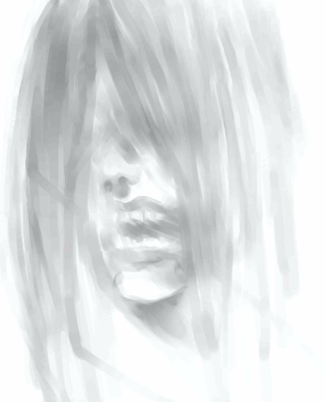
|
6 comments
– latest 4:
Sweetcell (Jul 11, 2007)
If it was just a touch darker it would look like that girl from The Ring. You made it quite creepy though, especially with the open mouth.
kokumi009 (Jul 11, 2007)
it's scary but the soft gray colors takes a bit of that awaythe teeth and nose are well-drawn i should say :D nicely done for a 40-minute work
gizemko3 (Jul 12, 2007)
soft and ghostly... like the way you did the mouth
Wraith (Jul 14, 2007)
Very cool stuff.. This is a very educational drawing for me. When I first started to see this get drawn, I was thinking "What in the world is he doing? That does not look like a mouth. That does not look like a nose." Then I saw the drawing get touched up towards end. WOW! So this is how you artists draw! |
| |||||||||||||
|
Rudeezy
(Jul 12, 2007)
haha, I titled it Rabi because I really hate how they changed his name to Lavi. D:ALL ONE LAYER! I probably did that because I thought I was using paint, but it still came out pretty good. I did a similar one with Allen on a different oekaki, so it's kind of like a series of pictures. Oh, and I used Rabi's look from Ch. 125 (today's release) as a ref.
Punky (Jul 12, 2007)
This is so cool, I like the outfit and the skecthy style. :D
gizemko3 (Jul 12, 2007)
yea, Rabi sounds better. too bad 'Lavi' is an official version approved by author... nice drawing
Sweetcell (Jul 13, 2007)
Just two colors, yet done so well. And I hate using one layer after finding the wonders of multiple layers. Nicely done Rysufio. Like the font on the left. |

| |||||||||||||
| ||||||||||||||
| 2draw.net © 2002-2025 2draw.net team/Cellosoft - copyright details - 0.67sec (sql: 36q/0.18sec) |
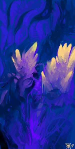
I love this, especially the tree. It's so pretty.
Real sweet picture! Go solids!