| |||||||||||||||
| Public Boards/Beginner | |||||||||||||||
|
frootcake
(Jul 17, 2007)
followed a bit of a tutorial on shiny. fairly pleased with this even tho i over worked it a bit. |
| ||||||||||||||
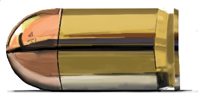
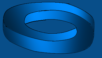
|
frootcake
(Apr 23, 2007)
http://www.metacafe.com/watch/529271/the_impossible_ring_by_hoax/thought i could recreate this with the gradients. I thought wrong.
davincipoppalag (Apr 23, 2007)
Sure looks like you did it to me Dave.. |
| ||||||||||||||
| Specialty Boards/Contest! | |||||||||||||||
|
frootcake
(Apr 18, 2007)
Just one of those common phrases ya hear knocking about.
Miss_DJ (Apr 18, 2007)
oh that's a great idea! good one!
Cameo (edited Apr 18, 2007)
This is really cute, Dave!!
shults (Apr 19, 2007)
That's funny. :)
fleeting_memory (Apr 24, 2007)
haha great idea! |

| ||||||||||||||
| Public Boards/Beginner | |||||||||||||||
|
frootcake
(Apr 5, 2007)
When i click the image to add text, I can't change the size of the font, it doesn't show any numbers, just the the blank box.this is just more of what's in my head atm.
Punky (Apr 5, 2007)
I like the smoothness, but I wouldn't really want 2draw to looks like that.I agree with HunterKiller, more 2draw skins/colour scemes would be great.
TammyF (Apr 5, 2007)
This is eye catching! I like the picture and expression but wouldn't change the sites look.
Sweetcell (Apr 5, 2007)
Like how you got the shiney and dimension of the keys, but I love 2draw the way it is. It's already above parr over anything else out there.
jaded_angel (Apr 5, 2007)
nice draw and i too like 2draw the way it is since the kina neutral layout makes the art pop out more which is the main focus of this site :) A super bright shiny layout might just clash with the drawings and then it might look like utter chaos... |
| ||||||||||||||
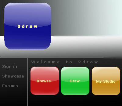
|
frootcake
(Apr 2, 2007)
with the new vista and smoother new look of a lot of webpages, does anyone else think 2draw is beginning to look dated?
frootcake (Apr 2, 2007)
i basically meant making use of the new gradient tool, like in most apple icons, or the new windows media player.I saw the facebook preview of what changes they're making, and sites like www.last.fm, even youtube have gradient'd elements. also the new gta4 trailer (and logo) and these new ps3's and xbox elites, everything has sex appeal. When I look at 2draw, i think of davincipoppa
plasticwrap (Apr 2, 2007)
yeah but do you know how much they slow down the system? yeah i bet not.simple- is a lot easier to use.
Kloxboy (Apr 2, 2007)
Well, I agree the logo could use an upgrade but the current logo isn't too bad.plasticwrap: What are you talking about? The amount of gradients or colors in a logo hardly determines on how fast a logo loads on the internet and if it does, it's barely detectable. Size is what makes the difference, that will determine load time for that specific image. Or the way it was put on the internet. Flash too could make loading take longer but that's a different matter. |

| ||||||||||||||
| Specialty Boards/Contest! | |||||||||||||||
|
frootcake
(Feb 8, 2007)
This is what we do in Scotland.I did davinci's request.. "frootcake...I request you draw a scotsman facing a plate of cold leftover haggis after four nights of drinking whiskey with friends..........."
davincipoppalag (Feb 8, 2007)
HA... can you imagine?
cmb (Feb 10, 2007)
poor dear man! looks like an awful hangover! |

| ||||||||||||||
| Public Boards/Advanced | |||||||||||||||
|
frootcake
(Feb 4, 2007)
the ref is a watercolour pic, I want some feedback.. timer is way out
friend (Feb 12, 2007)
Beautiful scene!
Sweetcell (Mar 1, 2007)
There should be a favorites folder, this would go right in there.
TaCO (edited Mar 1, 2007)
O.O I really really really like this pic!!!!!!!!!!!!!!!!!
Sweetcell (Apr 28, 2008)
I was browsing through the Advanced boards and came across one of my favorite pieces that EVERYONE needs to see and admire. So bampo. |

| ||||||||||||||
| Public Boards/Beginner | |||||||||||||||
|
frootcake
(Feb 2, 2007)
i have great things planned for this |

| ||||||||||||||
|
frootcake
(Jan 29, 2007)
been up since 5am gmt, so that's like 11pm where most of you guys live.
Alter.Native (Jan 29, 2007)
That would be 9pm where I live. That cube on the bottom right I just wanna push into place. |

| ||||||||||||||
|
frootcake
(Jan 24, 2007)
now i only posted this to show how easy klox makes it look. i thought it was going ok, until i checked what his version looked like. i then decided to stop. |

| ||||||||||||||
| |||||||||||||||
| 2draw.net © 2002-2024 2draw.net team/Cellosoft - copyright details - 0.71sec (sql: 28q/0.42sec) |
(nice job on it)