| |||||||||||||||||||||||
| Public Boards/Intermediate | |||||||||||||||||||||||
|
Layne
(Feb 17, 2010)
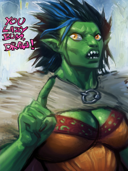
So, everyone seems to be doing a little copying from favored painters & illustrators so I thought I would throw in my 2 cent.This is from Kay Nielsen. I really love all of his work. Especially for the East of the Sun and West of the Moon book. :) Not done yet, and the lady needs some reworking of the torso and head, but better then nothing! Ref: http://www.ralphbakshi.com/blog/archives/sunmoon03.jpg |

| ||||||||||||||||||||||
|
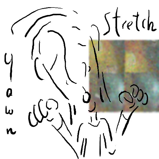
mursku
(Feb 25, 2010)
it prolly a bit presumptuous of me to try to make a tutorial, but what the hell, you learn by trying :P
enjoydotcom (Feb 26, 2010)
Oh yes, so presumptuous ;). Great tips.
firecracker (Feb 26, 2010)
This is so cool....I really like it....I liked the tutorial also.....:)
spyra (Feb 26, 2010)
Great tips indeed. Thanks! :D
mursku (Feb 27, 2010)
thanks guys :D ..but the second tutorial it will be better than this, first i just gotta figure out if the techniques will work in chibi painter and is there any workarounds.. oh yeah, and i gotta plan it out beforehand. in this piece i was just winging it ;) |
| ||||||||||||||||||||||
|
Flubbles
(Feb 22, 2010)
Teapot (Feb 24, 2010)
It's so pretty and dewy-looking. I dunno. Might be dangerous to glamorize a bottle holder, could start a flaunting trend. Soon young men with pretty bottle holders will walk the streets wearing strangely designed trousers with the ass cut out. Oh, wait. They already do that in San Francisco. Nevermind.
Bobstained (Feb 24, 2010)
I think i've performed miricles to make it look pretty, afterall it is an asshole.
shell (edited Mar 14, 2012)
ugleh
cyclops (Aug 8, 2010)
there should be little beady eyes looking out from the darkness. |
This is hidden because it is rated 18+. Edit your privacy settings to make it visible.
| ||||||||||||||||||||||
|
elly
(Feb 23, 2010)
...meh
Flubbles (Feb 25, 2010)
I dont mind the dodge and burn in this pic, i think she used them well without over doing it.
elly (Feb 26, 2010)
I tend to use dodge and burn in about every draw I do somewhere or another...can we say obsession?? lol! I do overuse them and I'm trying to tone it down a bit...I'm only in my 2nd step of the 12 step program for dodge and burn addicts =) LOL! Thx for the comments =)
Zero_Lemons (Feb 26, 2010)
I just want to hold it in my hands, it's so cute! I really love the details of the feathers. I think your use of dodge and burn is effective for this as a whole :)
madscientist (Feb 27, 2010)
Lovely little bird! He looks nice and healthy!:)) |

| ||||||||||||||||||||||
|
shults
(Feb 22, 2010)
I'm Vlad-inspired.
lori (Feb 22, 2010)
this looks like something out of a cartoon movie.. nicely done :)
enjoydotcom (Feb 22, 2010)
Nils Holgersoooooon, one of my childhood faves!
firecracker (Feb 22, 2010)
very cute draw!! :)
shell (Apr 2, 2010)
yay Nils Holgersson |

| ||||||||||||||||||||||
|
Bobstained
(Feb 17, 2010)
firecracker (Feb 20, 2010)
I know it's a pebble flubadub....haha......this reminds me of many many years ago, when my first husband and our daughter, and myself were living in an apartment....and our landlord and his wife lived downstairs. Whenever we would go down there to pay the rent....they showed us this big glass display case that they had in their living room....it was full of beautiful rocks and minerals and pebbles and stones.....some of the pebbles looked amazingly like this one that you drew here.....very nice draw!! :P
Flubbles (Feb 20, 2010)
Fascinating.
firecracker (Feb 21, 2010)
I knew you would be fascinated by my story......"lolzz"!! :P
staci (Jun 23, 2012)
dang. looks real. |

| ||||||||||||||||||||||
|
lori
(Feb 19, 2010)
elly (edited Feb 19, 2010)
Well that's fun to look thru =) I like this one the best but with the first version dude with the closed mouth =) Cute!
enjoydotcom (Feb 19, 2010)
It's fun :D. How's are you and your tablet getting along?
lori (Feb 19, 2010)
I think it's great fun... haven't used it tons, but will more and more I'm sure
firecracker (Feb 19, 2010)
cool draw.....I like it....:) |
| ||||||||||||||||||||||
| Main Forums/Drawing Discussion | |||||||||||||||||||||||
 |
mursku (edited Feb 16, 2010)
..and tell me if its any good :3 Well it looks awesome, you can draw in perspective and use gradient fills in perspective and do all kinds of stuff with it. But it requires opengl 3.0 and i only have a crappy integrated graphics card :( ..so guys, should i save monies for a better graphics card?
4 comments
|
||||||||||||||||||||||
| Public Boards/Intermediate | |||||||||||||||||||||||
|
Suntan
(Feb 16, 2010)
I really think it's about done. Few more shadows.
firecracker (Feb 19, 2010)
You oughta frame this suntan, and hang it on your wall......it's beautiful......:)
Suntan (edited Feb 19, 2010)
Maybe I'll try that, fc. thank you, again. :)
shell (Apr 2, 2010)
really cool I like it
Suntan (Apr 4, 2010)
thank you. |

| ||||||||||||||||||||||
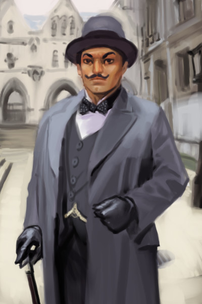
|
7 comments
– latest 4: hmm.. i'll mark this as finished, even this really isn't. I just got bored with this and want to draw something more interesting :P
enjoydotcom (Feb 16, 2010)
You sweet people don't know Hercule Poirot? The famous Belgian detective from the Agatha Christie books? I devoured those books when I was still in school and still enjoy them. Must say he looks more tan than the actor who has played this character most. Good job none the less :D.
mursku (edited Feb 16, 2010)
thanks :)heh, i was having trouble with painting the head. it never looked right (the actor has this really strange looking face!).. ..so in the end i just gave up trying to make him look like the actor :(
Teapot (Feb 16, 2010)
...but it does look like David Suchet. I spotted it from the thumb! I can't stand Agatha Christie's writing but for some reason the Brits are always able to make her work seem much more interesting and well written in their dramatizations of it. Joan Hicks made Miss Marple into a great character the same as Suchet has done with Poirot. Peter Ustinov and Albert Finney were also really good Poirots, IMHO. |
| ||||||||||||||||||||||
| |||||||||||||||||||||||
| 2draw.net © 2002-2025 2draw.net team/Cellosoft - copyright details - 0.66sec (sql: 37q/0.53sec) |
It would be a great contest, draw from your favorite artist. In his or her style.
if you wanted to have texture like in the original painting, an easy (and quick!) way to do it, would be with a scatter brush (choose a high scatter count and you can maybe crank up the spacing too) on a separate layer. that way you can easily erase the eventual wayward dots from unwanted areas, and you can also play around with the blend mode and opacity (make it subtle)
..hmm, another thing that i noticed was that the original was much more sharper (darker and thinner lines).. i suck at line art so i'll not gonna try to give you any advice on that. You would only get worse if i tried to teach you line art :P