| ||||||||||||
| Public Boards/Advanced | ||||||||||||
|
elmenora
(Feb 14, 2012)
|
| |||||||||||
| Public Boards/Beginner | ||||||||||||
|
elmenora
(Feb 13, 2012)
|
| |||||||||||
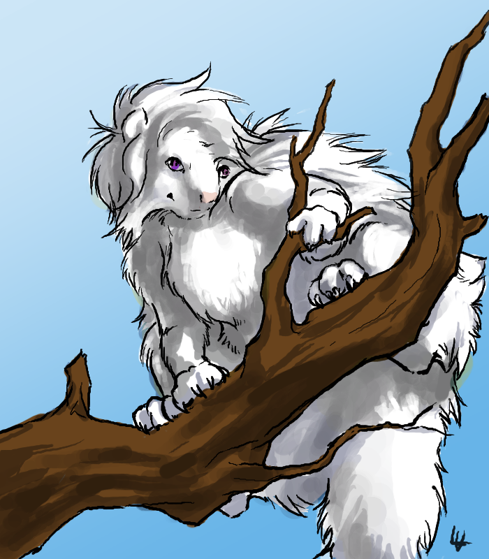
| Public Boards/Intermediate | ||||||||||||
|
elmenora
(Feb 12, 2012)
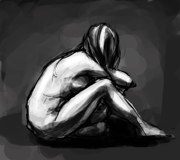
Herp derp, glow stuff. There's more to fix on this but I'm tired of looking at it :PAny advice or critique would be greatly appreciated. Thanks! |

| |||||||||||
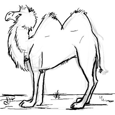
| Public Boards/Beginner | ||||||||||||
|
elmenora
(Feb 10, 2012)
My first try at drawing a bactrian camel :)
Wraith (Feb 10, 2012)
That's a cool drawing of A Camel.
davincipoppalag (Feb 11, 2012)
looks pretty good |
| |||||||||||
| Public Boards/Intermediate | ||||||||||||
|
elmenora
(Feb 8, 2012)
enjoydotcom (Feb 10, 2012)
I really like your style.
Axil62 (Feb 10, 2012)
me too
Flubbles (Feb 10, 2012)
Me three...thought I'd get there before anybody else did. |

| |||||||||||
| Public Boards/Beginner | ||||||||||||
|
elmenora
(Feb 9, 2012)
davincipoppalag (Feb 10, 2012)
very cute . I like
lori (Feb 10, 2012)
love this.. looks like something I would draw only you're much better at it
enjoydotcom (Feb 10, 2012)
Adorable! |
| |||||||||||
| Public Boards/Intermediate | ||||||||||||
|
elmenora
(Feb 4, 2012)
davincipoppalag (Feb 6, 2012)
really good work
dorothyblueeyes (Feb 6, 2012)
yes, you have a A great feeling. real touch for fine art!
Suntan (Feb 7, 2012)
like it :)
Teapot (Feb 8, 2012)
I like! |
| |||||||||||
|
elmenora
(Feb 6, 2012)
|
| |||||||||||
|
elmenora
(Feb 7, 2012)
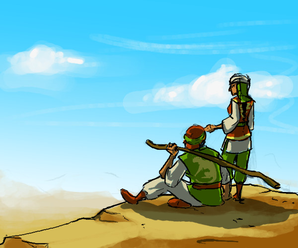
Couple characters of mine. They're brother and sister. |
| |||||||||||
|
elmenora
(Feb 5, 2012)
davincipoppalag (Feb 6, 2012)
cool drawing
dorothyblueeyes (Feb 6, 2012)
yes, very cool! |
| |||||||||||
| ||||||||||||
| 2draw.net © 2002-2026 2draw.net team/Cellosoft - copyright details - 0.58sec (sql: 35q/0.14sec) |
It's not completely possible to discern between lit skin and glowing goo(though I would guess the ears are just lit). It seems like that dragon(?) just ate a mouthful of lava from of a pit that's underneath.
The backlight doesn't completely make sense...some parts are more lit from the left and others more from the right. But I guess that's a minor problem if you chose a convincing color palette and construct things well through textures.
I should also mention that the throat is pretty awkward. I know you wanted you bend the throat(neck) so that he looks up, but it end up looking like the head sits on the back of his neck. Illustration: http://i.imgur.com/6CCsf.jpg
Also the eye could use some more definition...that's where a ton of people look, especially when it glows golden.
I'm not sure if you were going for this so I mention it, the dragon looks like it's made of wax. Not that there's anything wrong with that but I assume you maybe wanted it to look more like reptile skin with scales.
To spice up the composition I generally think it's good to make background, middle ground and foreground interact with each other/connect them.
Keep it up, I dig your general approach. The bokeh effect around the little droplets is neat too.
/critique