| ||||||||||||||||
| Public Boards/Intermediate | ||||||||||||||||
| 3 comments – latest 3: |
| |||||||||||||||
|
cianteed2
(Jul 31, 2006)
second edition: jussi
eevildeeva (Jul 31, 2006)
I've been in the 'Fiend Club' for 18 years now- no way I wouldn't recognize the 'Crimson Ghost' when I see it! I have no idea why they call their logo that, being that it's neither red, nor a ghost, but I digress.....;)Cute pic- that's kinda hot..
Sweetcell (Jul 31, 2006)
Have no idea what anyones talking about I just find it to be a good picture.
davincipoppalag (Jul 31, 2006)
There are worlds out there we've never heard of Sweet.....Hell I can hardly remember THIS one...
bad_choices1569 (Aug 13, 2006)
Thats hott :D !! |
| |||||||||||||||
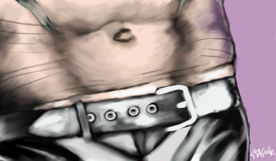
|
cianteed2
(Aug 1, 2006)
third edition: ville valo
Axil62 (Aug 1, 2006)
I don't know, some earth tone I guess, as long as it's darker than the skin.Any better?
Axil62 (Aug 1, 2006)
I think it is.
bad_choices1569 (Aug 13, 2006)
I love the tattoo. |

| |||||||||||||||
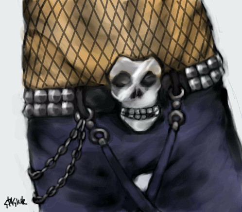
|
cianteed2
(Aug 6, 2006)
I dont know where I come up with this stuff.
101_Torchic_101 (Aug 7, 2006)
I love this! He looks mischievous =P Yay for naked kitty boys, lol.
Sasuke-fan-Sapphire (Aug 7, 2006)
lol. this is cute XD
Skai (Aug 8, 2006)
I don't know where you get this stuff either, but I like it. >w<
bad_choices1569 (Aug 13, 2006)
This is really weird, but very good. Nice. |

| |||||||||||||||
| Public Boards/Advanced | ||||||||||||||||
|
cianteed2
(Aug 4, 2006)
alala~
concannon (Aug 5, 2006)
Great likeness, very good. :]
squee (Aug 5, 2006)
Well done :D This is fantastic!!!
wboyer (Aug 6, 2006)
Holy crapcakes! Pixel art?! You are a master. Although the eyes are a bit wider than they are in the reference, the proportions of the face are absolutely PERFECT. The background is really nifty as well :D Cool beans, Stasiuk
erilu (Aug 11, 2006)
OH MY GOD! I want your pulse, so perfect! |

| |||||||||||||||
| Public Boards/Beginner | ||||||||||||||||
|
cianteed2
(Aug 9, 2006)
Another, this time on beginner.
Sweetcell (Aug 9, 2006)
Used correctly the line and bezier can do your work for you. And I say this is intermediate, but then I'm biased towards your work. That be an awesome doo.
cianteed2 (Aug 9, 2006)
This got way more comments then it deserves, lol =3
Sufiroyce (Aug 9, 2006)
Well heres another one I like this alot. Espeacially the colour choice.
wboyer (Aug 10, 2006)
absolutely love the design of the hair and the color pallette... even your doodles are the shit. h8888888 XD lmfao |

| |||||||||||||||
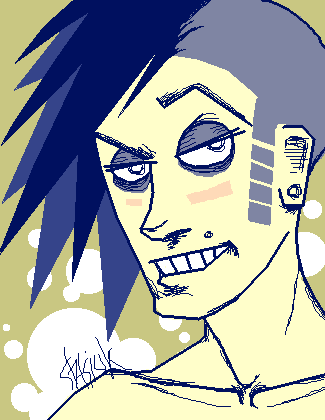
| Public Boards/Intermediate | ||||||||||||||||
|
cianteed2
(Aug 8, 2006)
doodle? then maybe this should have gone on beginner..
Seshio (Aug 9, 2006)
I dont know, I like it, its a different style. I really love the hair and how you drew it.
Fiesta (edited Aug 9, 2006)
No I think its intermediate quality its amazing I love the funky style of it.^-^
Ti||y (Aug 9, 2006)
Cool cool~!The colors are great and so is your style. :D
Sweetcell (Aug 9, 2006)
Even your doodles strike me. And your doodles my friend are a hell of a lot better than some peoples best efforts. Deserves to stay here. I love that smirk, saying yeah baby.... whatcha want. |
| |||||||||||||||
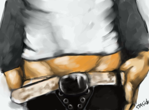
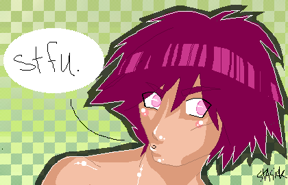
|
cianteed2
(Aug 1, 2006)
fourth edition: davey havokthank you to sierra (xswirvex) for the recomendation and ref!
fleeting_memory (Aug 3, 2006)
now THEMS some boyz hips :)
wboyer (Aug 4, 2006)
Holy... I absolutely LOVE the definition of the abs :D Is that a sheer cloth shirt? Oh! I get the presence of folds now. Seriously sweet, stasiuk! :D
pancakes_rock (Aug 5, 2006)
XD nice |
| |||||||||||||||
|
cianteed2
(Aug 4, 2006)
mm. pixels.
Alodie (Aug 4, 2006)
Omg, I dig it so much. The magenta and green go great together. The guy is purdy hawt tew :9
PicklesandHugs (Aug 4, 2006)
I love the white outline in this. ^_^
squee (Aug 4, 2006)
Haha. This rocks! |
| |||||||||||||||
|
cianteed2
(Jun 22, 2006)
Step 1: On layer 0, use a light colour, such as light blue, to make your preliminary lineart. It's easiest just to make broad geometric shapes in the same shape as your subject. This makes it easier when you go to "ink" your lineart, and ensures it will be proportionate (that is, if you DREW it proportionate!). Skipping this stage could cause your lineart to look disfigured, unless you've practiced enough to skip it.Step 2: Next, go to layer 2. Use the pen or pencil tool (or whatever else you prefer) to make your lineart. Its good practice to experiment with different colours of lineart, but black is usually a safe bet. You can now erase the preliminary blue on layer 0. Tips: If your lineart looks too dark or intense, use the erase rectangle tool on low intensity and shave off a layer of it. It will make the lineart look finer and light, and when you go to colour the lineart wont look as separate from the colouring. Step 3: On any layer lower than your black lineart, fill it in with colour! (but PLEASE dont use the "fill" tool. Not only will not work on a lower layer, but it looks ugly when people use it and it never goes to the edge of your lineart.) Step 4: This step is just shading and detail. I'd go further into how to shade, but this isn't a shading tutorial! I just have 1 tip: Avoid shading dark areas with straight black. Shadows aren't black, they're merely darker tones of the same colour. However, if it's your "style" to shade with black, by all means go ahead.
HunterKiller_ (Jun 22, 2006)
You deserve a cookie. (.':)
pandabarrie (Jun 23, 2006)
looks familiar :)this turned out nicely, good job!
sephiroth54321 (Jul 29, 2006)
But really, the shadow would be black wouldn't it? Only it is a bit transparent which is why it appears a darker shade of the same color...i dunno
cianteed2 (Aug 4, 2006)
actually theres no such thing as a black shadow. a shadow is just a lack of light, thus the subject's colour wouldnt turn black in a shadow - it would just be a darker version of its original colour. |

| |||||||||||||||
| ||||||||||||||||
| 2draw.net © 2002-2025 2draw.net team/Cellosoft - copyright details - 1.02sec (sql: 29q/0.50sec) |
Heh, I think I'm gonna like this series. ;)