| |||||||||||||||||||||||
| Public Boards/Intermediate | |||||||||||||||||||||||
|
DMV
(Jun 16, 2004)
Your a mean one ,saucey Jack.... |

| ||||||||||||||||||||||
| Public Boards/Beginner | |||||||||||||||||||||||
|
KiLi
(Jun 16, 2004)
timer is very, very off...
Sutafani (Jun 16, 2004)
it looks great, keep working
bumpinthenight (Jun 16, 2004)
I like the hair and hat... some of the anatomy is quite off (chest region, nose), but it doesnt make the picture entirely unredeemable.... I suggest you use oekaki shi... it would be easier to work with.... |

| ||||||||||||||||||||||
|
MoonlessDreamer
(Jun 15, 2004)
Hello. I'm new to this board. I kinda got lazy on this. I don't feel like shading this one, yet.Almost done. AOL is being evil.
Oops. I forgot her left shoulder. Oh well. Not going to finish it anyhow.
bumpinthenight (Jun 16, 2004)
ehhh... pretty good... her right eye (viewers left) is too far to the viewers right..... her lips are also not very well formed.... but the shading and background are nifty! oh... and dont make elf ears too pointy... then they would seem unrealistic.... there has to be a more blunt and defined point to the end...
lp_phaery (Jun 16, 2004)
cute little background,i like the hair. |
| ||||||||||||||||||||||
| Public Boards/Advanced | |||||||||||||||||||||||
|
DeadlyBlondeArcher
(Jun 14, 2004)
I was afraid of mannequins when I was little and they still kind of give me the creeps.
monkeyboy (Dec 10, 2004)
wheres the left guys left eye
MelissaMissy (Feb 9, 2008)
COOOL! You should be a graphics designer or animator for computer games!...if you arent already :P
x_Lucky_Clover_x (May 11, 2008)
I was afraid of them too, and I don't blame you. O_O
davincipoppalag (Oct 27, 2020)
theyre still creepy |

| ||||||||||||||||||||||
| Public Boards/Intermediate | |||||||||||||||||||||||
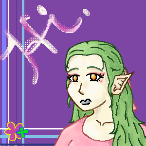
|
Platina
(Jun 16, 2004)
bumpinthenight (Jun 16, 2004)
yeah.... i cant use lascaux either.... tis sad, really!
Erewin (Jun 16, 2004)
She looks the sweet and gentle type ... likes to mother her friends perhaps. Nice choice of color :)
audie (Jun 16, 2004)
Lascaux is pretty easy once you get the hang of it.This is real cute.
lp_phaery (Jun 16, 2004)
yeah wat a totally cute lil pic. |

| ||||||||||||||||||||||
| Public Boards/Beginner | |||||||||||||||||||||||
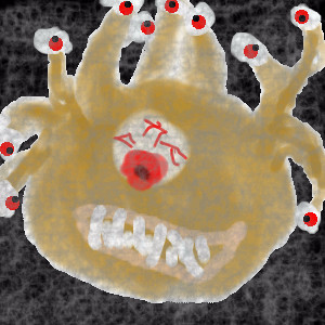
|
Nightmare66641
(Jun 15, 2004)
A wise man once said, beauty is in the eye of the beholder, but a smarter D&D player said, make sure the eye isn't on you.Yes, I just got the D&D monster manual version 3.5 and I wanted to try drawing one of the monsters. So I opened the book to a random page and came up with page 26, the beholder.
SilhouettesOfDimension (Jun 15, 2004)
thank you. i appreciate it.
Nightmare66641 (Jun 16, 2004)
Anything for a fellow artist. I am sorry, I was unaware that I had used the same title.
bumpinthenight (Jun 16, 2004)
errrrrr.... Nice convo going on... Anyhoo, not bad!!! I can recognize it... What you should do is make the outlines more defined... that is your main problem here... Also, learn to do a better job shading... Interesting piece, though!
Nightmare66641 (Jun 17, 2004)
Thank you for the advice. I will have to work on my shading, as well as my outlines. |
| ||||||||||||||||||||||
| Public Boards/Intermediate | |||||||||||||||||||||||
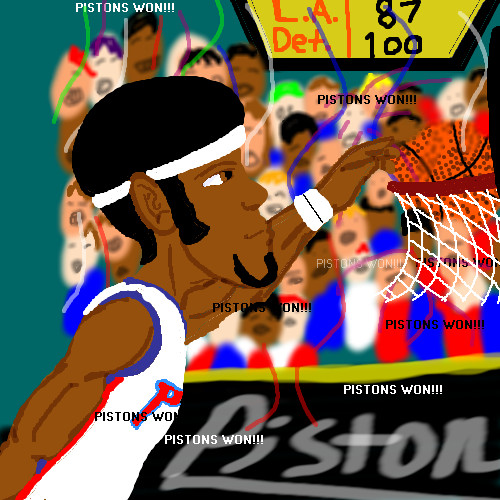
|
ChibiNay
(Jun 15, 2004)
AH i knwo this aint the best but hey I neede the room! idc I am to happy PISTONS WON!!!
kejoco (Jun 15, 2004)
i'm just extremely happy the lakers lost....stupid lakers....
bumpinthenight (Jun 15, 2004)
errrr..... your anatomy and lineart could use some work, and you should actually use shading... but your use of the text tool is ok.... |XP
Knockoff (Jun 15, 2004)
boooo, the pistons suck!!lol, nah. Im glad the pistons won, too!
Zack (Jun 15, 2004)
I don't really have team preferences, except in collegiate sports, (f. miami, man) so I usually just root for the underdog. I say go Pistons.As for the picture, my one main complaint is the font. That font is just... ugh. Use Eras Demi or something, and check the 'antialias' box. It makes a big difference. An easy way you could have made the background a lot easier on the eye is (assuming it's on a different layer) make its layer a little transparent and put another layer of solid (in this case, dark) color below it. It'd give the pic more depth too. I like the look on the guy's face. |
| ||||||||||||||||||||||
| Public Boards/Beginner | |||||||||||||||||||||||
|
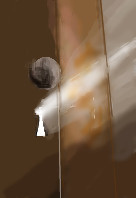
xwindflyer
(Jun 15, 2004)
There's a brighter day out there. (from a photo on the net)
Beaukat (Jun 15, 2004)
:D no problem! Looks great either way.
davincipoppalag (Jun 15, 2004)
Good job on the light rays X... very nice gradations..
emmamommalag (Jun 15, 2004)
This is really neat. You got that light shining through there just right. I like it a lot. :)
bumpinthenight (Oct 14, 2004)
very nice light effect... good stuff! |
| ||||||||||||||||||||||
| Public Boards/Intermediate | |||||||||||||||||||||||
|
DMV
(Jun 15, 2004)
He sure looks worried LOL!
kejoco (Jun 15, 2004)
duration 1 min????DAMN DMV, you ARE good!!! ;)
sal (Jun 16, 2004)
very nice dmv... i like ur black and white ones...
DMV (Jun 16, 2004)
1min lol! I wish ...no Kejoco ,sometimes I have trouble submitting, so I have to submit my back up image.Thanx Sal:)
Thear (Jun 16, 2004)
hey great draw!! i have to say this too: Freaking good shadings! =P heh =P his chin looks funny ^^ |

| ||||||||||||||||||||||
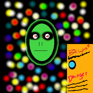
| Public Boards/Beginner | |||||||||||||||||||||||
|
PrettyPaintingArtist
(Jun 15, 2004)
This is an alien floating in space. I know it doesn't look very mean, but I am working on it, I am not sure about the background. I was just playing around!
bumpinthenight (Jun 15, 2004)
learn to unlock your caps lock.... and try to use something other than the elliptical tool, the rectangle tool, the pencil tool, and the blur tool....
PrettyPaintingArtist (edited Jun 15, 2004)
1...........I know how to unlock the caps lock tool, I didn't want to use any of the other tools for this picture....besides..............I like it this way.........I just have a little more to do with it.................it isn't as awful as the other pictures, and I will draw more pictures with the other tools, I know how to use 'em now, It isn't to hard, Someone asked me to draw this pic for them so i did, there is another pic that I am working on with the pencil and blur tools, I think you will like that style better!
Beaukat (Jun 15, 2004)
It doesn't look like you put any effort into it at all - try using some different tools... i agree.
emmamommalag (Jun 15, 2004)
I like the background. It's very colorful and the balls seem to be lit from within. Nice! |
| ||||||||||||||||||||||
| |||||||||||||||||||||||
| 2draw.net © 2002-2025 2draw.net team/Cellosoft - copyright details - 2.08sec (sql: 39q/0.67sec) |
this is very unnerving. i like.
And no Taori never read those books...but I like to read Steven king's stuff