| ||||||||||
| Public Boards/Beginner | ||||||||||
| 7 comments – latest 4: |

| |||||||||
|
Zack
(Jul 2, 2004)
although also garbage, this is more of the 6:00 AM variety
davincipoppalag (Jul 2, 2004)
It DOES looklike Gerald Ford! i like that little"DMVesque" touch in the right corner
Knockoff (Jul 3, 2004)
Wow. Looks like clox's stuff a little. The colors are nice, burnt colors..... That face thats white is awesome XD.
Aubrey (Jul 3, 2004)
Looks like a caveman sitting in a dark cave stained by campfire smoke and bloody from all the hunting the group has done for their dinners. Cool picture.
LovelyLori (Jul 4, 2004)
I'm always amazed with those on this site that use sooo many colors in a face and it still looks sooo real and I love these spooky looky ones.. I agree with Aubs, that pronounced portion under his nose and the mouth have that caveman, apelike feel to them... he looks like he's got alot on his mind |

| |||||||||
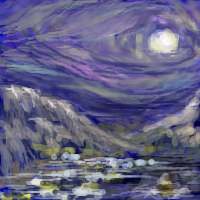
|
Zack
(Jul 2, 2004)
random 4:00 AM garbage
Bumble_Beez (Jul 3, 2004)
Wow, that's really nice!
Aubrey (Jul 3, 2004)
Reminds me of Starry Night.. one man's garbage is another man's priceless painting... This is very cool.
sinann (Jul 16, 2004)
It's beautiful. Very Van Goghish. Love the color and lines.
JackSprat (Jul 25, 2004)
Very pretty paint. As much mention, it is very Van Gogh.....you do still have both ears, right? |
| |||||||||
| Public Boards/Intermediate | ||||||||||
|
Zack
(Jun 16, 2004)
gawrsh this would look a lot better without that text box. bummer.came out differently from what I intended, but whatever.
text box looks uber cheesy. haw.
DeadlyBlondeArcher (Jun 18, 2004)
WHooooh! I like it better now! Still want it for my shingle, and my business cards... mhmmm. :D
emmamommalag (Jun 18, 2004)
Far out, Zack and I think the text box is great.pay no attention to the man behind the curtain!
|

| |||||||||
| Public Boards/Beginner | ||||||||||
|
9 comments
– latest 4:
davincipoppalag (Jun 2, 2004)
Thumb looks a bit too long? Cute pic..
Knockoff (Jun 2, 2004)
Hah, thats pretty cool.Though I agree the thumb is a bit to long.
Zack (Jun 2, 2004)
That's probably an effect of cropping and perspective. Plus the knuckle is a bit low. The thumb doesn't seem long to me, probably because I can picture what the rest of the hand looks like.Wasn't exactly making my best anatomical effort either. :P
DeadlyBlondeArcher (Jun 5, 2004)
OMG! This is great! How'd I miss this? LOL The paper looks real... shiny and crinkledy and sticky and stuff! Stickers make me happy :D! Thanks, ZACK. |

| |||||||||
|
Zack
(May 26, 2004)
I just lost a drawing... you know how this feels
davincipoppalag (May 26, 2004)
It seems to me that happens more with Shi-Painter than with Lascaux.. At least I have heard it more from folks who use that... Sucks to lose work...
mooseflower (May 27, 2004)
Yes, I do know the feeling... you poor, poor creature. |

| |||||||||
| ||||||||||
| 2draw.net © 2002-2024 2draw.net team/Cellosoft - copyright details - 0.96sec (sql: 24q/0.46sec) |
drawn in 16 min
drawn in 22 sec