| |||||
| Public Boards/Beginner | |||||
|
MattyP
(Feb 8, 2004)
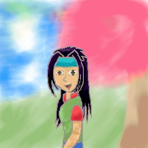
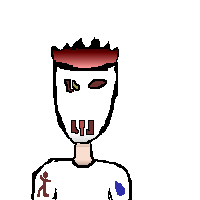
Hi everyone!! It has been a while since I have drawn here so I though I would come back!!This is my newest character, Kiyoku. She is not finihsed at the momment but tomorrow i will blend and smoothen lines, draw a BG and draw her face. |
| ||||
|
MattyP
(Sep 26, 2003)
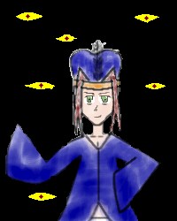
This Blue Mage risks walking in the dark without the knoledge of what lyes behind him. |
| ||||
|
MattyP
(Aug 4, 2003)
well it is obviously not done i will work on it again tomorrow-EDIT- still not done yet |
| ||||
|
MattyP
(Aug 1, 2003)
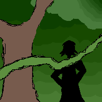
A girl stranded alone in the forest |
| ||||
|
MattyP
(Jul 31, 2003)
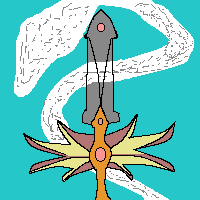
I am afraid that the power is going to go off so it is better safe than sorry. I will probably finish it tomorrow.By the way, when it is finished it will be Ba'alzamon from the wheel of time books by Robert Jordan Still not finished yet i still need to do some things with the person and i need to make the bg |
| ||||
|
MattyP
(Jul 28, 2003)
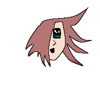
This was once a full pic of a face but it went terribly wrong and it lacked..umm..... "goodness", so i just kept the eye and a bit of hair and voila it is part of a face concealed in darkness.I know it is not very good but it was a try at least.
taori (edited Jul 28, 2003)
The eye looks nifty, as does the shading on the hair...and I like the little blue thingy in the corner. |

| ||||
|
MattyP
(Jul 22, 2003)
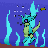
I was trying to draw a Mars Djinni from Golden Sun but it went wrong so i made a little creature
Knockoff (edited Jul 23, 2003)
Hah I tihkn its good. The game is awsome! The shading here is good as well! |
| ||||
|
MattyP
(Jul 5, 2003)
O.K, it is one of my first times using the computer to draw so i don't think it is THAT bad is it????? I thought i would choose to draw a sword from my favorite anime show, Magic Knights of Rayearth.~Mattyp~ |
| ||||
|
MattyP
(Jun 18, 2003)
It is only my second time using the computer to draw so its not that bad..is it???
taori (edited Jun 18, 2003)
Hey, that's not very nice! It's only his second picture. :( MattyP, it's not perfect, and a lot of TGgold's points are valid, but I have seen much, much worse. Anyway, I know you'll get better if you keep practicing. Keep trying!
concannon (edited Jun 18, 2003)
I think it's fairly good...don't mind TGgold. It could stand improvement, but improvement takes practice, so just keep it up.
TGgold (edited Jun 18, 2003)
No, please do mind me. I know that people are trying to keep you from being discouraged, but I've been hanging around oekaki boards for quite some time, and I mod one myself. You have to be blunt with beginners, or else they'll draw many pictures of the same poor qualoity, and not strive to improve enough. At least if people tell the truth then they know what the heck to work on and that people pay attention to what they're doing. Believe me, I can barely C&C this picture because there was not enough atempted for me to comment on. There could have been shading, more details, clothing folds, ect. I don't care if they are terrible, but if they're attempted I know the person is trying.Reasons why I stay in practice boards is to A) Help those who accept help B) See people reactions and observe growth over time. It helps me develop my own style if i track someone long enough. I DO NOT come to boards to see people ask for crit and then become offended when they get the truth from me. I DO NOT come to boards to be yelled at for telling the truth. Oh yes, while this is his second picture, you must see, it is visible that there are many flaws with the picture...very easy to see. The artist could at least attempt to change his mistakes to a satisfactory level. And there is a print screen button, it allows you to save an image on your screen, so you don't need to post every image, especially lowpar ones. They take up room. So, if you don't want my opinon of something, don't ask. I'm not as comforting and decieving as the other members.
marcello (edited Jun 18, 2003)
TGgold: Though you have good points, after watching the animation, I have reason to believe most of the 'mistakes' you refer to are actually intentional and part of the style the artist was attempting to achieve. Rather, the mistakes don't detract from the image, and fixing them wouldn't improve the image (and quite possibly hurt it).In a sense, I'd say this drawing is more successful than most, because it took a limited set of tools and came up with a visually pleasing piece. If you look at the animation you'll notice the artist recolored and resketched the piece more than once. One thing this image has that most don't is a sense of style. Whether or not any of that was intentional, I can't say, but rather than point out 'mistakes' which are more accurately stylistic choices, it might be better to look at what parts are unfitting for the particular image's overall effect. In this case, the moon is probably the weakest part, it is too precise and lacks the same sense of distinguishment from the rest of the piece. maybe if it were hand drawn, and perhaps if it had an outline, it would have a better effect, but I can't say for sure. Now of course, if you made 5 pictures that were basically the same as this, then I'd consider it spam, but there's probably worse stuff to critique than this. And TCgold, I don't mean to insult your critique, and I completely agree with how spineless most people are on boards like this, and can't take any critisism. It just seems out of place in this picture. |

| ||||
| 2draw.net © 2002-2025 2draw.net team/Cellosoft - copyright details - 1.18sec (sql: 25q/0.31sec) |
drawn in 48 min
Hope you like it!!
PLEASE critisize it!!!