| ||||||||||||||
| Public Boards/Intermediate | ||||||||||||||
|
Intermittent Windscreen Wiper
Bobstained
(Mar 14, 2010)
Finish off later
Flubbles (Mar 16, 2010)
what do you mean?
Suntan (Mar 16, 2010)
...before you go and make it perfect. :)
Flubbles (Mar 16, 2010)
I was gonna leave it alone, do you think i should do some more with it?
Suntan (Mar 16, 2010)
well, I told you which v I liked best. I prefer that soft foreground. |

| |||||||||||||
|
vlad.the.hamster
(Mar 8, 2010)
kinda a mix of Twilight Princess and The Wind Waker versions...
Suntan (Apr 5, 2010)
I like it, it's nicely done..I like her features and I like the colors within her face. :)
vlad.the.hamster (Apr 5, 2010)
thank you. :)
backmagicwoman (Apr 5, 2010)
Looove Zelda and this is so prettay!
elly (Apr 5, 2010)
She looks like china or ceramic....just beautiful!! |

| |||||||||||||
|
itchymonkey
(Mar 3, 2010)
somewhat distorted
BehindMyScreen (May 21, 2010)
I thought it was Mr Jack Sparrow. Very good!
KayosAvian (Jun 15, 2010)
That is extremely creepy. I saw the original of this only yesterday o____o
karl (Mar 8, 2011)
my favorite artist of all time, great recreation. i love your works
davincipoppalag (Dec 11, 2020)
<agrees with karl |

| |||||||||||||
|
vlad.the.hamster
(Feb 22, 2010)
Matt Bellamy in action! I am way too in love with him. :DFrom 99x Mistletoe Jam 2004 ...painting this is driving me nuts... XD
vlad.the.hamster (Mar 2, 2010)
Thank you! :)
Mushroom-Knight (Mar 6, 2010)
It's so good!!! :D
vlad.the.hamster (Mar 7, 2010)
thanks!
shell (Apr 2, 2010)
I like the lighting. |

| |||||||||||||
| Public Boards/Beginner | ||||||||||||||
|
Chiyu
(Feb 27, 2010)
Wow, I havent been on here forever. Maybe because everyone was so rude commenting my other art. Yay for support. Anyways, here. I actually have a shirt that says hope three times. And I was going to have no back ground. So, a stupid one is better than none, right? Meh.
Layne (Feb 28, 2010)
i think the background is fitting. :) |

| |||||||||||||
|
ChiKawaiiChan
(Feb 27, 2010)
Hi! this is my first drawing here...I didnt do much, I have no idea how to use these tools xD hopefully ill color it...eventually...anyways, hope you like it!stillnot done...
almost done! just needs a little more shading
okay so i think its done now......i might change it later though
Layne (Feb 27, 2010)
Welcome :) really cute first drawing. Hope you do lots more! |

| |||||||||||||
| Public Boards/Advanced | ||||||||||||||
|
mursku
(Feb 27, 2010)
reference phototrying to make the wings more part of her body.. lightened the face, it was too dark. and changed the eyes to green, you know, for the contrast.. got rid of the horns for now.. made the tail point towards the viewer. i think its a bit better now, but it might look even better if the tail rested on top of her legs. i'll try that later... got rid of the props, but now i don't know what to put there instead. or should i just forget the whole prop idea?... maybe i should just try out the classic (small) devils horns on her forehead?
Layne - thanks :D yeah, i too thought the wings should stay on. i think they more effectively sell the idea that she's some kinda demon that way :)
Flubbles (Feb 27, 2010)
I think the horns on the forehead would be a good idea, and instead of a sword you could go with a whip.
elly (Feb 27, 2010)
Her face reminds me of some Ben 10 characters...love the lighting =)have anybody else noticed that it takes a lot longer to upload the drawings than before, or is it just me?
fixed her left leg (the one in the back), it was too short. had to move the whole picture a bit to the right.. maybe now that there's not that much of empty space on the right, i might get away without needing any props. But i would like to have something more, than just a naked demon chick in my painting, even if its just some jewelery.. hmm.. maybe its time to go look at Frazetta paintings for some inspiration :) elly - it does, doesn't it? :D i guess i and the artists on Ben 10 have just been inspired by the same artists.. yeah and i love dramatic lighting, you can imagine the forms much more clearly than if there's no shadows... it's like i can touch that ass in my mind :D haha :P Flubbles - i'll try that whip idea :) [Edit:] maybe its because its 5:48 AM and im really tired, but her head is looking too big to me.. i'll go to sleep and look at this with fresh eyes, maybe its nothing.. |
This is hidden because it is rated 18+. Edit your privacy settings to make it visible.
| |||||||||||||
| Public Boards/Intermediate | ||||||||||||||
|
Layne
(Feb 17, 2010)
So, everyone seems to be doing a little copying from favored painters & illustrators so I thought I would throw in my 2 cent.This is from Kay Nielsen. I really love all of his work. Especially for the East of the Sun and West of the Moon book. :) Not done yet, and the lady needs some reworking of the torso and head, but better then nothing! Ref: http://www.ralphbakshi.com/blog/archives/sunmoon03.jpg
Teapot (Feb 27, 2010)
I bought all the illustrations from that book in card form about...erm...30 years ago. Still have them. Still love them. This is very, very pretty and has captured the feeling of his work.
Layne (Feb 27, 2010)
I am glad you like it. They republished the east of the sun and west of the moon about two(?) years ago in a really nice hardcover edition. :) I was so glad when i saw because while I had a book of his illustrations I really wanted to be able to read the stories that went along with all of his illustrations.
enjoydotcom (Feb 27, 2010)
Very attractive style, those soothing colors are great.It would be a great contest, draw from your favorite artist. In his or her style.
mursku (Feb 27, 2010)
when i compare your piece with the original, the first thing that pops to my eyes is that the original looks like it was made with watercolors, while yours looks too smooth, there's hardly any texture.. i liked the texture you had going in the fifth version. if you wanted to have texture like in the original painting, an easy (and quick!) way to do it, would be with a scatter brush (choose a high scatter count and you can maybe crank up the spacing too) on a separate layer. that way you can easily erase the eventual wayward dots from unwanted areas, and you can also play around with the blend mode and opacity (make it subtle) ..hmm, another thing that i noticed was that the original was much more sharper (darker and thinner lines).. i suck at line art so i'll not gonna try to give you any advice on that. You would only get worse if i tried to teach you line art :P |
| |||||||||||||
|
cpomaybo
(Feb 25, 2010)
thanks you guys for all your nice comments on my last sub - I'm always happy to get to spend time drawing here
dorothyblueeyes (Feb 26, 2010)
very pretty
Layne (Feb 27, 2010)
very nice. love the way you used the lines. :) I wish I could use lines so nicely! |

| |||||||||||||
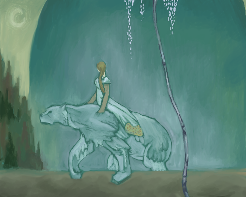
|
spizzy
(Feb 26, 2010)
Urgh. I take too long to do this shit.
elly (Feb 27, 2010)
It's was worth the time =)
Layne (Feb 27, 2010)
looks awesome. love the colors.
Bobstained (Feb 27, 2010)
I like the colours.
Zero_Lemons (Feb 27, 2010)
this is a really interesting style :) |

| |||||||||||||
| ||||||||||||||
| 2draw.net © 2002-2026 2draw.net team/Cellosoft - copyright details - 1.20sec (sql: 41q/0.32sec) |