| |||||||||||||||||||||||
| Public Boards/Beginner | |||||||||||||||||||||||
|
sal
(May 3, 2004)
... |
| ||||||||||||||||||||||
| Public Boards/Intermediate | |||||||||||||||||||||||
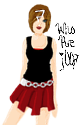
|
morbidboblover
(Apr 28, 2004)
I started drawing hilary duff and this is where it turns out... where is my life going? I think it's pretty good... WHO ARE YOU?
Knockoff (May 2, 2004)
This is nice, I like the dress/skirt. I think it needa a bit more shading, and a little less blur, but it is of to a good start.
emmamommalag (May 2, 2004)
Yes, this is going to be really good when you get it sharpened up. Good job on the clothing.
tivatdoar (May 10, 2004)
great ideas - the blured image on the mirror, and the sharp writings on it....great job. |
| ||||||||||||||||||||||
| Main Forums/Drawing Discussion | |||||||||||||||||||||||
 |
morbidboblover (May 2, 2004)
Anyone for a collab?
6 comments
|
||||||||||||||||||||||
| Public Boards/Intermediate | |||||||||||||||||||||||
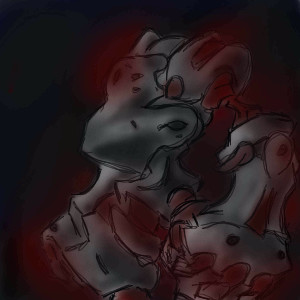
|
mooseflower
(May 2, 2004)
Drawing for stress relief.
scarfeh (May 3, 2004)
The little creature in the corner looks like a munkouse.
davincipoppalag (May 3, 2004)
This is nice moose.. I like the figures and the scene in general.
mooseflower (May 3, 2004)
A munkawhassis??
Knockoff (May 30, 2004)
Looks like toad is finally being used for a good reason....Hmm this is awesome. The scratchy-ness of this one is cool. The lineart color is cool because most people just use boring black (like me) |

| ||||||||||||||||||||||
| Public Boards/Beginner | |||||||||||||||||||||||
|
Minitsaru
(Mar 5, 2004)
safety save
bluesky (Mar 5, 2004)
woah i likes but i dunno what it is... really cool ^ ^FINALLY DONED!!!!! tho as soon as i sent it i notice something wrong while knowing i've hit max space...
Knockoff (May 2, 2004)
Finished!! I like the colors, and I like that it is dark. I think this came out good.
F_loug (May 27, 2004)
yoyoyoyoyoyoyooyoyoyooy tahts pic is hype i like your work |
| ||||||||||||||||||||||
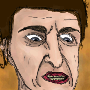
|
sal
(May 2, 2004)
kinda zep inspired...
Xodiak (May 2, 2004)
Who punched him. I will cry... <:~(You used a wonderful artwork style, sal! >:) |XOD|
Knockoff (May 2, 2004)
Nice....! Your getting better with shading.
davincipoppalag (May 3, 2004)
Good one to be inspired by sal.. nice |
| ||||||||||||||||||||||
| Public Boards/Intermediate | |||||||||||||||||||||||
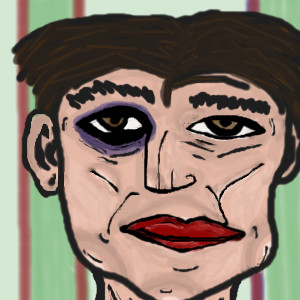
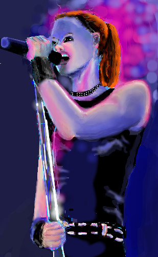
|
diver2026
(May 1, 2004)
it's a picture of shirley manson from rolling stone magazinefixed it up a little bit
Knockoff (May 2, 2004)
Dunno why theres no comments on this. I love the colors, and the purples blues and pink skin tones.The bg could of been a bit better, but this is still very nice!
tivatdoar (edited May 10, 2004)
amazing work, loved the light on the stand effect.body is very realistic. the face however seem much less realistic, the eyes are too close, from one another and too close to the nose.
laurael (Jul 8, 2004)
Hey now, this is pretty cool! I like how you did the lighting effects on this and that hair...the color is wonderful...! |
| ||||||||||||||||||||||
| Main Forums/2draw.net | |||||||||||||||||||||||
 |
TheCrimsonKing (edited Mar 2, 2006)
.
17 comments
|
||||||||||||||||||||||
| Public Boards/Intermediate | |||||||||||||||||||||||
|
marichan
(May 1, 2004)
hm, just doodle..but then I have to wait for a download, so I colored it..��so just say hallo.. I like the artwork here.. nice..^^ bye marichan
method3 (May 1, 2004)
Wow, very interesting way of shading the eyes and as said before, good coloring done for this piece.
Kasha (May 1, 2004)
shazzy! I like teh hair. Berrrrrrry good. I encourage more ppl to comment. Damn you all. Guwd jab.
Hedwiga (May 1, 2004)
The texture of the face is great! Wow! This is so exciting.. yes please stay!
Knockoff (May 2, 2004)
Woaw, awesome job. I love the shading, especially in the hair. Wonderful colors.I love the background and the lowwer left corner. |

| ||||||||||||||||||||||
|
coriolis
(Apr 19, 2004)
It didn't turn out as well as I wanted it to. But I'm running out of space and getting rather tired of working on it too.
tappie_chan (Apr 22, 2004)
this is really beautiful. i really love the shape of the lips and the facial expression. the left eye is a bit too high, but it doesn't detract from the overall beauty.
coriolis (Apr 22, 2004)
Was kinda like that in the original photo. I probably should have found one that was easier to do ^_^ I'll try to finish this one later.
Pandora (Apr 23, 2004)
This is a great drawing to learn from ..it does look like a oil painting. Wish I could use it for an example of using tones when I draw, just so I could understand at least that part of it.It's to bad we can't pull the drawing down at the same time. Not for copying but for understanding.Exquisite!Still not quite happy with it. But I ought to quit while I'm ahead.
|

| ||||||||||||||||||||||
| |||||||||||||||||||||||
| 2draw.net © 2002-2026 2draw.net team/Cellosoft - copyright details - 3.00sec (sql: 38q/2.39sec) |
Really nice. :)
Agressive.