| |||||||||||||||||||||||
| Public Boards/Beginner | |||||||||||||||||||||||
|
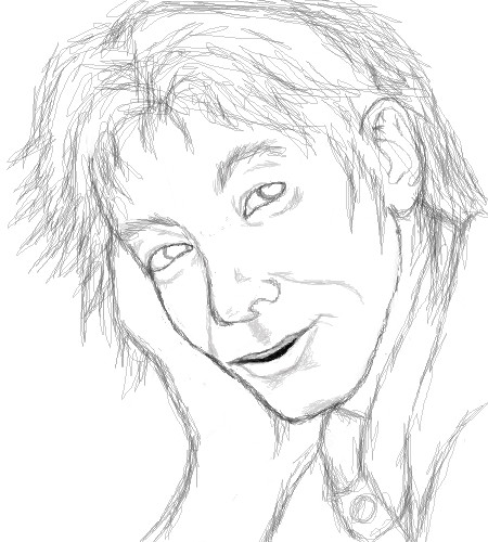
Kim
Priszcilla
(Jun 25, 2005)
randomness
marcello (Aug 24, 2005)
I bet I could do this in 13 minutes.
Priszcilla (Aug 24, 2005)
You sooo could! You should draw a cutesy anime girl right now :D
marcello (Aug 24, 2005)
Actually what I should do is homework, but...
cianteed2 (Aug 9, 2006)
13 minutes? I cant believe it... and it's one of my favourites that you've done! |

| ||||||||||||||||||||||
| Public Boards/Intermediate | |||||||||||||||||||||||
|
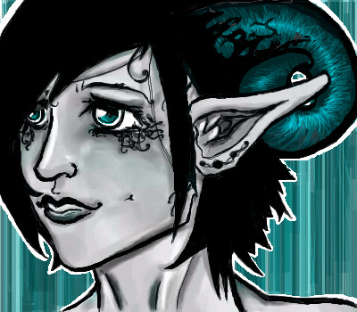
Menyway
(Jun 17, 2005)
This is just practice but.... would you want something like this????? (A ref was used for the pose but i changed it to my likeing) Ref ----> http://www.suzukitchen.com/ouendan/image/jiichan_up.jpgEdit: I'm puttin this as finished to make room and i dont want to work on this for awhile... i'll finish this in Adobe Photoshop some time..
Kloxboy (Jun 17, 2005)
Nice! I think you're on the right track. Without sounding too much like a nitpicking ass-munch, here is a list of things you might consider before doing our collab, which will be on the Advanced board:- Your facial proportions are pretty good overall but they could be better. - The line work is a little scratchy and thick, consider tightening your line work a little. - This portrait is sort of plain and lacks unique details, consider ref subjects with more form and expression in their faces. - The canvas should be bigger, the height should be at least 550, I know, this one is just practice but keep that in mind for the Advanced collab. I hope that helps and I hope I don't sound like a jerk.
Menyway (Jun 17, 2005)
No you don't sound like a jerk!!! Ok now i know what to look for in the refs.... thanks for more info Clox!!!!! |
| ||||||||||||||||||||||
|
Menyway
(Jun 23, 2005)
I know this is kinda weird but I always thought Inu and gang would be cool as soldiers and i wanted to draw them as so, so here is Inuyasha playin*eerr holding* a missile!!! ^_^
hideyourface (Jun 25, 2005)
well. I hate this because you just made inuyasha worse. ;oAnd the US army? >_>
quintessence (Jun 25, 2005)
He would definitly have to a get a haircut to be in the army.
Cordelia_Pink (Jun 25, 2005)
Looks good. The only thing that I'd complain about is the lips. I don't really like how thick it is. Nice background effect though.
Menyway (Jun 25, 2005)
Well.. i guess every artist is going to have at least 1 drawing that people dont really like!! Ohwell!! ^_^ |

| ||||||||||||||||||||||
|
Kraisa
(Jun 23, 2005)
I was gonna touch things up but I have reached my space limit...looks ok in the finished version though...just the animation has a black line where it shouldnt...
Kloxboy (Jun 25, 2005)
Wow, this is way cool. I read your memo, I was too late it looks like but it looks like you're doing just fine, great work.
hideyourface (Jun 25, 2005)
really cool. although the colours and lines on the cup don't seem really finished, so it kind of interferes.
spehallkay (edited Jun 26, 2005)
interesting.... a crfeature sopposed to be mean and killer suddenly seems so..... CALM and nice /\/\ (.. ) (I I) _^^_
Cianteed (Jun 26, 2005)
I love looking at this. I see a lot of dragon pieces but few this nice! |

| ||||||||||||||||||||||
| Public Boards/Advanced | |||||||||||||||||||||||
|
zep
(Jun 25, 2005)
just a title...
laurael (Jun 26, 2005)
This is so awesome zep...yes, those colors are killer!
Kasha (Jun 26, 2005)
how do you manage to do stuff like this? This should be in an art gallery. Fo' realz.
zep (Jun 26, 2005)
thanks a lot people...basically i´m teaching my heart to believe in what i´m doing at this time of my life :)
terracotta (Jan 15, 2006)
If your heart is having trouble there's no hope for any of us. I'd travel many miles by bus to see an exhibition of your work. And I didn't go to see the Picasso in Vancouver, only 35 miles away. I did drive 1,000 to see the Chagall in San Francisco though... |
This is hidden because it is rated Extreme. Edit your privacy settings to make it visible.
| ||||||||||||||||||||||
| Main Forums/The Post Board | |||||||||||||||||||||||
 |
monoplyguy (edited Jul 3, 2005)
22 comments
|
||||||||||||||||||||||
| Public Boards/Beginner | |||||||||||||||||||||||
|
Hopeless
(Jun 24, 2005)
/me loves spongebob :D
voodoobunny (edited Jun 24, 2005)
Aww.....Everybodey loves SpongeBob :3 This looks just like him, great job! Those bubbles on the background was a good idea.
Menyway (Jun 24, 2005)
bob freaks me out... Just like Alf does *shivers* ... But this looks just like him though!!! Good job!! ^_^
renire (Jun 24, 2005)
:D this is brilliant!!!!!!!!!!!!!!!!!!!!!!!!!!!
Hopeless (Jun 25, 2005)
:D thanks. |

| ||||||||||||||||||||||
| Public Boards/Advanced | |||||||||||||||||||||||
|
rmleon
(Jun 24, 2005)
3
Kloxboy (Jun 24, 2005)
Wow, that's great. Again, great structure and in 2 minutes no less. Your pen work is pretty nice, that looks like more than 2 minutes of work.
davincipoppalag (Jun 24, 2005)
This looks like zep~
Alex-Cooper (Jun 24, 2005)
Two minutes? What?! It's pretty damn cool as it is, but I'm looking forward to see how it's looking after you put like maybe a half hour into working on it. Speed demon. |

| ||||||||||||||||||||||
| Public Boards/Intermediate | |||||||||||||||||||||||
|
Draslic
(Jun 22, 2005)
Practicing noses. And eyes. And ears. And horns. Expressions, too. And just angles.
Kloxboy (Jun 24, 2005)
Jesus! Courtney, what the hell happened? She must have gave up heroin for Twinkies. Strange, it's actually kind of an improvement. I think she has an addiction problem or one might say an "addictive personality" and her current state is proof of that. She gave up the drugs for food, it's actually pretty sad, she needs help.Maybe done?
I'm renouncing backgrounds.
edit: And, as an ending note, Lethe's a guy. Not much of a Courtney Love.
Urei-sama (Jul 11, 2005)
this is beautiful! i love the colors and the designe |
| ||||||||||||||||||||||
| Public Boards/Beginner | |||||||||||||||||||||||
|
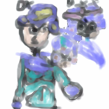
Yu-Gi-Oh
(Jun 23, 2005)
COOL DENERS CHECK THIS OUT YAL.
Maiko (edited Jun 23, 2005)
=__=;; why is this on the theme board? and please use layers :|Edit: moved :o
Ty854 (Jun 23, 2005)
The theme board is for intermediate level drawings. In order to draw on the intermediate board you must be used to the applets and fairly skilled at drawing. From the looks of this drawing, you don't seem to be used to drawing with okeaki shi painter. It's very hard to make out whats going on here. Next time, try using some solid lines, and please post in the begginer board until you have become more used to the applets. ;)
monoplyguy (Jun 23, 2005)
you need to work on your skills......alot
Kloxboy (Jun 23, 2005)
If Monet paintined Mega Man, this is what it would look like. |
| ||||||||||||||||||||||
| |||||||||||||||||||||||
| 2draw.net © 2002-2025 2draw.net team/Cellosoft - copyright details - 2.39sec (sql: 37q/1.99sec) |