| |||||||||||||||||||||||
| Public Boards/Beginner | |||||||||||||||||||||||
|
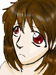
pandabarrie
(Aug 25, 2005)
this is a bad pic. i dont know why im uploading this, maybe its because i havent in a while...anyway... |
| ||||||||||||||||||||||
| Public Boards/Intermediate | |||||||||||||||||||||||
|
hideyourface
(Aug 25, 2005)
rawr
KH44N (Aug 25, 2005)
This is really nice. It reminds of the little red dragon from Mulan. ^__^
deleted34235 (Aug 25, 2005)
if this was a poster, I'd put it in my room.....I love it....nice job!!!!!!
DinoFlorist (Aug 26, 2005)
Awesome! It is fun and funny, and still very beautiful too. Excellent work!
TaCO (Aug 29, 2005)
Do me a favor and draw aleast 5 more pics like this one.Very cool pic, It almost makes me want to try to draw something good. |

| ||||||||||||||||||||||
| Public Boards/Beginner | |||||||||||||||||||||||
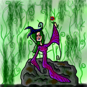
|
renire
(Aug 24, 2005)
Arrrgh....Im tired, and my comp keeps on stopping...so i promise ill finish it A.S.A.P! I just loved the way i had shaped it, so i didnt want to just delete it....so this could just be a sort of...Safety-Sleepy save? <:DEdit: Also, can anyone think of a BG please?
RyadicalEdward (Aug 24, 2005)
you have a spiraly type line art stuff so if your going the Serous cool bg- go Vines or if your going Halloweeny- Pumpkins and Vines spiralying around in a type of magic way. I dont know first things that came out of my head. :O But i like where this is going. :D@~~@~~@~~Too many swirls and curls!~~@~~@~~@
KH44N (Aug 25, 2005)
This is really nice. I like the background a lot. Nice work.
renire (edited Sep 3, 2005)
Heh, thankyou! ^_^ |
| ||||||||||||||||||||||
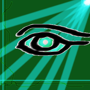
|
Semblance
(Aug 25, 2005)
Err.. strange eye thing.. or something like that..
Semblance (Aug 25, 2005)
Whah.. yeah, I see the resemblances..
Mormja (Aug 25, 2005)
Fantastic eye and background, it suits perfectly. :-D
hideyourface (Aug 25, 2005)
the white around the edges of the eye and curvy lines kind of takes away from the picture. Also the shape of the eye should be made smoother/thinner. Although the idea and composition is very good.
KH44N (Aug 25, 2005)
This is really nice. I love the light shinning down from above. Nice work. |
| ||||||||||||||||||||||
| Public Boards/Intermediate | |||||||||||||||||||||||
|
HunterKiller_
(Aug 22, 2005)
Something different.
Urei-sama (Aug 25, 2005)
cool. this is really nice. i like the designes
AuschwitzBurns (Aug 26, 2005)
With the whole "Harp of Silence" idea, wouldn't it be a little more to the meaning if it didn't have strings? Or if the strings were all snapped or made of bone or something like that. Very nice work, anyways.
HunterKiller_ (Aug 27, 2005)
Having no strings would be a clever idea but according to the the thesaurus, 'silence' is under the word 'death', therefore, this is a harp that brings death when played. Basically, itself is not silent, but it renders any souls silent who were unfortuante enough to hear it.
KaykuyoAkabane (Aug 30, 2005)
Wholy cow! This is so...Wow. Its amazing! Really! Wow. Wow, Can I say Wow? Keep up the amazing work!! <3 |

| ||||||||||||||||||||||
| Public Boards/Beginner | |||||||||||||||||||||||
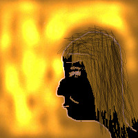
|
Kenshin
(Aug 25, 2005)
Whee! XD This is so crappy. I wasn't really trying to make it be really good or anything :PIt's supposed to be Gackt, but I guess it doesn't look much like him ;\ I hate this picture :D
Kenshin (Sep 17, 2005)
Masa is a cuuutie~Totchi [Toshiya] is hot, too D: So is everyone in Dir en Grey <3
voodoobunny (Sep 19, 2005)
Gackt is gay. That is the only thing I like about him. (Have anyone seen the live video Vanilla? He...well..better if I don't say anything XD)
Pakasutemanshikuka (Sep 19, 2005)
i like gackt and this pic here *~~~* cool!voodoobunny! i have seen it! :33
Kenshin (Sep 20, 2005)
OMFG Vanilla live is the best video EVER XDDD! <3<3333333333 This picture bothers me XD |

| ||||||||||||||||||||||
| Specialty Boards/Collaborations | |||||||||||||||||||||||
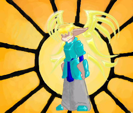
|
Bitching Background hunter
13 comments
– latest 4:
kitty25 (Nov 24, 2005)
very nice colors! and cool wings things !
Zeal (Feb 17, 2006)
Hmm I see a flaw*gasps* The leg is vanishing~ <_<
Noremac (Feb 17, 2006)
woah... i never saw that...
Zack (Feb 18, 2006)
The background itself is cool, and so is the character, but the two styles clash a bit. Cameron's work always has very low levels of contrast, so that high level of contrast in the background is a bit confusing. It makes the background design pop out more while the character's low contrast makes it recede into the background. If you squint, the wing designs and hair almost disappear, as well. If you did a layer above the background and below the character of solid dark red and set it to maybe 50% transparency, that might help fix some of the contrast issues. |
| ||||||||||||||||||||||
| Public Boards/Beginner | |||||||||||||||||||||||
|
Semblance
(Aug 25, 2005)
Well..
KH44N (Aug 25, 2005)
This is coming along great. This will looks really nice when its done though. |
| ||||||||||||||||||||||
| Misc. Boards/Sprites | |||||||||||||||||||||||
|
hideyourface
(Aug 25, 2005)
icon :o
KH44N (Aug 25, 2005)
This looks really cool. It a flammy type feel to it. I love the different shades of red u used.
deleted34235 (Aug 25, 2005)
I agree with KH44N
renire (Aug 29, 2005)
I agree with KH44N also, but instead of 'flammy' I'd rather use the word 'flamey' ^_^ Love your pic *thumbs up*
Punky (Sep 3, 2005)
Cool icon. :) I love your art. |

| ||||||||||||||||||||||
| Public Boards/Beginner | |||||||||||||||||||||||
|
Mika-Lilia_Rieu
(Aug 25, 2005)
Whee my first entry! I was doing this while half asleep and talking to my sister while registering for classes! boy im tired now x.x;
KH44N (edited Aug 25, 2005)
Awww... that's so cute. Nice drawing and welcome to 2draw. |

| ||||||||||||||||||||||
| |||||||||||||||||||||||
| 2draw.net © 2002-2025 2draw.net team/Cellosoft - copyright details - 1.12sec (sql: 38q/0.53sec) |
|XOD|