| |||||||||||||||||||||
| Specialty Boards/Collaborations | |||||||||||||||||||||
|
not done...erm....too lazeh...
15 comments
– latest 4:I'm not even NEAR done with the lineart so just lemme finish it and you can work on it. |
| ||||||||||||||||||||
| Public Boards/Intermediate | |||||||||||||||||||||
|
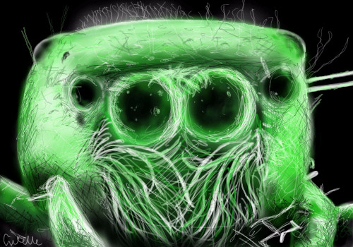
PolythenePam
(Jun 6, 2004)
Not as good as the last one I don't think...I don't think i picked a very good photo, should've had some legs in there or something I reckon. Anyway, I was experimenting with colour, and I plan to do more...What do you guys reckon? I like how the colour came out...
PolythenePam (Jun 6, 2004)
Look past the grossness...Please!
Gothic_Otaku (Jun 6, 2004)
*hugs* yay spiders <3 ....i'm a strange little girl. I love it, it's very realistic, but don't spiders have eight eyes? I can only see four here.
Zhenny (Jun 7, 2004)
Aww, tentacles~*has been playing too much Cthulhu'ish games lately* The eyes are really good (=evil), but, the body looks a bit two-dimensional.
davincipoppalag (Jun 7, 2004)
Dang Pam.. this is well done! (Creepy) but well done! |
| ||||||||||||||||||||
| Misc. Boards/Sprites | |||||||||||||||||||||
|
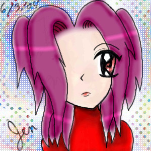
snow_child
(May 22, 2004)
just wanted a picture for my msn icon. idunno i tried to drwa myself in anime... hair in all haha yurp
laurael (May 22, 2004)
I LOVE the eye...and yer very cute!
Childlike_Vampire (May 23, 2004)
This is very well done, the very small lines and details make it so. Nice! :D
bumpinthenight (May 25, 2004)
oooh... very cool.... kind of looks like Relena Peacecraft from Gundam Wing... Does anyone else agree?
ILoveKenshin (Jun 6, 2004)
In a very weird way, it reminds me of Zakuro from Tokyo Mew Mew...It's anine-ish, but then again it's realistic... not really realistic, but a little.. It's pretty ^.~ '~:Kaoru:~' |

| ||||||||||||||||||||
| Public Boards/Advanced | |||||||||||||||||||||
|
safescene
(May 29, 2004)
Well, this thing was the death of me.I know I'm kinda' late on the whole self-portrait extravaganza, but I thought it would be fun...ha, don't ask me what I was on the day I decided to try it out.
Miss_DJ (Apr 1, 2006)
sigh....just perfect..wow...when I grow up artistically, I wanna be you, cindy, poppa, mommalag, kejoco..etc...this is so fine!
Suntan (Mar 1, 2010)
wow, come back!
vlad.the.hamster (Mar 1, 2010)
Wooow! This is so perfect.
shell (Apr 2, 2010)
molto bella |

| ||||||||||||||||||||
| Public Boards/Intermediate | |||||||||||||||||||||
|
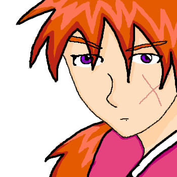
KiwiKitsune
(Jun 1, 2004)
;____;!!! I'LL NEVER BE AS GOOD AS HER!! ...how does Porcelain do such a good job with her art? She's awesome!! O_O!!
KiwiKitsune (Jun 2, 2004)
Aww... thank you! ^^;
ILoveKenshin (Jun 4, 2004)
Umm, you drew the wrong hand... O_OAlso, what's with the little pinkish dot things on the shoulders...? '~:Kaoru:~'
KiwiKitsune (Jun 6, 2004)
I know. I changed it a little bit... I dunno.
Xodiak (Jun 7, 2004)
She looks very pretty, I like Porcelain's artwork and yours as well! You both draw pretty girls! >;D|XOD| |

| ||||||||||||||||||||
|
Axil62
(Jun 3, 2004)
Nnn so...like, this one time I was on acid nnn...yeah...nnn then we played Led Zepplin backwards on 78 speed man....and I saw God man....
assha-rei (Sep 12, 2009)
i'm not exactly sure why it works, i think it was something like, your mind works like a camera, so when you look at it and your eye shifts its vision to (or just focuses on) another portion of the image, your mind tries to smoothly transition from the image of 'your first glance' and the image of 'your second glance'. thus, the image moves to the side, but the circular arrangement of the dots makes them appear to rotate, rather than merely shift.but, like i said, i'm not really sure :l
Roytje (edited Sep 13, 2009)
Not cool for my eyes.
Flubbles (Sep 13, 2009)
http://loscuatroojos.com/wp-content/uploads/2008/08/scary_optical_illusion_count_faces.jpg
shell (Mar 1, 2011)
And everyone did acid but me. But thanks to this I'm not missing out this time. |

| ||||||||||||||||||||
| Public Boards/Beginner | |||||||||||||||||||||
|
Aura_Unknown
(May 30, 2004)
Whee. I actually finished something! Be proud. xD
lp_phaery (Jun 3, 2004)
i luv her eye, it stands out well.i also like the expression on her face.
Knockoff (Jun 4, 2004)
Its nice and I like the shading, but the hair isn't right.You have the anime-ish bangs, but thats about it, wheres the rest of her hair?> hehe. Still nice,
Aura_Unknown (edited Jun 18, 2004)
About the nose: I suppose her body is moved in the same direction that her nose faces... xDAbout the eyes: I can't draw BOTH eyes for some reason. About the hair: I don't know where the rest is. I tried to add more hair, but the picture didn't look right. |
| ||||||||||||||||||||
|
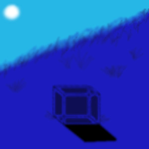
Linwe_lover_1990
(Jun 3, 2004)
Its a little Blue box. Kinda boring to most people probably.
davincipoppalag (Jun 4, 2004)
I think it's mysterious.. I would like the bg a bit sharper especially the grass on the knoll.. but I like this
ILoveKenshin (Jun 4, 2004)
I like this picture, it's cool how you made blue the main color. I also like how it's kind of foggy... '~:Kaoru:~'
BlueDreamer (Jun 4, 2004)
Me again. So, I think this really nice. I love the hill, the hazy look really pulls it off.
Traaleeah (Jun 4, 2004)
This looks really cool. Good job! |
| ||||||||||||||||||||
|
hoopstarchick10
(May 30, 2004)
tell me what you think!
Kenshin (edited May 30, 2004)
Yes, I agree with MD Anonymous, I think an outline would so some good. I think you could also color it a bit more, add a background, and match colors better. I know your not finished, but these are some tips when you are working on it again. You have great potential! ^^-Kenshin
Knockoff (May 30, 2004)
The comments your leaving are nice, but please don't advertise. You already have your website up on your page.. ;P
ILoveKenshin (Jun 4, 2004)
I also think that it would be great if you outlined your picture. I like the blue you used for her outfit! '~:Kaoru:~'
Thear (Jun 5, 2004)
yup, need outlines! do i see wrong or did u use fill-tool? |

| ||||||||||||||||||||
|
strawberry
(May 31, 2004)
edit: finished...
Kenshin (May 31, 2004)
I like the shading and the texture of the hair. Over all it is a good picture, but I personally don't like Yu-Gi-Oh! .°:Kenshin:°.
ILoveKenshin (Jun 4, 2004)
I agree with Kenshin. I love how you colored it, and the shading is excellent! The only thing I could suggest is: try erasing the color that's going out of the hair, and into the background, then it would look even better. Even though I don't like Yu-Gi-Oh! it's a great drawing! '~:Kaoru:~'
Aura_Unknown (Jun 4, 2004)
Oooo... 'Tis Mai! I like this picture. I could never draw her hair. X_x I don't really liked the dubbed version of YGO... The Japanese version is so much better. I'll shut up now. -runs off-
KiwiKitsune (Jun 4, 2004)
YEY! Good job! :D |

| ||||||||||||||||||||
| |||||||||||||||||||||
| 2draw.net © 2002-2026 2draw.net team/Cellosoft - copyright details - 1.95sec (sql: 41q/1.03sec) |
scarfeh: do whatever you want :)
drawn in 9 min