| |||||||||||||||||||||||
| Public Boards/Beginner | |||||||||||||||||||||||
|
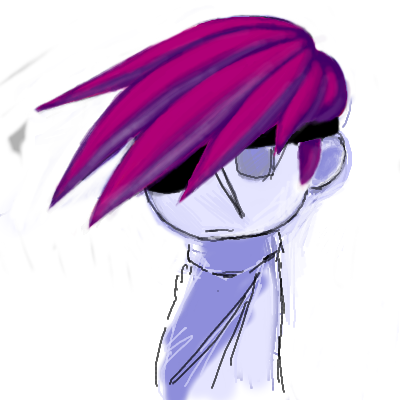
go!
GO
(Feb 19, 2006)
gaia anyone?
HunterKiller_ (Feb 19, 2006)
The hair is quite nice. =]
KaykuyoAkabane (Feb 20, 2006)
I Uber <3 Gaia. ^-^ I like how you did the hair, too. But the little sausage body is cute, too. (( O.o Sasuage? xD SP? ))
woah_pockster (Feb 20, 2006)
:DD I'm pockylurvinhoe ^____^ I haven't been on gaia in a while thoughh |
| ||||||||||||||||||||||
| Public Boards/Intermediate | |||||||||||||||||||||||
|
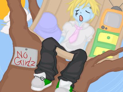
BunnySlippers
(Feb 17, 2006)
No girlz allowed! They have cooties.note: I took a bazillion breaks during the making of this picture. note#2: I'll add a background later. Lame.
HunterKiller_ (Feb 19, 2006)
With girls around, we still go insane.
suzie (Feb 19, 2006)
I really, really, like this! I was wondering how many layers you used on this? I am still getting the hang of layers, but to my untrained eye, it looks like you used quite a few. I keep coming back for another look..lol
mx (Feb 19, 2006)
i think this is good....well done |
| ||||||||||||||||||||||
|
DeadlyBlondeArcher
(Jan 30, 2006)
Hell of an angel Skin that shines like pearls Eyes that make your soul bleed Innocent and sweet Your friends surely agree Like candy she's a real treat But sugar's far from calm I don't mean to alarm By the time you blink The shit kicks in I'm walkin' up the stairs My heart's beating fast Following her legs To her thighs To her yeah, yeah, yeah Like a knife at my throat I like the way that she gropes Her curves make my blood swim in my veins Her pain comes in doses Till you're one step closer Then you're completely insane Hung by a halo and stabbed by horns Then she'll tell you they're both the same I went to bed with an angel At least that's what she said But as she tore off her dress Lord I must confess I got the devil's daughter I got the devil's daughter in my bed
Sweetcell (Feb 4, 2006)
Awesome as usual, don't you dare delete. My goodness what can you do on a large canvas? BTW, what song is that from? You quote a lot of songs that I almost know.
Miss_DJ (edited Feb 5, 2006)
sizzlin'......what a pearl of a girl
DeadlyBlondeArcher (Feb 5, 2006)
thanks... sweetcell, it's "Devil's Daughter" by Silvertide
suzie (Feb 19, 2006)
The skin tones, her shape, and pose are all so beautiful. The flames are good but they just focus your eyes on her..gorgoeus work. |
This is hidden because it is rated 18+. Edit your privacy settings to make it visible.
| ||||||||||||||||||||||
| Main Forums/Drawing Discussion | |||||||||||||||||||||||
|
Shanghai (edited Feb 19, 2006)
I have Painter 8 but I don't know too much, besides some basics, about customizing the brushes in it. I know how to open the brush editer and make changes like bristle type, etc., but there's a lot of options I just don't know how to use. what I want to do is get a brush set up to work -exactly- like the brush in lascaux when you have both the antialias and blend options checked. Specifically what I can't seem to get is the transparency to work right. In lascaux when you lower the opacity o...
7 comments
|
|||||||||||||||||||||||
| Public Boards/Beginner | |||||||||||||||||||||||
|
technocrata
(Feb 19, 2006)
heeeeehe
HunterKiller_ (Feb 19, 2006)
Nice sketch. Boob be too large, though. =] |

| ||||||||||||||||||||||
| Public Boards/Intermediate | |||||||||||||||||||||||
|
phantasmagoria
(Dec 11, 2005)
Seriously.Who can resist him?
HunterKiller_ (Feb 18, 2006)
This is Albert, correct?
SYTHE (Feb 18, 2006)
"Not everything that counts can be counted, and not everything that can be counted counts." (Sign haning in Einstein's office at Princeton) -Wasn't this the poster from Animal House? Looks good!
DoOp (Feb 19, 2006)
oohh man, she's sexy *_* hehe great job :'D
suzie (Feb 19, 2006)
Fantastic likeness, and I love the grey scale work. :D |

| ||||||||||||||||||||||
|
suzie
(Feb 18, 2006)
Ref' used..just messing with colour really..lol
marcello (Feb 18, 2006)
I think the problem is that it doesn't look anything like dust. not so much that it's there. dust is nearly opaque
DeadlyBlondeArcher (edited Feb 18, 2006)
I personally don't think it needs to look like dust, (it does look more like smoke or something), but it's just cool looking, anyway.
nobody (Feb 18, 2006)
ya, i don't think it looks like dust. but i think whatever it is, it just looks neat.
suzie (edited Feb 18, 2006)
I want to thank you all for your views on this and how you see it. I was kinda messing with what colours I could use, that you wouldn't normally link to an Elephant, and the dust kind of evolved..lol I think the colour thing went to my head a lilttle, but I really appreciate all this feedback, it helps me a lot. Thanks again! :D |

| ||||||||||||||||||||||
|
Punky
(Feb 9, 2006)
I don't really like this, I just wanted it the hell out of my studio.Experimenting with colors and stuff, and I wanted to draw a gas mask. :P edit: If it's not worthy of intermediate, feel free to move it down to beginner.
Pakasutemanshikuka (Feb 18, 2006)
The colors look so good together! I absolutely love all the colors, and the coloring does not suck >:O~Awesome work, again!
sal (Feb 18, 2006)
really like this pic as well.. :x
woah_pockster (Feb 18, 2006)
you;re beautiful punky :D your hands are very skilled and your creative mind is developing wonderfully :Dyou're awesome :D <333333
HunterKiller_ (Feb 18, 2006)
Great style. Gas masks are too cool for school. |

| ||||||||||||||||||||||
|
jimno1001
(Feb 17, 2006)
Fell asleep DVD authoring and drawing this pic.
staci (Feb 17, 2006)
how. cool.
davincipoppalag (Feb 17, 2006)
This is really well done. I like the little tendrils of vegetation coming down the shaft.
HunterKiller_ (Feb 17, 2006)
Great concept.
Zack (Feb 18, 2006)
I really like this kind of work. |

| ||||||||||||||||||||||
| Specialty Boards/Collaborations | |||||||||||||||||||||||
|
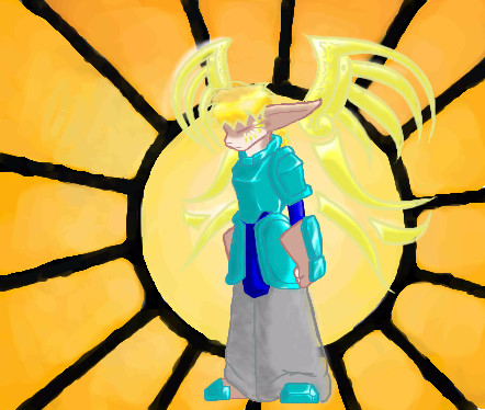
Bitching Background hunter
13 comments
– latest 4:
kitty25 (Nov 24, 2005)
very nice colors! and cool wings things !
Zeal (Feb 17, 2006)
Hmm I see a flaw*gasps* The leg is vanishing~ <_<
Noremac (Feb 17, 2006)
woah... i never saw that...
Zack (Feb 18, 2006)
The background itself is cool, and so is the character, but the two styles clash a bit. Cameron's work always has very low levels of contrast, so that high level of contrast in the background is a bit confusing. It makes the background design pop out more while the character's low contrast makes it recede into the background. If you squint, the wing designs and hair almost disappear, as well. If you did a layer above the background and below the character of solid dark red and set it to maybe 50% transparency, that might help fix some of the contrast issues. |
| ||||||||||||||||||||||
| |||||||||||||||||||||||
| 2draw.net © 2002-2025 2draw.net team/Cellosoft - copyright details - 0.84sec (sql: 37q/0.52sec) |