| |||||||||||
| Public Boards/Beginner | |||||||||||
|
Lark
(Feb 15, 2007)
Bleh. I had a sudden urge to draw bright green eyeballs. Or something. P: Sleep. Good Night. |

| ||||||||||
| Public Boards/Intermediate | |||||||||||
|
fleeting_memory
(Feb 9, 2007)
In celebration of the fillers finally ending!
jaded_angel (Feb 10, 2007)
Yea cant wait for this week to roll over fillers are over YIPPY lol....I heard that they are not starting with the kakashi gaiden though ..i was looking forward to watching that...naruto is better watching it rather than reading it to me....any who Love your pic so far :)hm all done now! Everyone enjoy the 2.5 year time jump! w00t!
Gollywoggers (Feb 15, 2007)
I think I have seen this cartoon before. It looks good.
EngineerErrant (Feb 21, 2007)
"Hey, can I have some food?""Sure!" "WHAT THE F*** DID I JUST SAY?!?!" Still have to watch the non-parody versions of these... |

| ||||||||||
| Public Boards/Advanced | |||||||||||
|
comd
(Apr 11, 2006)
Trying to draw some figures without a reference as practice before I attempt to correct that guy on the left in the previous drawing. I'm kind of screwed with the previous drawing since I drew the figures based off a reference (loosely, but still with a lot of aid when it came to proportions, anatomical detail, perspective, etc.). If I'm going to draw my own figure in there, I'm going to have to try really hard to convincingly make it blend in with the other two figures without making my own figure look like a badly drawn cartoon.It's been a while since I've attempted to construct a full figure without looking at anything - I've gotten pretty rusty, but I think I've improved at least on the feet a little after all the anatomy practice I've been doing (I realize the ones in this one aren't too great, but for me, they are an improvement). Feet have always been one of the hardest things to draw for me since they have to be planted firmly on the ground in perspective, and that's one of the parts where I can't really fake the perspective as a result (and I have a really hard time constructing any sort of organic form in perspective without some sort of reference). I was originally planning to save this one and delete it as with the majority of my quick practice drawings, but this one didn't turn out too badly. I might keep it around for a while and see if I can refine it a bit.
davincipoppalag (Apr 12, 2006)
You are fascinating to watch.
HunterKiller_ (Apr 12, 2006)
I didn't expect you to finish like this. Fantastic finish. =D
DoOp (Apr 13, 2006)
nice colours you choooseee <3 they're really lightish, but a bit on the grey scale, it's pretty wicked ^^ the softshading is really good on this, and the pose, i :heart: it lots! costume design is awesome too :)
Gollywoggers (Apr 16, 2006)
Wow, you really know what you are doing with the angles and positioning. Drawing those lines there is a great idea. I am clapping my virtual hands. |

| ||||||||||
| Public Boards/Intermediate | |||||||||||
|
fleeting_memory
(Apr 15, 2006)
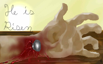
On the evening of that first day of the week, when the diciples were together with the doors locked for fear of the Jews, Jesus came and stood among them and said, "Peace be with you!" After he said this, he showed them his hands and side. The diciples were overjoyed when they saw the Lord.John 20:19-20 edit:gah 13+ for blood forgot about that
Gigandas (Apr 16, 2006)
This makes me cringe...cause not too long ago, in anthro class, we watched this video on this cultural thing where a guy gets crucified; and yes, they zoomed in on the palm and showed them driving a large nail into his palm :(.As for your efforts, I think this turned out pretty well :). I mean....it did make me cringe, right? lol...(I know I know, you're probably gonna say something like, "you could have covered your eyes during the video..." but I just couldn't look away, bleh) Anyway, I hope you had a nice Easter yourself :). Glad to see you drew some more...
Nyuusen (edited Apr 21, 2006)
The nails on Jesus' went through his palms but in normal curcifixions, which they did many times in various histories (Roman, Greek, etc.) the nail traditionally went through the wrists and ankles. Or so i've read. The shading looks weird and the blood kind of looks like ribbons but it's better than i could do. So kudos.
woah_pockster (Apr 29, 2006)
hey did you know judas may have not been all that bad? =]there's a gospel of judas that was found and they restored it and it was 13 pages long. it says that judas was asked by jesus to do all that stuff. and no I'm not christian or anything. I barely know anything about the religion. I learned this in my "myth magic monster and mystery" class. we watched a documentary on this. I'm buddhist kthnx. christianity and other monotheistic religions confuse me.
EngineerErrant (Dec 23, 2006)
"OUCH!!!"Soooome things in life are bad...they can really make you mad...noice. |
| ||||||||||
|
Sweetcell
(Mar 9, 2006)
Trying again... X(
Sweetcell (May 19, 2006)
Ok, ok, I'll try. Have to ask Marcello for space. Maybe after other pieces are finished.Ok, so I'm trying this one again.... maybe it'll come out.
Looking a little better
Well damn, it turned out half decent.
|

| ||||||||||
|
fleeting_memory
(Mar 9, 2006)
-I cannot see! You have blinded me-My dear brother, none has blinded you but yourself. Open your eyes. -I cannot, I am blind! -I weep for you but when at last you open them you will see what I see. *bored, just drawing crap* This picture is making me sick-no background works at all-it was supposed to be an ass-doodle please move to beginner
Gollywoggers (Mar 9, 2006)
I like the wings on the one on the right. It really is not as bad as you think that it is.
DeadlyBlondeArcher (edited Mar 9, 2006)
I think it's pretty cool, I mean... it might not be what you intended when you started, but since we don't know what that was we aren't holding it to that standard. (I like the wing on the one on the right, as well... it looks like a tattered autumn leaf)WHAT'NTHAHEYALL is an ass doodle? lol
Sweetcell (Mar 9, 2006)
evokes the theme of the poem well I think. the tattered wing is great. Ass doodle, are we starting a theme? |

| ||||||||||
| Specialty Boards/Collaborations | |||||||||||
|
Ok it's a start. I think that I will have to work more on the wings. Your turn :)
6 comments
– latest 4:
hideyourface (edited Nov 18, 2005)
the deer is rather blurry and that nose and the wings need work.
Gollywoggers (Nov 26, 2005)
no kiddingI am so sorry that I was gone and I never did finish this. My gosh you are so much better than me. Thank you for doing a collab with me despite of that. Lets get this out of our studios, what do you say?
deleted10215 (Mar 15, 2006)
i really think you should get rid of the wing and fix the left side the rest is A okay |

| ||||||||||
| Specialty Boards/Contest! | |||||||||||
|
fleeting_memory
(Nov 22, 2005)
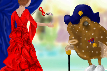
The Admiral in his finest at the head of the recieving lineReferences: http://cellosoft.com/2draw/view/15782/ http://www.moviegowns.com/oldercreations.html (about halfway down its the most beautiful dress I think I have ever seen) grrrrrr it refuses to look right
Qwerty_Wittle_Fawah (Nov 23, 2005)
I just noticed his badge...that is awesome I like the background I dunno about you but I like it!
Gigandas (Nov 23, 2005)
Ooh, nice finish :)! I still think the admiral is jealous of the fact she's so much more detailed than he is :P. Good work with the out of focus bg, pushing the characters forward. I vote for this one :).
Gollywoggers (Nov 26, 2005)
This one is still my favorite. The dress is really nice. I do not think I would be able to sit that long and shade. I think the admiral being there completes the picture. Good job; I like it a lot. |
| ||||||||||
| Public Boards/Intermediate | |||||||||||
|
Gollywoggers
(Aug 18, 2005)
Well I was trying to get the shape of things down(hense the sillouhette) and I could not get it to turn out quite how I wanted it to. I think that I still managed the feel I wanted though.Not sure if this should be here or beginner-either works for me
fleeting_memory (Aug 18, 2005)
the neon makes it intense-good use of color. The whole shadow thingy's kinda cool too
LisaAnne (Aug 18, 2005)
I'd say its pretty good...I mean I think that there could be some refinement (but who doesn't need to refine their work). I love the whole idea though...kind of the "energies" colliding. Also there is a little bit of question of sex (as in gender), which I find very interesting.
Gollywoggers (Aug 19, 2005)
There is? Uh the one on the bottom is a girl and the one on the top is a guy. There should be no gender confusion. He is more calm passionate-hense the calmer color and she is more intense hense her position and color.
LisaAnne (Aug 30, 2005)
Well I assumed that the bottom was female, but I also second guessed, because of the colors, as well as the face. In general people associate or use (not trying to say this is the only way obviously), but Reds, purples, pinks are feminine, and blues, greens masculine. Even if I didn't interpret this piece the way you intended I still like it. |

| ||||||||||
| Public Boards/Beginner | |||||||||||
|
AmyLurvesRichard
(Aug 2, 2005)
isint he hawt?
Tezzy (Aug 4, 2005)
I think he looked better without a face Amy.... hahah Im just kidding xD and I'll teach you how to shade a picture SneakyWalter is right it will look much better.
Xodiak (Aug 11, 2005)
This looks very romantic... <:D|XOD|
sincity (Aug 11, 2005)
I'm with gollywoggers. :}Argh dont believe in 2nd time being a charm
|

| ||||||||||
| |||||||||||
| 2draw.net © 2002-2024 2draw.net team/Cellosoft - copyright details - 0.64sec (sql: 44q/0.21sec) |
drawn in 44 min
"I CAN SEE MY HANDSSS!!!!!"
gimme a call before you come over tomorrow, I'll be scrambling to get dressed.
it looks so... dramatic.