| ||||||||||
| Public Boards/Beginner | ||||||||||
|
Faul
(Feb 11, 2007)
This is my second attempt after I got help from my friend Moose. >< Tis a little better than the old one |

| |||||||||
|
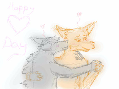
Faul
(Feb 11, 2007)
Start of a piccie called Puppy Love. ^-^ Tis my friend and I's fursonas.Changed the hands and fixed some of the anatomy errors >.<
a_blue_orange (Feb 11, 2007)
^____^Line art!!!!!
>< I cant color. I'm getting people to help me fix things. I promise it will look better soon ^-^
|
| |||||||||
|
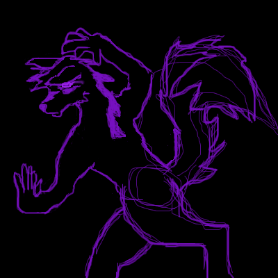
Faul
(Feb 6, 2007)
Heres a pic I had to draw. I was inspired by Connercoon's rave picture they drew.-HATz |
| |||||||||
|
Faul
(Feb 6, 2007)
This is an icon of my wolf fursona Hatchiman in a raver style.-HATz |

| |||||||||
| Public Boards/Intermediate | ||||||||||
|
Faul
(Feb 3, 2007)
Meh, my sad attmpt to see if I can still draw witha mouse. I'm guessing not... Maybe I'll make this better in the fututre sometime.-HATz
cmb (Feb 3, 2007)
I like the style... different... |

| |||||||||
| Public Boards/Beginner | ||||||||||
|
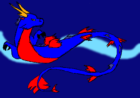
Faul
(Oct 16, 2005)
Behold my dragonadded more blue
Yea whatever
bethica2001 (Jan 7, 2006)
his body is out of proportion and it like swisted funnyI decided to add a backround to finish it
|
| |||||||||
|
Faul
(May 3, 2005)
Its a dragonRaNDOM DOODLE
silvercoyote (Jul 3, 2005)
A cute dragon. Very spiffy.
littledebbie1990 (Jul 3, 2005)
I like the cartoon-ish element
Kraisa (Jul 3, 2005)
I like his green spots |
| |||||||||
| Misc. Boards/Sprites | ||||||||||
|
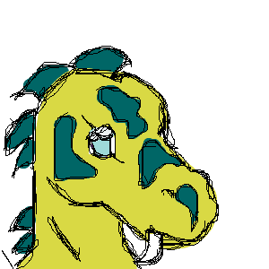
Faul
(Apr 17, 2005)
Aku hahaha |

| |||||||||
| Public Boards/Intermediate | ||||||||||
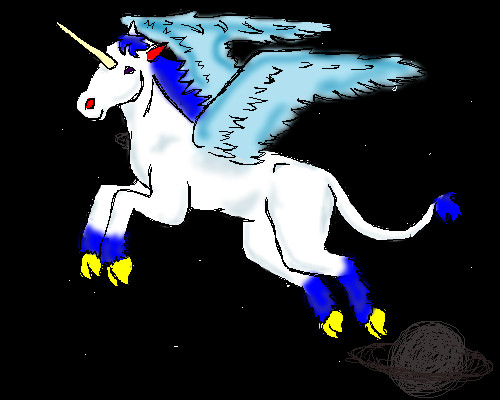
|
Faul
(Nov 26, 2004)
Wow, that took awhile
Maiko (May 2, 2005)
haha ^_^ I like this picture. Lovely leg/mane/tail hair :3 good job~
Faul (May 2, 2005)
Thanx for the comments
Destervetha (May 3, 2005)
The leg anatomy is very good.
Shanghai (May 3, 2005)
There's a few nice things about this, but I think there's also a few things you could have worked on more. The sketched versions seemed to have a little more life to them, once you added color everything flattened out. More shading would give it back the depth it lost there. I also think the lines are too rough. Rough lines can be used well sometimes, but in this case there's so many places that I can see spots of white inbetween and around the lines that I wish they were smoother, maybe with a lower opacity setting. |
| |||||||||
| Public Boards/Beginner | ||||||||||
|
Faul
(Apr 10, 2005)
Its a VenomothFixed the words
bethica2001 (Apr 10, 2005)
hey its a venomoth haha, check yo' studio right now!!!! |

| |||||||||
| ||||||||||
| 2draw.net © 2002-2024 2draw.net team/Cellosoft - copyright details - 0.38sec (sql: 37q/0.12sec) |
drawn in 10 min
no whitefox I will not dance with you. :b