| |||||||||||||||||||||||
| Public Boards/Intermediate | |||||||||||||||||||||||
|
nekodesu
(Jan 31, 2006)
eeh?....That metal rod thing is a bow to those who were wondering. And yay for the glowing effect XD |

| ||||||||||||||||||||||
|
phantasmagoria
(Dec 11, 2005)
Seriously.Who can resist him?
HunterKiller_ (Feb 18, 2006)
This is Albert, correct?
SYTHE (Feb 18, 2006)
"Not everything that counts can be counted, and not everything that can be counted counts." (Sign haning in Einstein's office at Princeton) -Wasn't this the poster from Animal House? Looks good!
DoOp (Feb 19, 2006)
oohh man, she's sexy *_* hehe great job :'D
suzie (Feb 19, 2006)
Fantastic likeness, and I love the grey scale work. :D |

| ||||||||||||||||||||||
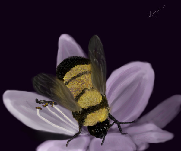
|
Felistorm
(Feb 18, 2006)
practicing.
davincipoppalag (Feb 18, 2006)
Oh..I .like this one very much Jana! This one pops out. The wings and "bee fuzz" look great.
DoOp (Feb 19, 2006)
oh ahh ehhh the bee is super duperrrrrrrrrr, the bug itself is awesomee, I love bugs *_* so this is really awesome, good job on it! practice xD.... something i need to do...often....
suzie (Feb 19, 2006)
Great fluffy texture on the Bee..and the colour showing through the wings is a nice touch too, I love this :D |
| ||||||||||||||||||||||
|
suzie
(Feb 18, 2006)
Ref' used..just messing with colour really..lol
marcello (Feb 18, 2006)
I think the problem is that it doesn't look anything like dust. not so much that it's there. dust is nearly opaque
DeadlyBlondeArcher (edited Feb 18, 2006)
I personally don't think it needs to look like dust, (it does look more like smoke or something), but it's just cool looking, anyway.
nobody (Feb 18, 2006)
ya, i don't think it looks like dust. but i think whatever it is, it just looks neat.
suzie (edited Feb 18, 2006)
I want to thank you all for your views on this and how you see it. I was kinda messing with what colours I could use, that you wouldn't normally link to an Elephant, and the dust kind of evolved..lol I think the colour thing went to my head a lilttle, but I really appreciate all this feedback, it helps me a lot. Thanks again! :D |

| ||||||||||||||||||||||
| Public Boards/Beginner | |||||||||||||||||||||||
|
Lycan
(Feb 18, 2006)
Please do not smite me for the background, 'cause it sucks so bad.
DoOp (Feb 18, 2006)
I luff the mice xD... rats are soo darling! my friend has like, two rats or three adn they are so cute!! *_* hehe teh ahdns not too bad, but the ring ringer is a bit bigger then the rest? i dunno xD cute rat, looks too blurred tho *_* but darlingly cute
Maiko (Feb 18, 2006)
I have a rat o_o; why would anyone consider them evil?anyway, the hand is okay, but I really can't tell that what its holding is any type of rodent. also, if it's a rat..uhm...rat's are preeetty big >_> |

| ||||||||||||||||||||||
|
xiau
(Nov 19, 2005)
Everyone's leaving 2Draw ;_;Nooo...pleeease, nobody else leave! ;_;
kristine (Nov 25, 2005)
mhm.
pikagirl (Dec 9, 2005)
This is quite adorable...no, more than quite adorable...no more than adorable, It's the cutest thing I've seen today! =^o.o^=
DrsFan (Feb 16, 2006)
I only know Xodiak left.Who else did?
~Wolf~ (Feb 18, 2006)
diechan left but i think she goes on every so often. |

| ||||||||||||||||||||||
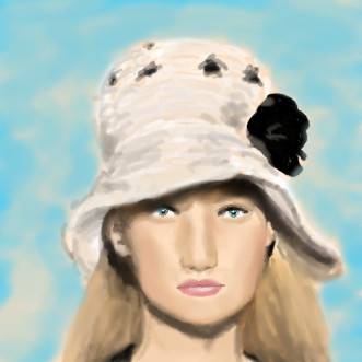
|
Pseudonymous
(Feb 11, 2006)
Constructive criticism, anyone?Edit: It's not worth it to ask for more space, so it's gonna stay as is. Oh well. :)
terracotta (Feb 12, 2006)
Very pretty, Pseu. for an overall impressionistic effect I don't think you need to do a lot of fine detailing. Here's what I'd do: lighten those shadows behind her ears and spread them over the hair so that it looks like the brim of the hat is casting a shadow over the hair (but not too dark.) Think about where your light source is in this picture and then you'll know where the shadows should fall. You might try shaping the bridge of her nose a little--most people don't have a bone in the bridge of their nose that is quite that wide from top to bottom. Also, a small shadow underneath her lower lip will indicate the indented curve between lip and chin--think of it as the shadow that the protrusion of the lower lip casts on the top of the chin. Your skin tones are real nice.
SYTHE (Feb 12, 2006)
Looks like her nose is a bit long and the top looks a bit flat. I think the black rose/bow needs some more detail, maybe some lighter areas on top? I agree that the hair looks a bit undefined as well.
Pseudonymous (edited Feb 13, 2006)
You're right, Sythe. I was trying to get the bottom moved upward, but I couldn't figure out how to on Lascaux. Any ideas? Do I just have to draw it all over?Edit: Whoa. I had no idea I reached my limit on this thing. O_O
SYTHE (Feb 17, 2006)
Yep, those pesky limits just hit you from outta nowhere don't they?!? |
| ||||||||||||||||||||||
| Public Boards/Intermediate | |||||||||||||||||||||||
|
Pseudonymous
(Feb 14, 2006)
:)
Zack (Feb 16, 2006)
I think Oekaki-Shi compresses the submitted images a lot more than Lascaux does, which would explain why Oekaki-Shi pictures have so much more banding in them. The specific tools you use don't affect the space, but the technique you use does. Generally, the blurrier or messier the image, the more space taken up.Because of the way it loads pictures via animation, I don't think the number of layers you use makes any difference in Oekaki-Shi. It makes a big difference Lascaux, though. But with either program the biggest factor is usually the canvas size.
DoOp (Feb 16, 2006)
he's nice lookin x3 ~<3
Pseudonymous (Feb 16, 2006)
Hmm...that's probably the reason. I'll start using Oekaki again, I guess. Thanks :)Yes, he is VERY nice looking. Hot is the word I'd use.
suzie (Feb 17, 2006)
Wow..yummy..:D |
This is hidden because it is rated Extreme. Edit your privacy settings to make it visible.
| ||||||||||||||||||||||
|
George_Goat
(Feb 11, 2006)
This is a safety save for now, especially since I already left it on so long while I was gone. I still need to add the characters into it!
DoOp (Feb 12, 2006)
this is a nice scene so far :) i can see it as a childrens book fantasy xD it's awesome so far, i wanna see this finished ^_^I left this on for a VERY LONG time while I was gone for Valentine's day. O_O
But, it is finally done. *phew*
Pakasutemanshikuka (Feb 16, 2006)
Beautiful..the sky is fantastic<3~
xiau (Feb 16, 2006)
I like that song O_O "First Love" by Hikaru Utada, right?Anyways, it's pretty. I really like the sky <3 |

| ||||||||||||||||||||||
|
Axil62
(Feb 15, 2006)
I drew this
DoOp (Feb 15, 2006)
no way, you didn't draw this >.>xD this looks cool, all cartoon american ness :D |

| ||||||||||||||||||||||
| |||||||||||||||||||||||
| 2draw.net © 2002-2025 2draw.net team/Cellosoft - copyright details - 1.25sec (sql: 36q/0.64sec) |
drawn in 36 min