| |||||
| Specialty Boards/Contest! | |||||
|
Coquitah
(Aug 4, 2007)
http://delivery.gettyimages.com/xc/E012290.jpg?v=1&c=CFW&k=2&d=C95D2AEC9A2138DB942B2A1EC1FF4057there is no way I have time to finish this before the deadline |

| ||||
| Public Boards/Beginner | |||||
|
Coquitah
(Aug 3, 2007)
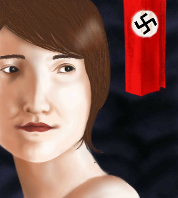
Sofie Scholl MOvie :P well kindahttp://www.kinoswiat.pl/okladki/kino/sophiescholl/sophiescholl_1.jpg
davincipoppalag (Aug 3, 2007)
It looks a good start to meShould I put in the flag the nazi sign? cause its like the movie...?
Sweetcell (Aug 3, 2007)
Go for it Coquitah, it won't be offensive if it's part of the picture, there have been worse pics over the years, trust me. Looking good so far.Done! I really like it is not exactly like the girl but I love how it ended up... this is about my 4th drawing
|
| ||||
|
Coquitah
(Aug 2, 2007)
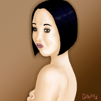
this thing is addictive, please tell me what should I change in the face or if it needs something to get fixed =)
enjoydotcom (edited Aug 2, 2007)
The eyelashes look just a bit choppy to me, you can fix it somewhat by zooming in real close and erasing in a tapered matter. It took a while to figure this out, but when you have a 1 pixel brush and you set the slide under opacity and then flow, to the indication mark, you'll get the thinnest lines. Hope you find this usefull.Otherwise it looks good so far, that scrunched up mouth is funny. done!
davincipoppalag (Aug 2, 2007)
It's a very cute little scrunchypout. The hair looks kinda odd, like it's a solid sheet of something with sharp edges? I like the eyes
Sweetcell (Aug 4, 2007)
Sh'es pretty, and I like her pose. The hairs my favorite part actually.I'd say the mouth is a bit too high, too near her nose. Just needs to be lowered a little. The shape of her head is odd, when you look at a face at this angle it starts off as you have it on the forehead, turns in at the eye, then the cheek (all of which looks right) but it doesn't curve so sharply in towards the neck, it flares out just a bit as it get's to the chin, then forms the chin (I don't know if any of that makes sense, it's so much easier doing than writing) Her chin looks big but that may be because the mouth is so high, but you may need to make it smaller, course that would make her neck too long, so you'd have to lower her head slightly, and move it to our right a bit, it's jutting out just a tad too much (I make that mistake a lot as well) What Joy said about the lashes were correct. They look too cupie doll. By looking at natural lashes you see they're longer on the outside eye and nearly non-existent as they get towards the inside. Erase most of the lashes on the inner parts of the eyes (upper and lower) and make them longer and more tapered on the outer. And the brows could use some plucking :) One last thing, if you erase the extra part of the finger and just leave the tips (and make them just a little smaller) they'd fit better. These are just suggestions, observations, smart allecky know it all stuff. You can just take it in for next time or not. |
| ||||
|
Coquitah
(Aug 2, 2007)
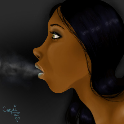
Blahhh my hand hurts noww! Hope you like, wanted it more realistic, but I guess thats that. This is my 2nd Drawing =)wuff my hand hurts xD I like how it looks, wanted it more realistic but I guess thats that.
dridridreamz (Aug 2, 2007)
this is lovely. my favorite thing is her hair. looks so soft!! the eye is sexy too!! =]
enjoydotcom (Aug 2, 2007)
Very nice, i love her nose. |
| ||||
|
Coquitah
(Aug 1, 2007)
not finished its inspired on a spanish song called flaca- Jarabe de palo
SoraItachi (Aug 1, 2007)
It looks pretty so far, it's all nice and simple. ^^That's cool how your drawing was inspired by a song.
dridridreamz (Aug 1, 2007)
cool effects [the blurriness]. like she's in the city or somethin
PinkLipgloss-x (Aug 1, 2007)
This is beautiful ^^
Sweetcell (Aug 2, 2007)
Well damn, nice first draw. It looks like some cartoons where they put animated characters behind a real bg. Welcome aboard Coquita. |

| ||||
| 2draw.net © 2002-2026 2draw.net team/Cellosoft - copyright details - 1.56sec (sql: 21q/0.36sec) |
p.s. yours looks better