| |||||||||||
| Public Boards/Beginner | |||||||||||
|
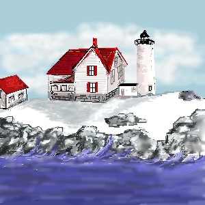
Cape Neddick Light..York Maine
davincipoppalag
(Feb 7, 2004)
Still trying to get used to the tools.. this is loosely based on the Cape Neddick light in York,Maine.
davincipoppalag (Feb 10, 2004)
thanks...yeah I should have spent more time on the water and the shadow.. I kind of threw them in fast to finish up..I was afraid I was going way over the size limit... I still don't know how that works...
DeadlyBlondeArcher (Feb 16, 2004)
This is very pretty. There's alot of depth to it with the way you did the sky, and I love lighthouses but we don't have any around here. :)
davincipoppalag (Feb 17, 2004)
this one came out crappy compared to the one I did on an oekakibbs board I am used to.. I posted a link to it in the post forum..I need alot more practice with these tools to get the same control..but I will keep at it.. thanks
laurael (Feb 18, 2004)
Haven't tried buildings myself...nice job on the overall pic. Love the sky! |
| ||||||||||
| Public Boards/Intermediate | |||||||||||
|
4 comments
– latest 4:
rosalyn (Feb 7, 2004)
Toung! I have seen this every where! Great job! * bow* Rock on!
marcello (Feb 7, 2004)
rolling stones...
BlackLaertes (Feb 8, 2004)
Wow, Ari-chan, that's great! I absolutly *love* the backround ^_^ You'll have to teach me how to do that someday... |

| ||||||||||
| Public Boards/Beginner | |||||||||||
|
Edward
(Feb 7, 2004)
playing around with my tablet now that i got my computer after the shop and got pressure senssativity working....stilll dont have the hang of it but i am working on it!
BlackLaertes (Feb 7, 2004)
Wow, thats pretty good, it has that nice painted feel to it. It looks like it should have a story...maybe work on the face a little bit, and it will be great!
Edward (Feb 7, 2004)
yeah i am trying to get into a new style of art and the tablet makes it look a but paintish ^^; its also one of my first times using the lascaus sketch so i think it is fairly good for using two completly two new programs to me
DeadlyBlondeArcher (Feb 7, 2004)
I think it's very nice. Takes a while to get used to a tablet - if you don't like the watercolor paint look of it, darker opacities will fix that.
sal (Feb 7, 2004)
looks good.. i like the diff tones |

| ||||||||||
|
BlackLaertes
(Feb 4, 2004)
Well, it's not great, but its okay I suppose. Its my 2nd drawing, so...enjoy!
Ari (Feb 4, 2004)
Wow... That leaf is AMAZINGLY AMAZING!!!! *dies of the incredible schpiffy-ness* ^_^
BlackLaertes (Feb 4, 2004)
But of course, you're biased ^_^ |

| ||||||||||
| |||||||||||
| 2draw.net © 2002-2024 2draw.net team/Cellosoft - copyright details - 0.17sec (sql: 17q/0.06sec) |