 |
| |||||
| Public Boards/Intermediate | |||||
|
Asriel
(Jun 3, 2007)
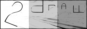
A logo for a website of mine...p.s. When you zoom in and out (25% to 100%) it looks like the characters move. : ) IT IS ONLY ON THE Advanced Board FOR THE SIZE... sorry. |
|||||
|
6 comments
– latest 4:
Opium (Dec 26, 2005)
very interesting...edward scissorhand's brother? watched that again for the first time in years a few months ago, wasn't as good as I remembered it, but still good! This pic, very nice, but it would look nice if you put some shading in the face. not much at all, nothing definite, but just so it's not so flat
Asriel (Dec 27, 2005)
yeah i thought about doing that, but i wouldn't have even done that well...
Opium (Dec 27, 2005)
Sure you would've! You've done everything else in this picture well! You could always try, then if you don't like it, don't save any changes
Asriel (Dec 27, 2005)
heh.. i did try... now isn't the time for me to draw faces. |
|||||
| Public Boards/Beginner | |||||
|
Asriel
(Apr 20, 2005)
Let's try an eye.http://modular.fas.harvard.edu/talks/2004-05-22-UIUC/eye.jpg |
|||||
| 2draw.net © 2002-2026 2draw.net team/Cellosoft - copyright details - 0.47sec (sql: 15q/0.06sec) |
drawn in 57 min
It's a little disproportional... I'll have to fix that before the end.