| |||||||||||||||
| Public Boards/Beginner | |||||||||||||||
|
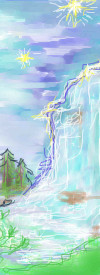
Night Falls
Alicia
(Aug 26, 2005)
The light shineth in darkness , The darkness comprehended it not.
Namori (Aug 26, 2005)
so pretty for such a small picture!!!
KH44N (edited Aug 26, 2005)
This is very pretty. I love the colours u used. Great work.
lycene (Aug 26, 2005)
I really like the colors you used in the sky; the texture is really appealing. |
| ||||||||||||||
| Public Boards/Intermediate | |||||||||||||||
|
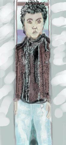
Alicia
(Mar 6, 2005)
I got the reference pic from my hubby's nintindo power mag. This was intended for intermediate, please move.I found the silver reflections on the elevator doors hard to acomplish. Does anyone have any hint on light reflections and flesh tones?
The_Chosen (edited Mar 10, 2005)
Not too bad but it�s not advanced material.
ILoveKenshin (Mar 10, 2005)
I agree with The_Chosen. Try not blurring so much, and defining the lines more. ^_^
Kenshin (Mar 13, 2005)
This is obviously not advanced, and I don't know why it hasn't gotten bumped. There are many things that you need to work on before posting here...
Zack (Mar 13, 2005)
Give it a rest, Kenshin. Not only did Alicia edit the description saying it wasn't advanced, but we mods are doing our work in our free time and thus do not always get on top of things right away. The first time someone says "this is not such-and-such" on a picture is enough to flag it for a mod's attention. |
| ||||||||||||||
| Public Boards/Beginner | |||||||||||||||
|
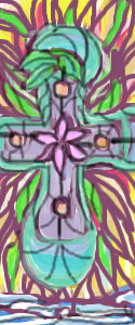
Alicia
(Jan 9, 2005)
This started as a tile design.
davincipoppalag (Jan 9, 2005)
It;s beautiful, It looks like a tiffany panel
emmamommalag (Jan 9, 2005)
Oh, that is very pretty, Alicia. I love the design and your color choices. |
| ||||||||||||||
|
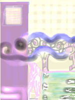
Alicia
(Oct 14, 2004)
Mousing around! :)
Knockoff (Oct 14, 2004)
Ohh. Cool colors. I love your style. Nice job. |
| ||||||||||||||
|
Alicia
(Oct 14, 2004)
More flowers. :)
Knockoff (Oct 14, 2004)
Oh.. Not bad! The colors are nice so far.!
TheSilentTiger (edited Oct 14, 2004)
I like it! you should try working on the background now.
Knockoff (Oct 14, 2004)
Ohh, nice edit. I like the pale colors. |

| ||||||||||||||
|
Alicia
(Oct 14, 2004)
Reminds me of a repeat design .
Knockoff (Oct 14, 2004)
Wow, those colors are almost the same, and its so small. I had to soom up to see what it was.
aznanime93 (Oct 14, 2004)
They look really nice I like them close up..(eye problem hehe)
TheSilentTiger (Oct 14, 2004)
It's pretty! It's just a bit too small...
me007 (Oct 14, 2004)
this is pretty cool. maybe if u came in and brightened up the flowers a bit more, I bet that would help too but I like this one. it would make a nice little icon |

| ||||||||||||||
|
Alicia
(Oct 14, 2004)
I need Ideas for stain glass thumbnails. the only catch is, I have to use bright tissue paper colors. |

| ||||||||||||||
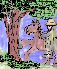
|
Alicia
(Jul 2, 2004)
Oh well , I drew , It stinks ! The tree is the only part I like .^ |
| ||||||||||||||
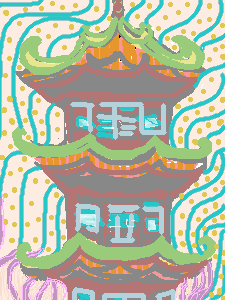
|
Alicia
(Jun 9, 2004)
The Chinese Restaurant's theme is the image that inspired me.:) |
| ||||||||||||||
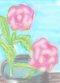
|
Alicia
(Jun 7, 2004)
A rose by any other name, Is still a rose.
emmamommalag (Jun 7, 2004)
Very pretty and delicate flowers, Alicia. I like this picture. :) |
| ||||||||||||||
| |||||||||||||||
| 2draw.net © 2002-2025 2draw.net team/Cellosoft - copyright details - 1.16sec (sql: 27q/0.62sec) |