| |||||||||||||||||||||||
|
Visions of Gradients
marcello
(Jan 13, 2007)
You reach a point where you're just overworking a picture. guess it's 20 minutes.ra ra ra
Dr.Snoopy (edited Jan 13, 2007)
Ha how great...it looks like the entry below belongs to this :D
davincipoppalag (Jan 13, 2007)
you spend twenty whole minutes drawing..we aren't worthy!
Maiko (Jan 14, 2007)
Very nice :] <3
Anna (Jan 20, 2007)
She reminds me of my 2Draw skin \o/ |

| ||||||||||||||||||||||
|
Kayos
(Jan 8, 2007)
the orriginal http://cellosoft.com/2draw/view/57953/.. and this is easily the hardest perspective of a dragon I have ever done.
davincipoppalag (Jan 13, 2007)
Great improvements..you are very good at this kinda thing kayos..love it
Sugarskull (Jan 18, 2007)
Awesome. You added the shoulder cannon, I see.
Sweetcell (Jan 18, 2007)
I love how you do armour and guns. Must study your pics (for inspiration of course :})
Kayos (Jan 18, 2007)
thanks everyone!and sweetcell, study away.. but if you want a short cut, watch lots and lots of sci-fi movies and stuff. |

| ||||||||||||||||||||||
|
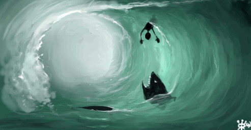
Roytje
(Jan 8, 2007)
Old one: http://cellosoft.com/2draw/view/66297/My first drawings on 2draw don't have a good atmosphere, so I hope I'll improve that now :)
Etheon (Jan 17, 2007)
oh man, i'm really impressed. i also can't believe that this took you only 54min! i love the humer too. XD
DrawingDork (Jan 17, 2007)
Muwah HA HAH HAH HAAA!!!!!!!!! WIPEOUT!!!!
Sweetcell (Jan 17, 2007)
Hahahahah nice finish.
Miss_DJ (Jan 17, 2007)
awesome water there, Roytje! |
| ||||||||||||||||||||||
|
Axil62
(Jul 5, 2006)
:)
Axil62 (Jul 12, 2006)
I deleted it.
sincity (Jul 12, 2006)
wow. this drawing is awesome. just like Ty said. :}
Purgatori1 (Jul 16, 2006)
How do you delete something?
a_blue_orange (Jan 16, 2007)
!!! |
| ||||||||||||||||||||||
|
11 comments
– latest 4:
Etheon (Jan 13, 2007)
this is absolutely stunning. the color scheme is great too.
davincipoppalag (Jan 13, 2007)
Another great entry. I like the torn photo effect you drew in..
Alter.Native (edited Jan 16, 2007)
Thanks!
Miss_DJ (Jan 15, 2007)
great effect! love this one! |

| ||||||||||||||||||||||
|
Orkdoop
(Jan 8, 2007)
A redo. I think this is the old one. http://cellosoft.com/2draw/view/27441/
Axil62 (Jan 12, 2007)
Good job Jessy. I love you. :)
Kloxboy (Jan 14, 2007)
Congratulations Orkdoop! "Jean Harlow" is awarded first place for Contest Week 42: Do over!. You can see a tremendous growth in Orkdoop's digital drawing skills in this piece. Aside from blowing her old piece out of the water, Orkdoop demonstrates a stronger sense of proportions, an eye for detail and an all around more advanced drawing ability. I also found the gradient patterns in the clothing to be an innovative approach to making fabric textures. You've come a long way siski.
davincipoppalag (Jan 15, 2007)
Congratulations on the win Jessica!
Miss_DJ (Jan 15, 2007)
very nice and congratulations! really a super representation of artistic growth! :o) |

| ||||||||||||||||||||||
|
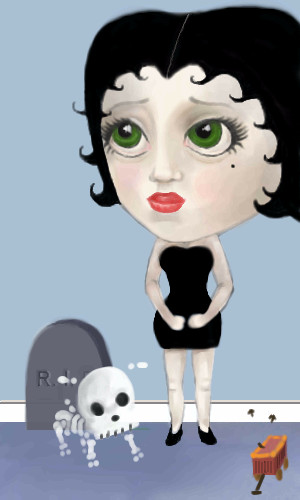
katloo
(Jan 4, 2007)
Betty Boop in Mark Ryden stylefinally got the body right, now just need to work on color
This is begining to drive me nuts and really want to finish!!!-
but for now i'm stuck and would love sudjestions. I do know this was for a challenge awhile ago, but i began it before I realized how close the deadline was XP (oops). I would love any critics :) thanks.
Miss_DJ (Jan 15, 2007)
well, I think it's obviously Betty Boop / Ryden style, that's for sure! If you want to make any changes at all, I'd only suggest looking at examples of his work, and examples of Ms. Boop. This is just fine as is though. :o)/end picture
|
| ||||||||||||||||||||||
 |
Kloxboy (edited Jan 15, 2007)
Contest Week 42: Do over! *Showcase Selections Announcement Below* Your goal this week is to select one of your older drawings on 2Draw and do it over...but better. The piece you select must be from the first half of your membership here, no newer pieces. Basically, the most improved piece wins, not necessarily the most skillful one. This is a great opportunity to show everyone how much you've improved and learned since you've been on 2Draw. When picking your "do over" piece, do not s...
23 comments
|
||||||||||||||||||||||
|
6 comments
– latest 4:
fleeting_memory (Jan 8, 2007)
hey I remember this! :) Interesting difference! I love this contest.
PolythenePam (Jan 11, 2007)
the detail on the money and the snowglobe is amazing
cmb (Jan 12, 2007)
I love the origami"!
Alter.Native (Jan 15, 2007)
This one was my favorite entry in this contest! (well, apart from mine of course..;)..) It's not only far more skillful than the original, but it goes to show that when you acquire more skills, you can take risks and chances to modify and apply your o w n artistic vision much more effectively. |

| ||||||||||||||||||||||
|
4 comments
– latest 4:
davincipoppalag (Jan 9, 2007)
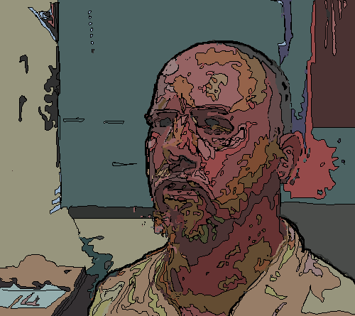
Yep..this one is better shultsy! good entryI gave his left cheek a lot of blush, probably the highest legally possible amount.
~I cant express myself well. I have lousy english.~
davincipoppalag (Jan 14, 2007)
I think it looks great.. and your English is better than my Hebrew!
shults (Jan 15, 2007)
It IS better! :D |

| ||||||||||||||||||||||
| |||||||||||||||||||||||
| 2draw.net © 2002-2026 2draw.net team/Cellosoft - copyright details - 0.71sec (sql: 38q/0.65sec) |