| |||||||||||||||||||||||
|
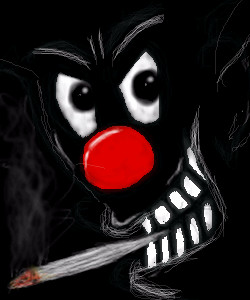
Wraith
(Jun 28, 2007)
Eh, I am not in the drawing mood tonight, but still I tried to draw, no matter what it was. And this is what I came out with. :( Sorry |
| ||||||||||||||||||||||
|
ittykitty
(Jun 28, 2007)
looked better on paper...MUCH better.Anime, I liked how the background turned out, just kinda quick...but I like it.
enjoydotcom (Jun 29, 2007)
Its still quite cute. It might be my flatscreen, but the contrast may be higher on the face tho. Fun eyes!
Sweetcell (Jul 7, 2007)
Oh, now this really cute. Could be quite a cute character. I'm sorry I never commented before. The eye's are hella big and weird, but it works. She kinda looks like the living dead. :D And hey, nice bg, simple but effective. |

| ||||||||||||||||||||||
|
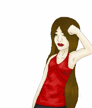
ittykitty
(Jul 1, 2007)
Found this on my unfinished board...kind of old
Sweetcell (Jul 1, 2007)
Well hell. You just improve and improve. Nicely done Itty, you really have come far. Keep going.I agree the hand is good, one thing though, the pinky should be smaller (pinky's are always smaller) and round her left shoulder more, it shouldn't curve like that, with the arm raised the shoulder and arm muscles would be more defined. But yes, it is one of your best yet. Good going girl.
Sweetcell (Jul 1, 2007)
There you go, much better, except (and it's minor but it's needed) the shoulder muscle wouldn't overlap the upper arm muscle (or in other words the line for the upper arm should be going in and towards the body, does that make sense?) and the upper arm wouldn't overlap the lower forearm, ite lower forearm would overlap the upper arm. Now this isn't bad at all, the way it is you did it right, but only if she were facing the right because her arm right now looks like it's reaching back behind her, and though it may be possible it'd be mighty uncomfortable. But these minor changes would bring the arm forward and conversly it'd be less straining. :)
mooki (Jul 1, 2007)
that arm would hurt if it bent that way
Sweetcell (Jul 7, 2007)
Better, see the difference? Now she won't strain her arm, and I'm loving your coloring so far. Very good Itty. |
| ||||||||||||||||||||||
|
Xiloyd
(Jul 1, 2007)
fail
Xiloyd (Jul 1, 2007)
why not?
Sweetcell (Jul 1, 2007)
That right leg looks..... weird. So does her left arm. But good work on making it look like pencils.Still, that leg.
Sweetcell (Jul 7, 2007)
That looks much better. Porr thing, she's dead isn't she? *sniff*sniff*Never noticed before, is that a ship in the bg? Nice design. |
| ||||||||||||||||||||||
|
xX_Firefly_Xx
(Jul 2, 2007)
A signature I did for forums that I am at. It's Buttercup from the Powerpuff Girls.
goodknight0102 (Jul 2, 2007)
wow that's great! i love the shading on the skin.
Sweetcell (Jul 7, 2007)
Oh I missed this. Nice solid shading and lineart. I love the adult looking version of her. Well done. I love your Sig name btw, reminds me of one of my favorite SF shows. If I didn't say it xX_Firefly_Xx, welcome. |
| ||||||||||||||||||||||
|
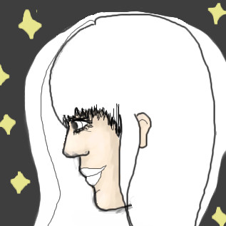
ittykitty
(Jul 2, 2007)
Somewhat realistic Quick doodle
naziworm (Jul 2, 2007)
It needs work Mary.You are getting there, but you really need to just sit down and sketch people, it's the greatest teacher.
Sweetcell (Jul 7, 2007)
As naziworm said, taking more time to sketch it out first does wonders. If you look at a person's profile you'd see the eye isn't right on top of their forehead, it's set back a bit, and it usually rests between the curve where the brow bone and nose ridge meet. (right now she looks more cyclops like) The nose is alright, maybe curve the tip a bit, and that line that connects the nose and mouth should be more u shaped (not too much) Set the ear back a bit more and make the upper lip smaller than the lower and this would be closer to a realsitic portrait. Only suggestions Itty, I think you've improved very much. I'd also make the hair not so.... round and low on the forehead. |
| ||||||||||||||||||||||
|
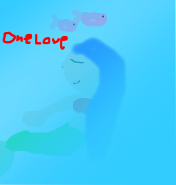
waternayru
(Jul 5, 2007)
mermaid is....wierd
Great_white (Jul 5, 2007)
Bastard!
Sweetcell (Jul 7, 2007)
Ok, an HOUR on this? Really? You need to really work on..... everything. |
| ||||||||||||||||||||||
|
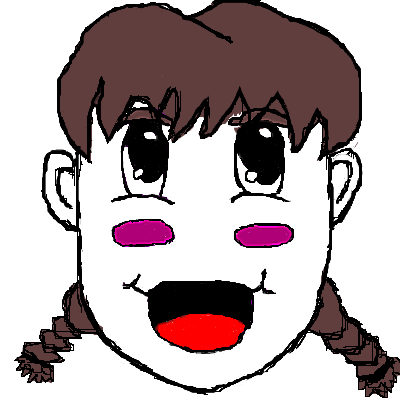
Tanias
(Jul 6, 2007)
It's just a face, I hope it'll become better. ^^
Sweetcell (Jul 7, 2007)
This scares me walks away slowly |
| ||||||||||||||||||||||
|
cimmeria
(Jul 7, 2007)
hi guys! i'm cimmeria and this is my first post here~ i really hope i like it here and this is my first drawing in this community ^_^ I hope i like it here :)
Sweetcell (Jul 7, 2007)
Not bad for a first, different, I like different. Could use a bit more work but a nice first. Hope you stick around. Welcome. |
| ||||||||||||||||||||||
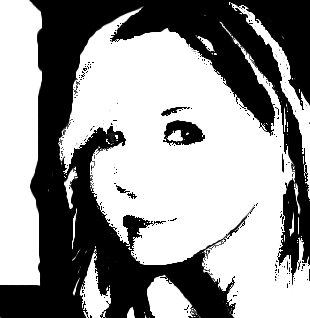
|
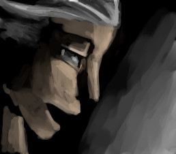
dark_angel
(Jul 7, 2007)
idk i'm bored
TaCO (Jul 7, 2007)
O.O Looks Cooooool!!!!!!
davincipoppalag (Jul 7, 2007)
THis is excellent!!
Sweetcell (Jul 7, 2007)
This is better than the other b & w. Her cheeks a little round, and the shadow under her lip is heavy, but it's just a quibble. Do more of these DA. |
| ||||||||||||||||||||||
| |||||||||||||||||||||||
| 2draw.net © 2002-2025 2draw.net team/Cellosoft - copyright details - 5.03sec (sql: 33q/4.99sec) |
cool clown, love the nose and joint