| |||||||||||||||||||||||
|
zep
(Apr 2, 2007)
ygdd |
| ||||||||||||||||||||||
|
koisnake
(Apr 2, 2007)
Yesh, I was bored..Anyhow, Ill finish this guy soon ^^; |
| ||||||||||||||||||||||
|
shaalan14
(Apr 2, 2007)
........ |

| ||||||||||||||||||||||
|
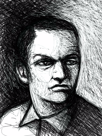
Kloxboy
(Apr 1, 2007)
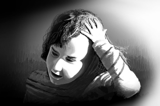
~~~needed to be lighter
HunterKiller_ (Apr 1, 2007)
Interesting, contemplative face.
davincipoppalag (Apr 1, 2007)
This one gives the impression of one of those dark ages inquisitors..I don't know why..just does.
Miss_DJ (Apr 2, 2007)
Your art always catches my eye. well drawn, Klox! |
| ||||||||||||||||||||||
|
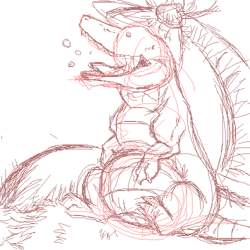
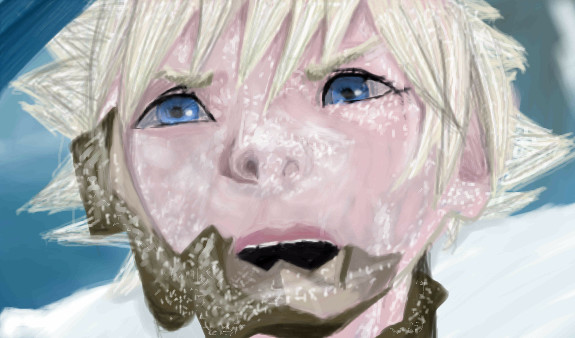
Rudeezy
(Apr 1, 2007)
Dayumn, KH2FM has like the coolest secret ending of all of the KH games.At one point, a knight guy's helmet breaks after he was frozen and he looks like Roxas. Soooo, i drew this from the video. I think it came out okay, but I saw a lot of things that could have been fixed, but i'm too tired and bad to fix them.
davincipoppalag (Apr 1, 2007)
They call him Rocky.... kinda cool
Miss_DJ (Apr 1, 2007)
damn...looks good but painful
Punky (Apr 2, 2007)
Holy crap, this is awesome Rysu. :O I love the look of the snowflakes resting on the face.You keep getting better and better. |
| ||||||||||||||||||||||
|
PS
(Apr 1, 2007)
The things I remember (when we were burning down).
brenndurdrykkur (Apr 1, 2007)
this is beautiful
fleeting_memory (Apr 1, 2007)
great start-fun contrast. :)
Miss_DJ (Apr 2, 2007)
great draw!! I wonder what she's thinking?
PS (Apr 3, 2007)
Thanks Miss DJ, we were on the north shore of Lake Supierior and I bet she was thinking "I hope this wind doesn't blow my hair right off!" |
| ||||||||||||||||||||||
|
Miss_DJ
(Apr 1, 2007)
for Sweetcell
davincipoppalag (Apr 1, 2007)
I say we start a movement to bring some beaches to Manitoba...oh wait.. we have..Global Warming.. nevermind!! Pretty Donna@
Sweetcell (Apr 1, 2007)
We got em Dave (there's ocean beaches and lake beaches and river beaches.) Winnipeg beach is a hella long way to go though if you don't have a car available and someone to drive you. But do no weep for me my friends.... I shall survive.
DeadlyBlondeArcher (edited Apr 1, 2007)
My husband just informed me this week that he's taking his duck hunting boat to the beach this summer... I just calmly said .... "Make sure you take out enough life insurance to buy the house we always stay in, because I'll have to throw flowers into the surf, they aren't going to find your body"... and then I smiled sweetly. He laughed, and then he stopped, because he knew I was serious. haHAH!!! Barb, I don't weep for you, you have POLAR BEARS!!!!!.Stop teasing me, Donna. :D
Sweetcell (Apr 1, 2007)
Well..... Winnipeg doesn't have wild Polar Bears, you have to go quite a few hundred miles north to Churchill Manitoba to see them, near the pole, in a special jeep/tank kinda thingy. If I see a Polar Bear in the city I'll freak out with the rest of my fellow Winnipegger's and wonder how the hell it got so far south (we border ND y'know). Either that or it escaped from the Zoo. That's the only Polar Bear I ever saw. That's as close as I want to get to one. |

| ||||||||||||||||||||||
|
jaded_angel
(Apr 1, 2007)
still my fave anime it wont let me draw yyyyyyyyyyyyyyyyyyyyy? maybe its a glitch...maybe its something i did...maybe its this old comp...o_0
Yippy its working again :)
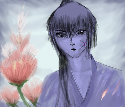
PS (Apr 1, 2007)
Cool flowers, and I like the shading you used for the hair.
jaded_angel (Apr 2, 2007)
thanks:) |
| ||||||||||||||||||||||
|
PS
(Apr 1, 2007)
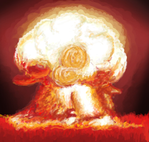
The garbage truck beeps as it backs up.
friend (Apr 1, 2007)
2012.
Sweetcell (Apr 1, 2007)
EXPLOSIVE! I see Peter Petrelli's dream come to life. (Heroes)
YoureToast (Apr 1, 2007)
Whoa, i love the texture.
HunterKiller_ (Apr 1, 2007)
Explosive. |
| ||||||||||||||||||||||
|
Roytje
(Apr 1, 2007)
Woohoo! Spring arrived in Holland! :D
davincipoppalag (Apr 1, 2007)
Gorgeous...this shouts SPRING! Roy!! Terrific
Sweetcell (Apr 1, 2007)
Not fair, it's all wet and grey here. *sigh* I'll just live vicariously through your pictures Roy. It must be wonderful over there.
Childlike_Vampire (Apr 1, 2007)
OOhh so pretty painterly-ness. Wow I am digging this. Love the glowy sun and the bright flowers and the oh so far away sky!
Roytje (Apr 2, 2007)
Thanks for all those great comments! I make more of this "30 min" drawings, but I never upload them because I think they aren't good enough. Actually I deleted this one almost... |

| ||||||||||||||||||||||
| |||||||||||||||||||||||
| 2draw.net © 2002-2026 2draw.net team/Cellosoft - copyright details - 3.84sec (sql: 36q/3.76sec) |
Who needs color????
This is pretty cool... I don't recall you ever doing anything in black and white, but I still knew it was yours from the thumbnail. I like it.