| |||||||||||||||||||||||
|
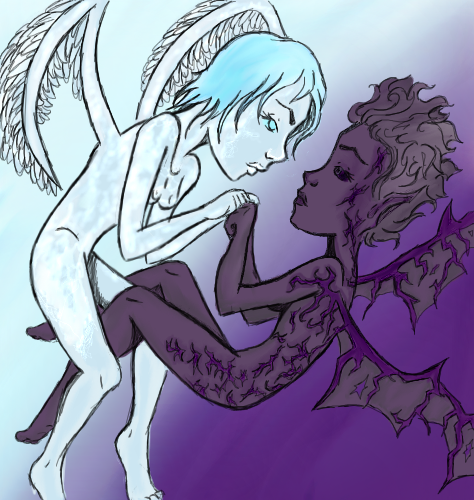
Angel and Demon
Bubblicious
(Apr 9, 2009)
Please dont ask >.< I'm gunna try to make it intermediate worthy... some how I doubt I will.. ugh...Finished! Finally. I envy you guys, you are so patient with your artwork. Five hours is kinda pushing it for me...
C_bikini_N (Apr 19, 2009)
Excuse me, but wtf is this shit?
Bubblicious (Apr 19, 2009)
A drawing I did awhile back. Duh.
xsi639 (Jun 13, 2009)
incredible*,*
Bubblicious (Jun 14, 2009)
Thanks X :) |
| ||||||||||||||||||||||
|
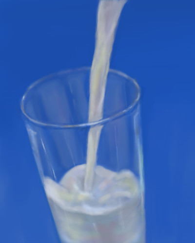
jpjp1052
(Jun 14, 2009)
Gooey (Jun 14, 2009)
Very nice. I love how you did the glass!
enjoydotcom (Jun 14, 2009)
Because of your drawing, I got a glass of milk, and fell asleep on the couch.... :D.Looks like and oldfashioned poster to promote milk.
firecracker (Jun 14, 2009)
Nice draw.....it really does look like milk. :)
bette_davis_eyes (Jun 14, 2009)
really nice draw jp! it looks so refreshing :) |
| ||||||||||||||||||||||
|
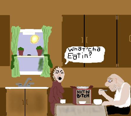
catfish
(Jun 10, 2009)
Cartoon
backmagicwoman (Jun 10, 2009)
LMAO!!!
bette_davis_eyes (Jun 10, 2009)
this really is funny! love it :D
gloworm043 (Jun 10, 2009)
Cute draw Cat....funny....lol
davincipoppalag (Jun 14, 2009)
Hahahaha lmao |
| ||||||||||||||||||||||
|
solve
(Feb 6, 2009)
Changed
vlad.the.hamster (Jun 11, 2009)
ooh, love how this is changing.
QTgillie (Jun 11, 2009)
nice, looks like a black and white Klox.
Bubblicious (Jun 13, 2009)
very cool
davincipoppalag (Jun 14, 2009)
Marcus marked! |

| ||||||||||||||||||||||
|
mesitka
(Jun 8, 2009)
My OCs, Rishi and Lucia, in a happy moment before their tragic story took off.
firecracker (Jun 12, 2009)
I think this is a very pretty draw.......I like how all the colors blend so well together. It has a very soft look to it. I also like the sketch too. Nice draw!! :)
kupocoffee (Jun 12, 2009)
Looks like A beautiful painting, Maybe oil/pastels medium. I love the purple used here, for the highlighting/shading. The outfits are so creative.
Bubblicious (Jun 12, 2009)
Very pretty :3
davincipoppalag (Jun 14, 2009)
very well done |

| ||||||||||||||||||||||
|
jpjp1052
(Jun 12, 2009)
firecracker (Jun 12, 2009)
"LOL"!!! This is really cute! It reminds me of a marionette that I had when I was a kid. Mine was "Harpo Marx". Great draw!! :)
bette_davis_eyes (Jun 12, 2009)
this is awesome! I so enjoy your art :D
Suntan (Jun 13, 2009)
Another great piece, jpjp!! :D
davincipoppalag (Jun 14, 2009)
Gotta love that expression |

| ||||||||||||||||||||||
|
shults
(May 31, 2009)
How could nobody detect the sadness in her eyes? -this aren't the eyes of a happy little girl.Lately I think of her a lot. I decided to draw her even though I can't do that angel any justice. Rose Pizam- http://edition.cnn.com/2008/WORLD/meast/09/11/israel.suitcase.girl/index.html
enjoydotcom (Jun 1, 2009)
Why is it that in a divorce, usually the kids are the ones to suffer. The little ones are too often used as leverage to get what either one or both of the parents want. Horrid. No child deserves this and the worst part is, you have more insane people outside the insane asylum than inside.
Bubblicious (Jun 1, 2009)
Yup. My mom and dad divorced, and when I was younger, I felt that my mom was using me to get to my dad, and vice versa. Don't get me wrong, they loved me and they never ever hurt me, but my mom was hounding my dad for child support, even before we had to live off of it. Any way, I just felt like that. I can't imagine how it must feel for a child who has gone through worse. I just wish I could just get rid of the pedophiles, sex offenders (which might as well be the same thing), and all those awful people who kill kids.
QTgillie (Jun 13, 2009)
my tears are falling.
Suntan (Jun 14, 2009)
oh my..you've done a beautiful work of her, shults. Such sickness and sadness in the world. I wish it were a better place. :`( |

| ||||||||||||||||||||||
|
For DrsFan
12 comments
– latest 4:I really liked the sketch, and i wanted to keep the sketchy-ness in the lineart, but it looks a little messy now. Oh well. I still like it. The arm by her head bothers me a bit, I think it's too long. But yeah, have fun Drs!! Edit: Shoot, I was supposed to put this on the collab board.
DrsFan (Jun 4, 2006)
true but I cant really think of anything to put in the background.
Noremac (Jun 4, 2006)
hohoho how'd i miss this one?FURRY JUBBLIES~
JK-Arts (Jun 4, 2006)
if them tails in the back ground where slghtly gray scale darker tone it would look even cooler then it does now
deaia (Jun 14, 2009)
is so sweet !pretty |

| ||||||||||||||||||||||
|
brenndurdrykkur
(Jun 10, 2009)
everything
solve (Jun 13, 2009)
I always enjoy your coloring work. The work in the forehead is swell.
Suntan (Jun 13, 2009)
I enjoy it as well. Good to see more of it. Great work. :)
kupocoffee (Jun 13, 2009)
I like this! Looks like there is a city in the background! I really enjoy the coloring around the face.
vlad.the.hamster (Jun 13, 2009)
I like this lots. :) |

| ||||||||||||||||||||||
|
xsi639
(Jun 11, 2009)
damn i finally I figured out how the layers workO_O...but sill needet some more adjusters:P
backmagicwoman (Jun 11, 2009)
really really pretty..
Bubblicious (Jun 13, 2009)
She reminds me of a dreinai from WoW, or World of Warcraft if you don't know. Very pretty. |

| ||||||||||||||||||||||
| |||||||||||||||||||||||
| 2draw.net © 2002-2025 2draw.net team/Cellosoft - copyright details - 3.24sec (sql: 36q/3.22sec) |