 |
| |||||||||
|
2draw.net
13 comments
– latest 4:
Anna (Jun 3, 2004)
I like this one. Definitely my favorite.
davincipoppalag (Jun 3, 2004)
Yea..where do I order my shirt?
littledebbie1990 (Jun 30, 2005)
Seriously! I wear a small.. O.o
iamawalnutt (Oct 30, 2006)
I looked through all the designs in this area, and i have to say this is the best i have ever seen!! great job well dobe!! |
|||||||||
|
Fin_beast
(May 20, 2004)
Full size it.I have finished halfway into the exam so I am going to do another quite large one. Marcello gave me permission to do this. I'm very pleased with how this came out. *grins* I attempted the lens flare/flair 4 times. It was anoying. This is the best one though. :) || Sorry Method3 but I can't do any more to it because it comes up with an error. ||
StrawberryYamichan (Dec 16, 2004)
wow this is absolutely wonderful!
octopus (Apr 30, 2005)
omg.....it makes me think of the ring........it was soooooo scary.........but the pictures reli gd!
srarh1122 (Oct 25, 2005)
very good.
frootcake (May 8, 2006)
this is hugeeeeeeeeeeeeee |
|||||||||
|
marcello
(Aug 9, 2004)
this is so advanced skill level it pukes.
nozomii (Mar 3, 2005)
Hmmm. I still haven't figured the last word...
emmamommalag (Mar 3, 2005)
color!
nozomii (Mar 3, 2005)
Ah! Ty emma!
sarah.com (Oct 26, 2005)
Love it!>.< |
|||||||||
|
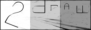
A 2draw logo designed for the back of a tshirt. Originally pretty faithful to the original sketch on paper with a few changes to make it more readable and hopefully less complicated. Now this monstrosity is pretty much a brainstorm of ideas. It will probably not be reproducible on a tshirt except by photographical reproductive process (not like a silkscreen).
6 comments
– latest 4:This thing is just a monster to work on. Messing with some other colors I think will help so... that's next. Also all the old layers are there in case you want to mess with them so don't worry.
Fin_beast (edited Apr 8, 2005)
Looks much better with that black surrounding. Should be insane when it's finished.Just added stuff behind (under?) the letters. What else does it need...
Some fixes to what I didn't like. But whether it's done or not... I think it still probably could use some work. Suggestions definetly welcome at this point.
|
|||||||||
|
method3
(Mar 3, 2004)
zoraw! Marcello's favorite design of course...
Maiko (Mar 20, 2004)
Very Sexy XDlove your artz0rz
method3 (Mar 20, 2004)
I did see a 2draw logo floating around on a bubble in celloland somewhereWhat?
staci (Mar 20, 2004)
she means this.. http://cellosoft.com/2draw/view/16573/ which is ok except i cant really see the 2, plus i personally think its kinda boring. *shrug*i like fin's design. have i mentioned that yet?
Ako (Jan 5, 2005)
so awesome! |
|||||||||
| |||||||||
| 2draw.net © 2002-2025 2draw.net team/Cellosoft - copyright details - 0.18sec (sql: 22q/0.16sec) |