boardscollaborationshorse
100% - zoom in - zoom out
drawn in 1 hour 28 min with Lascaux Sketch Classic
Collaborators
iconthesolarwinds
Addict
9 versions
36 min
iconGreenEye
Artist
3 versions
51 min
thesolarwinds (Sep 8, 2005)
horsie!
thesolarwinds (Sep 8, 2005)
drawn in 5 min
thesolarwinds (Sep 8, 2005)
drawn in 1 min
thesolarwinds (Sep 8, 2005)
drawn in 15 sec
GreenEye (Sep 8, 2005)
eeek! ooh, my turn! lol ;)
thesolarwinds (Sep 8, 2005)
drawn in 9 min
he says, moo
davincipoppalag (Sep 8, 2005)
I like the posture and the watercolory feel of this, so far.
thesolarwinds (Sep 8, 2005)
drawn in 4 min
thesolarwinds (Sep 11, 2005)
drawn in 6 min
thesolarwinds (Sep 11, 2005)
drawn in 18 sec
horsie!!!!
GreenEye (Sep 12, 2005)
drawn in 29 min
Well, here's my part in... i dunno who's gonna do the background though! :)
What do u guys think? OK? Not ok? U tell me... ;)
thesolarwinds (Sep 12, 2005)
drawn in 2 min
yay!.. who wants to do the bg?
GreenEye (Sep 14, 2005)
drawn in 12 min
What do u think? Gotta run, school! :)
thesolarwinds (Sep 14, 2005)
drawn in 5 min
yay! clouds = purdy!
davincipoppalag (Sep 14, 2005)
I liked it better with just the one horse..but that new one needs more refinement like the other one.
thesolarwinds (Sep 14, 2005)
that's greeneye's horse.
i like it the way it is. it looks bright and happy.
davincipoppalag (Sep 14, 2005)
It's not bad, it's just the new horse looks flat and detailless next to yours
thesolarwinds (Sep 14, 2005)
*shrug*
i still like hers the way it is.
GreenEye (Sep 14, 2005)
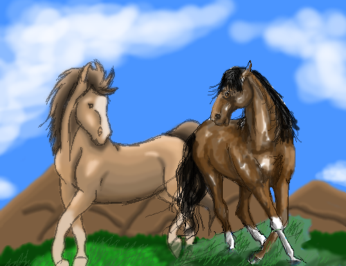
Thank you, thesolarwinds. I see where you're coming from, davincipoppalag, i'm not good at doing shape or form or stuff like that... I'm still practicing, so it'll be quite some time until it looks decent, but I suppose it isn't THAT bad, is it? o_0

I like the clouds, thesolarwinds, and the grassy touches. Looks great! :D
thesolarwinds (Sep 14, 2005)
lol... thanks!
davincipoppalag (Sep 14, 2005)
It's not that it's bad,, it just could be better if you did some of what sw did to hers..
emmamommalag (Sep 14, 2005)
I like the contrast between the two.
Gigandas (edited Sep 14, 2005)
I think what davinci means to point out is that the left horse doesn't have as much contrast in value (lights and darks) as the one on the right.
Although that's true, I have to applaud you two for actually doing a collab that seems more natural (the poses of the horses) instead of the more common cluttering of the canvas with several characters all over the place, just standing around and facing forward :).
GreenEye (Sep 15, 2005)
drawn in 9 min
Now, how does that look? I added a bit more light and dark, so, i dunno... I'm pretty new to this...
davincipoppalag (Sep 15, 2005)
There ya go... much better...it has more dimension
GreenEye (Sep 15, 2005)
YAY! Thanks guys, now i've learnt something... i'm so used to working in pencil and greys, now colours totally baffle me! :D
thesolarwinds (Sep 15, 2005)
yay! much better greeneye.... it does look more dimensional.... at least... i like the highlights... they're shiny... lol
iamawalnutt (Oct 2, 2006)
love it!! not sure about the brwn horsey tho..
post comment
You need to be logged in to post a comment. If you don't have an account, sign up now!