| |||||||||||||||||||||||
| Public Boards/Intermediate | |||||||||||||||||||||||
|
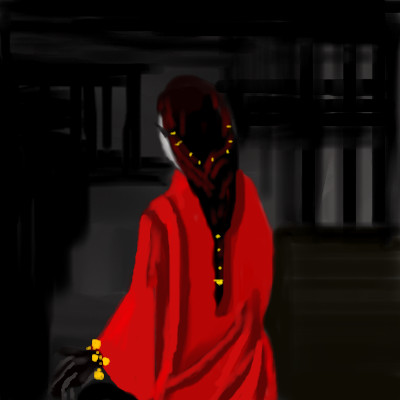
Layne
(Feb 17, 2010)
So, everyone seems to be doing a little copying from favored painters & illustrators so I thought I would throw in my 2 cent.This is from Kay Nielsen. I really love all of his work. Especially for the East of the Sun and West of the Moon book. :) Not done yet, and the lady needs some reworking of the torso and head, but better then nothing! Ref: http://www.ralphbakshi.com/blog/archives/sunmoon03.jpg |

| ||||||||||||||||||||||
| Public Boards/Beginner | |||||||||||||||||||||||
|
madscientist
(Feb 27, 2010)
Teapot (Feb 27, 2010)
Simple and beautiful. Love the hair and the way you did the background.
davincipoppalag (Feb 27, 2010)
I love the red robe |
| ||||||||||||||||||||||
| Public Boards/Advanced | |||||||||||||||||||||||
|
Bobstained
(Nov 19, 2009)
Flubbles (Feb 24, 2010)
I started this months ago i just wanted to empty my gallery, i'm not doing a self portrait nobody wants to see a pair of huge dimples grinning back at them.
dorothyblueeyes (Feb 24, 2010)
no, I know this picture is not easy to do, you just make it look easy. The white is hard to convey, and also the water. Very elegant and beautiful.
firecracker (Feb 24, 2010)
You don't want to do a self portrait flubadub.......because you look so much like "Spanky" of the "lil rascals"......with your dimples......"lolzzz"...:P I do luv this swan though......beautiful draw!! :)
Miss_DJ (Feb 25, 2010)
lovely |

| ||||||||||||||||||||||
| Public Boards/Intermediate | |||||||||||||||||||||||
|
Flubbles
(Feb 22, 2010)
Teapot (Feb 24, 2010)
It's so pretty and dewy-looking. I dunno. Might be dangerous to glamorize a bottle holder, could start a flaunting trend. Soon young men with pretty bottle holders will walk the streets wearing strangely designed trousers with the ass cut out. Oh, wait. They already do that in San Francisco. Nevermind.
Bobstained (Feb 24, 2010)
I think i've performed miricles to make it look pretty, afterall it is an asshole.
shell (edited Mar 14, 2012)
ugleh
cyclops (Aug 8, 2010)
there should be little beady eyes looking out from the darkness. |
This is hidden because it is rated 18+. Edit your privacy settings to make it visible.
| ||||||||||||||||||||||
|
elly
(Feb 23, 2010)
...meh
Flubbles (Feb 25, 2010)
I dont mind the dodge and burn in this pic, i think she used them well without over doing it.
elly (Feb 26, 2010)
I tend to use dodge and burn in about every draw I do somewhere or another...can we say obsession?? lol! I do overuse them and I'm trying to tone it down a bit...I'm only in my 2nd step of the 12 step program for dodge and burn addicts =) LOL! Thx for the comments =)
Zero_Lemons (Feb 26, 2010)
I just want to hold it in my hands, it's so cute! I really love the details of the feathers. I think your use of dodge and burn is effective for this as a whole :)
madscientist (Feb 27, 2010)
Lovely little bird! He looks nice and healthy!:)) |

| ||||||||||||||||||||||
| Public Boards/Advanced | |||||||||||||||||||||||
|
Flubbles
(Feb 19, 2010)
TumblingUpwards (Feb 26, 2010)
I like to lick mustard off people, does that count?We used to have a replica of this painting in our library growing up, scared the crap outta me when I was in there late at night. This does look a lot like it, you sure put a lot of time in your work, I don't know how you spare so much.
backmagicwoman (Feb 26, 2010)
Spicy brown, regular or honey?
firecracker (Feb 26, 2010)
"lolzzz".....I'm sure glad that I don't like mustard.....:P
TumblingUpwards (Feb 26, 2010)
Honey, you gotta have it slightly sweet. |

| ||||||||||||||||||||||
| Public Boards/Intermediate | |||||||||||||||||||||||
|
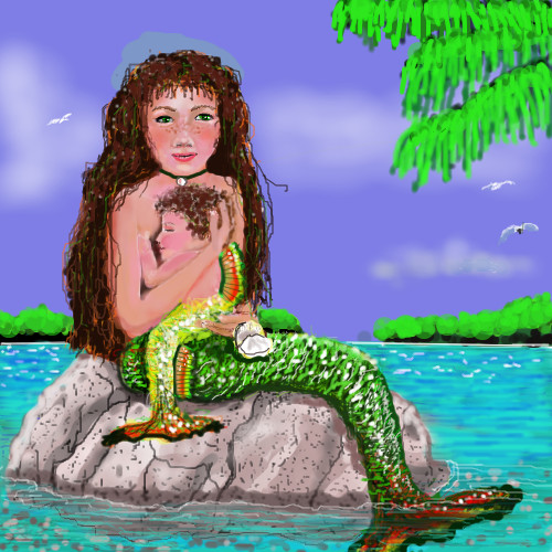
lynnandcharlie
(Feb 22, 2010)
firecracker (Feb 23, 2010)
"Awwwwwww"....this one is really adorable......that's the first time I've ever seen a baby mermaid. You're doing great with this pic.....I'm anxious to see it finished.....:)
Teapot (Feb 23, 2010)
A merchild! Lovely idea. I've always been fascinated by mermaid stories. I love her hair and the way you shaded the rock is very well done. Looks like they live in the Bahamas.
firecracker (Feb 23, 2010)
I think they live in Tahiti...... |
| ||||||||||||||||||||||
|
cpomaybo
(Feb 23, 2010)
Layne (Feb 24, 2010)
Very fun style :) love it.
Teapot (Feb 24, 2010)
What a fun drawing. Trying to figure out what the monument is a monument of, exactly. Does look like a pig with big hair...but then there seems to be kind of a squirrel tail, too. That sky has made my day. I don't want to talk about yard cleanup and trees.
Axil62 (Feb 24, 2010)
I think it's a monument to book burning
Flubbles (Feb 24, 2010)
I've been secretly admiring her style, it's free and loose and looks like it comes really natural to her. |

| ||||||||||||||||||||||
|
Teapot
(Feb 21, 2010)
spent 45 minutes trying to make the background look the way I wanted. :P
Teapot (Feb 23, 2010)
Thanks. Yeah, I did warm up the colors some. I wanted it to look a bit faded and old fashioned but don't think I accomplished that. In the ref photo (which I didn't follow much at all except for the pose) she seems to be kneeling next to a chair. Could be interpreted as rather suggestive, I guess. I'd kill for that hair.
Miss_DJ (Feb 23, 2010)
nice work, teapot. the dress pattern is great, as well as the texture.
firecracker (Feb 23, 2010)
"Wow"! This is totally awesome! My fave part is her gorgeous red hair.....nice draw! :)
Roytje (edited Mar 28, 2010)
Nice work. |

| ||||||||||||||||||||||
|
cyclops
(Feb 14, 2010)
backmagicwoman (Mar 9, 2010)
Yep..so don't even try...
backmagicwoman (Mar 9, 2010)
http://www.youtube.com/watch?v=l0JIyEEOjio
cyclops (edited Oct 29, 2011)
i thought it looked like what I intended it to be....a piece of ham.
backmagicwoman (edited Mar 10, 2010)
:)...anytime. |

| ||||||||||||||||||||||
| |||||||||||||||||||||||
| 2draw.net © 2002-2024 2draw.net team/Cellosoft - copyright details - 1.03sec (sql: 41q/0.55sec) |
It would be a great contest, draw from your favorite artist. In his or her style.
if you wanted to have texture like in the original painting, an easy (and quick!) way to do it, would be with a scatter brush (choose a high scatter count and you can maybe crank up the spacing too) on a separate layer. that way you can easily erase the eventual wayward dots from unwanted areas, and you can also play around with the blend mode and opacity (make it subtle)
..hmm, another thing that i noticed was that the original was much more sharper (darker and thinner lines).. i suck at line art so i'll not gonna try to give you any advice on that. You would only get worse if i tried to teach you line art :P